Upon seeing Hermès women’s latest runway show for Autumn-Winter 2020, one was immediately struck by the clean lines and bold swaths of color, featured against a background of white, then black, tan and beige. Models walked through a forest of white striped horse-jumping posts; a visual reminder of the house’s equestrian history, repeated over and over with similar references in the clothing themselves via striping, buckles and padding. A neutral palette with a bold shirt, or stripe, or bag, or even a belt at the waist or neck, to draw the eye. Of course as always the materials and cuts are luxe and beautiful, but in every look there was a basic practicality, a wearability. For those who needed the point reinforced, Hermès’ Ready-To-Wear designer Nadège Vanhee-Cybulski laid out the underlying theme of this runway show explicitly in her show notes: “What is beautiful must be useful”.
To say that the clothing was indeed beautiful regardless of whether it was genuinely useful would not be any stretch. And the notion of what is genuinely useful, or even needed, at what is certainly a very uncertain time, is, at the very least, fluid right now (although the runway show was only about two weeks ago, in some ways it was at what was indeed a different time already, especially knowing that the designs and preparations themselves certainly predate current events). Is any, say, white leather coat priced in the tens of thousands of dollars actually useful? I’m going to be honest and say that it’s probably not for me to question, because it would not be an item for me, regardless of the markets or season. Runway always has an element of fantasy, of presenting a perfect moment not found in the real world (though we may in our dreams aspire to it; in reality I am Carrie Bradshaw getting my outfit splashed by a moving bus). So let us go with Vanhee-Cybulski’s concept of useful – and really by that I mean the concept of useful as understood by the monolith of fashion in general, because to review runway is not really to discuss price as much as execution, the inherent value of a garment itself purely as whatever it is supposed to be, and not any financial value attached to it at the checkout.
In Sarah Mower’s review of the show for Vogue, she discussed how the show was really an intertwining of minimalism and the tastes of the moneyed class. Honestly, you could probably review every Ralph Lauren show from the beginning of time with that one sentence. While I personally agreed with much of what Ms. Mower said, it just seemed, more than anything else, as a counter-argument to those who might have found the show somewhat, well….boring. I personally have heard that response to it, hints from here and there even in the discussion on Purse Forum. The Vogue review noted that this season’s RTW “doesn’t have to pretend to be something that it isn’t”, “doesn’t need over explanation to prove [its] worth”, “stripping away the superficial to get to the functional”; in essence, we now know what the show was NOT, yes, but what that implies is that simplicity and ‘usefulness’ now have to be explained. Must fashion always be visually stimulating to be exciting, to have value, to earn its place in our fantasies and on our Instagram stories?
Is it enough to be useful, genuinely pretty, and uniquely executed? I would argue that yes, it is. We may all have our fun, fantasy pieces stored away somewhere, but we all know that we mostly wear the functional pieces that are pretty and make us feel good (even better if a piece is comfortable, too). The balance of simplicity (within reason) and uniqueness is, therefore, paramount for the consumer. Well-made pieces that easily mix with what we already have, yet have just a touch of something distinctive, should be welcomed. And I do. So this time I am just going to highlight some runway looks to reinforce and explain my point. For the rest of the show, you can see all of the runway looks here.
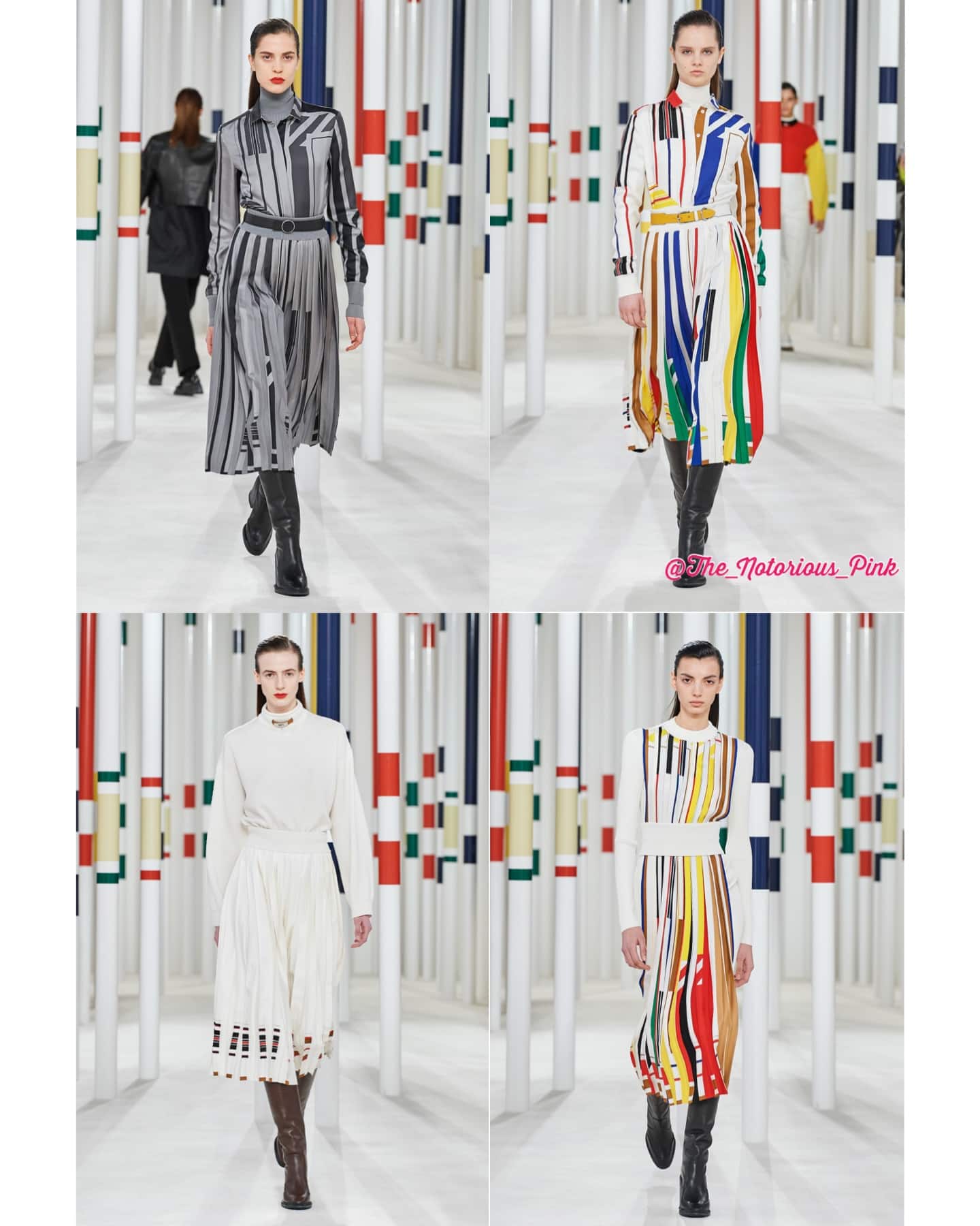
Here the jumping posts resonate with the variegated stripes on the clothing. The silhouettes are simple, letting the pattern do the talking. Any of these tops would work well with nearly any pair of pants (or jeans) in your closet; they are timeless, but the pattern is fun.
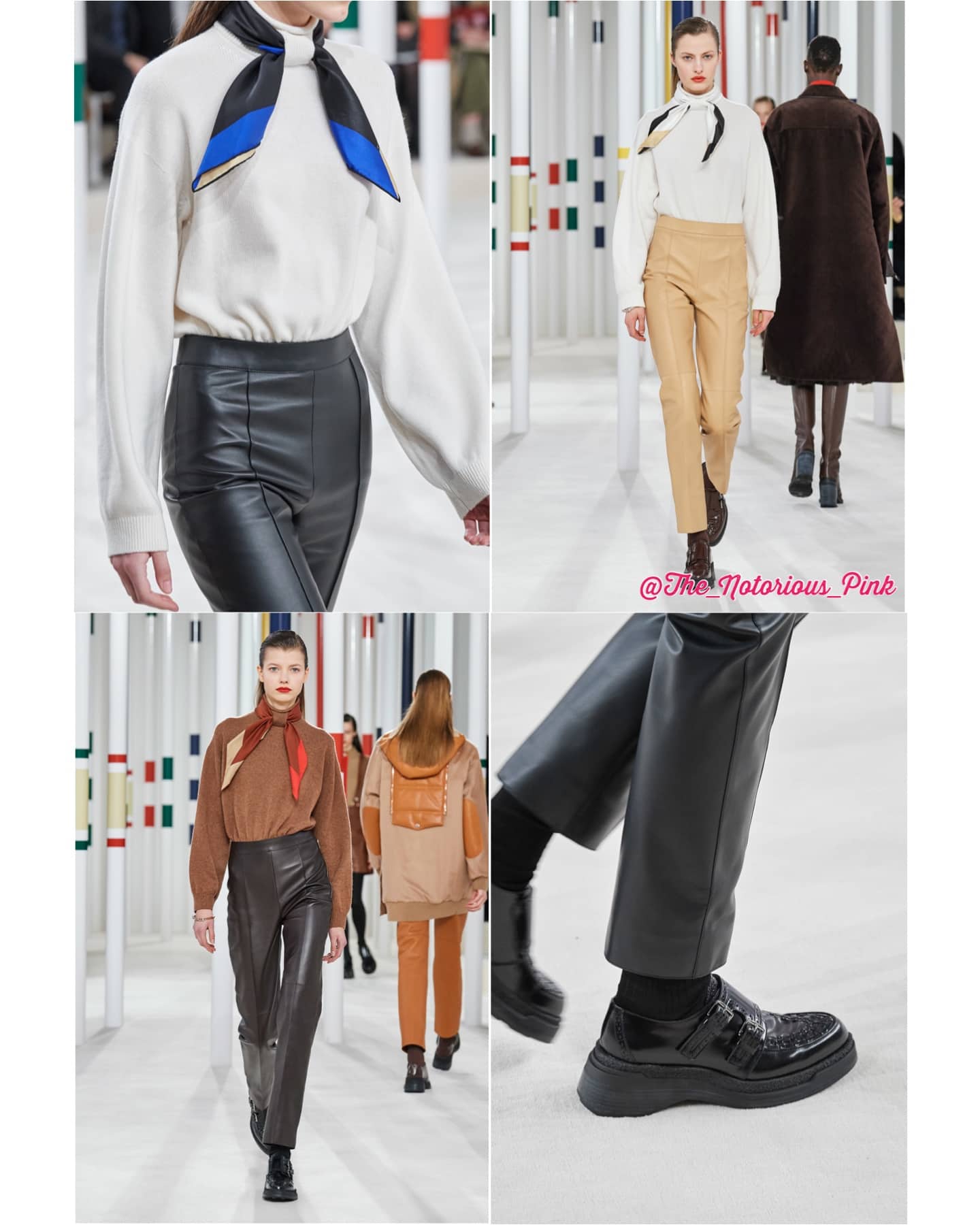
Another simple, streamlined silhouette. Here it’s just a fantastic sweater, especially for the scarf collectors, as it bears a loop in the middle of the front to loop a scarf through. The leather pants are simple and flattering (see below). The shoes here have a utilitarian, genderless, mod look. That foot could belong to a model in 2020, or to Mick Jagger in 1967.
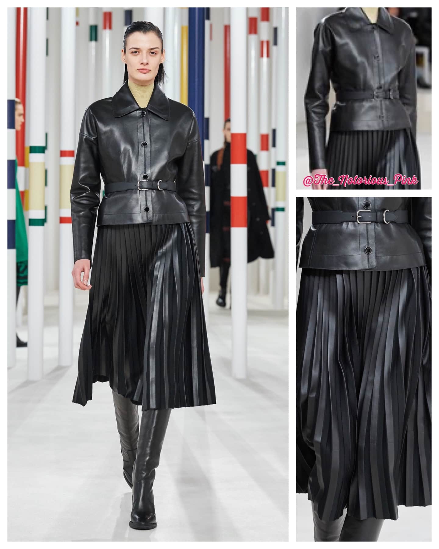
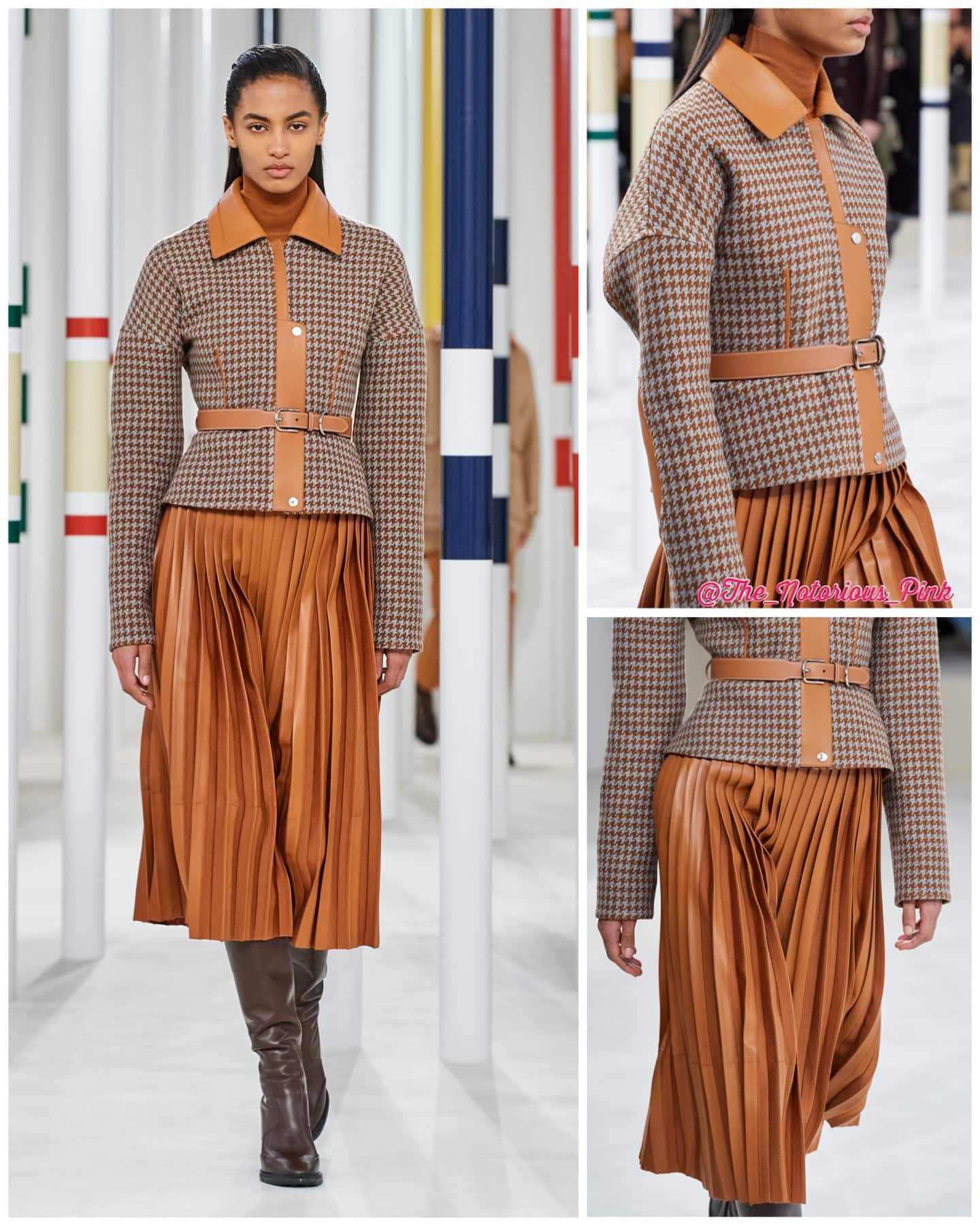
Two beautiful belted-jacket-and-skirt looks, in black and in tan.
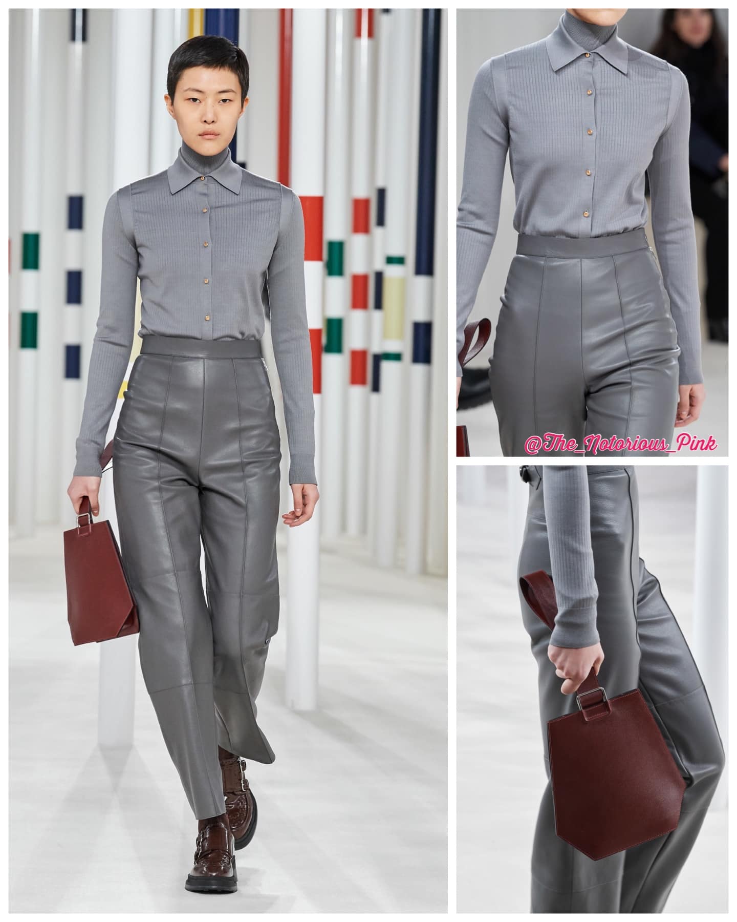
Stunning shades of gray that will, again, go with everything you already own. Here is where the detailed photos make the difference – can you see how these high-waisted pants sit? Click here for a closeup (then click on “details”), to see the back buckle, the seaming, and how effortlessly elegant and even sexy these are. The top also has pretty details that echo the pants.
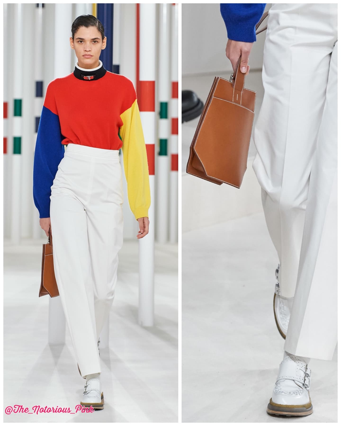
Note the Kelly lock detail at the neck (you can also see this in Look 5 above). The color blocking paired with white is pretty and very wearable – but I was interested in this different angle of the clochette-style bag above. Most of theater photos I’ve seen make this bag look flat and impractical; not so here. In fact, what I am visualizing is a modern version of the Picotin, with a top that closes, possibly in coveted Barenia leather.
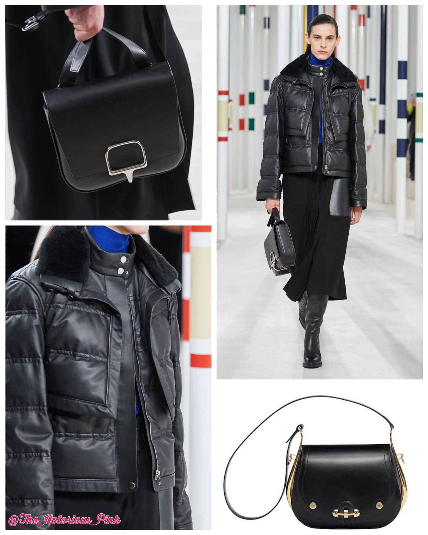
What I see here is two gorgeous leather coats which would not be layered in real life, but either would be a gorgeous, useful option. The bag above, which I am advised is called the Sac Della Cavalleria, is the bag that seems to be getting all the attention. It’s useful, yes, but to me, its just a modern version of the Passe-Guide bag (with the appearance of a double-rounded bottom), or even a 2002 with a different closure.