 Will Be Taking Over This Summer 1")
The color turquoise has been marinating in the back of my mind for a while now, even though it’s not a color you see all that often in the wild or on the runway, and can, at times, be needlessly difficult to pair. Yet, there it’s been, languishing low in the list of things I wanted to write about, waiting quietly (but surely) as I willed and wished for its return.
And now it’s here, and there’s a backstory to that.
You see, dear reader, The Devil Wears Prada (2006) is a source of many, many firsts for yours truly. It was the first time I’d gotten a glimpse into the inner workings of the world of fashion. Like Andy, it was the first time I’d learned of the existence of the Shu Uemura eyelash curler (and immediately Googled lest Gisele Bündchen read me to filth too). It was also the first time I’d heard of the color cerulean – the first, I’m not ashamed to admit, of many.

But sometimes, in the quest to fully experience our firsts, we fail to take a minute – and truly appreciate – our lasts. The last time you saw someone before they became a memory. The last day in a house that no longer belongs to you. The last summer that felt, in retrospect, young, wild, and carefree.
And the last time I felt that particularly uncomplicated, sun-drenched ease — and really, what in my mind feels like the last summer of my childhood — was on a searing hot day during sixth-grade summer vacation, when I happened upon on the television not The Devil Wears Prada, but another (almost) equally iconic Meryl Streep-starrer film, Mamma Mia! (2008).
And somewhere in the film’s glittering expanse of the Aegean, lapping blue waves on the Grecian shores, teal-capped villas and sunburnt ABBA songs, sixth-grader me fell in love with the color turquoise, cerulean’s languid, summery sibling that’s having its own unofficial moment this summer!
Cloud Dancer Who? The Absence of a Hue!
Now, as someone who is definitely NOT a fan of musicals, Mamma Mia! straddles a fine, occasionally off-key line (thanks, Pierce Brosnan). And yes, there is a lot of fluffy, feel-good singing (and sometimes squealing) that the film could perhaps do without. But while Streep and her cohort of jiving, dancing queens weren’t exactly reaching for the stars here (or, for that matter, lovely, slender, female paratroopers), they clearly were enjoying themselves.


And when I surrender myself to its turquoise-tinted plot and sheer nostalgia, I find that I do too. Really, what more could you ask of a film?
Pantone, the world’s premier authority of color, also caught onto the aquamarine funk the film inevitably triggered (albeit two years later), going on to declare turquoise (15-5519) as the Color of the Year for 2010. Interestingly, with Cerulean (15-4020), Pantone had actually been six years ahead of the trend, proclaiming it the color of the new millennium in the year 2000.
However, as 2026 rolled in – the year that marks the 20th anniversary of The Devil Wears Prada and the 18th anniversary of Mamma Mia! – Pantone’s usual sense of chromatic clairvoyance felt slightly off (much like Brosnan’s singing) when the color of the year was declared… white?
“Cloud Dancer”, the official name for the pristine, almost aggressively inoffensive hue (or lack thereof), felt less “an expression of attitude,” as they so reassuringly put it, and more a commentary on the world at large. “Pantone color of the year is white… I can tell,” read a meme on Jacob Elordi’s casting as Heathcliff in Emerald Fennell’s Wuthering Heights (or as some say, Wuthering Whites). The color has since been likened to unseasoned chicken, bathroom rolls, and the inside of a psych ward.
 0")
Which, in retrospect, isn’t too far-off considering how this year has been.
Cerulean’s Back on the Rack
But if the general consensus on Cloud Dancer is Pantone-deaf, it’s because the reigning color of 2026, with the release of The Devil Wears Prada 2 looming large, is cerulean. Yet again. And we have Meryl Streep to thank for that.
As screenwriter Aline Brosh McKenna tells Amy Odell about the original monologue, “I was the fifth writer — when I got the script, there were a few lines about, ‘People in this room are involved with you wearing that sweater.” It hung around in the script for a long time, kind of unmolested.”

In fact, it was only at Streep’s behest that McKenna expanded the monologue, eventually asking the former, “because we knew the sweater was going to be blue — I said, ‘Lapis, azure, cerulean.” She chose cerulean.” She later added, “I think Meryl especially felt like it was really important to understand that these folks had a mission, and a rationale, and almost a sense of calling.”


And even though Monsieur Oscar de la Renta and Yves Saint Laurent didn’t do cerulean gowns and military jackets quite as Mrs. Priestley asserts, the monologue nevertheless remains one of the most accurate representations of the fashion trend time-loop.
Now, the loop repeats itself as cerulean has escaped the tragic Casual Corners and returned to the mainstream, most notably on Streep herself, who donned a custom cerulean J.Crew crewneck cable-knit while promoting the sequel.
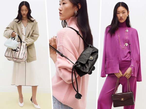
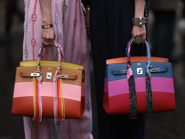
Then, electric blue themes showed up all over the spring/summer 2026 collections: in the form of coats, tops, and pants at Tory Burch and Ashlyn, as mules at Herbert Levine, and as updated takes on the Amazona 180 and New Luggage bags, respectively, Jack McCollough and Lazaro Hernandez’s Loewe, and Michael Rider’s Celine. Maria Grazia Chiuri’s debut collection for Fendi similarly invoked cerulean via a color-blocked beaded baguette.
@databutmakeitfashion traced the blue calling-cards back to Lady Gaga’s Super Bowl performance in February and the renewed popularity of Zara Larsson’s single Midnight Sun, while British Vogue’s Natalie and Augustine Hammond rounded up three distinct shades of blue in their trend predictions – Klein blue, Navy Blue and Powder Blue – across the SS26 runways of Jil Sander, Ferragamo, Burberry, Bottega, Gucci, Givenchy and Chanel!
And most recently, Sabrina Carpenter changed into a cerulean sweater during her Coachella set that Miranda would definitely approve of!
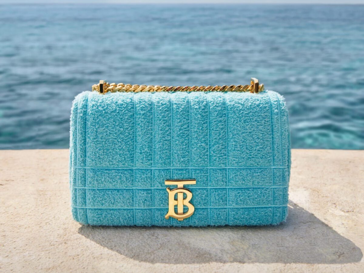
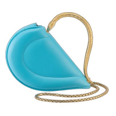
Turquoise In Its Own Terms
But while blue has been having a moment regardless of its various iterations, there’s something specific to be said of the quieter rise of turquoise. Because if cerulean and its electric cobalt cousins are a manifestation of the Miranda Priestly monologue and the (frankly horrifying) corporate culture of Runway, turquoise reminisces of childhood summer holidays.


Vogue’s Liana Satenstein, in her collaboration with Cleo Camp, dubs the color “Perpetual Vacation blue.” In recent history, Valentino Resort 2017 featured a range of turquoise-inlaid Rockstuds! while Jacquemus’ FW24 runway presentation at the Villa Malaparte of Capri was heavy on the turquoise, set against the azure waves of the Mediterranean (and inspired by Jean-Luc Godard’s film Le Mépris, yet another seafoam-heavy affair). Furthermore, Zimmermann sent a model down its SS26 runway in a head-to-toe turquoise look, complete with a turquoise headscarf!


Jennifer Lawrence and Elsa Hosk too recently invoked the swatch in the form of turquoise trainers and aquamarine arm candy. And Hailey Bieber had her own throwback Tom Ford moment in a Gucci Fall 1995 shirt – the same one Madonna wears to the MTV Awards that year- which Satenstein dubs “A hue of escapist azure, or maybe the frothiest, most lethal cyanic drink.”
Most majorly though, trend forecasters WGSN and Coloro crowned Transformative Teal – turquoise’s spiritual sister – as their Color of the Year for 2026, “a fluid fusion between dependable dark blue and aquatic green that reflects the diversity of nature and taps into an Earth-first mindset.”
So, if that’s not reason enough to indulge in a turquoise piece (or two) – or maybe to mentally book a flight to some exotic European locale and bask in the sweeping blue of its waves – what is? Isn’t it finally time turquoise got the summertime love it deserves?
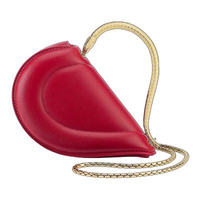
“…But what you don’t know is that that sweater is not just blue, it’s not turquoise, it’s not lapis, it’s actually cerulean.”
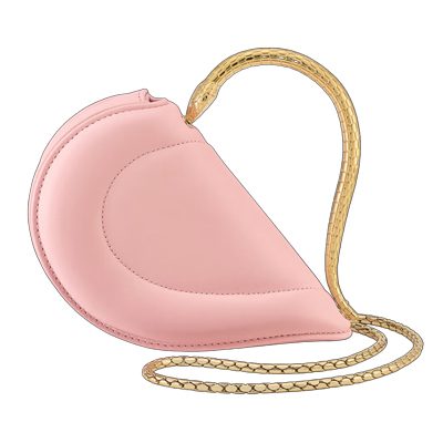
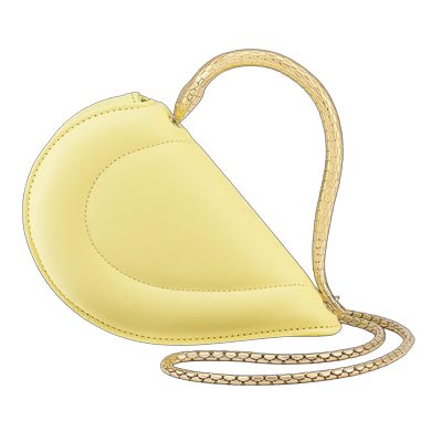
Turquoise and teal are two of my favourite colors so I am looking forward to seeing more products in those colors. I find aqua bags are more common than turquoise.
I’m already sick of anything Devil Wears Prada related. Yes, it was a great movie. No, we don’t have to quote and reference it every five minutes.
My FAVE accent colour 🤩
I was craving this color bag 2 months ago! Must have been a premonition!