“I’m looking for a man in finance. Trust fund. Six-five. Blue eyes.”
Forget brat summer, espresso season (spelled “szn” because I’m Gen-Z), and the demure days of fall; my vote for the ultimate soundtrack of 2024 goes to Megan Boni, a.k.a Girl on Couch, the architect and engineer behind Man in Finance on TikTok – the infectiously inescapable and maddeningly addictive mantra that encapsulates the romantic archetype of the modern day.
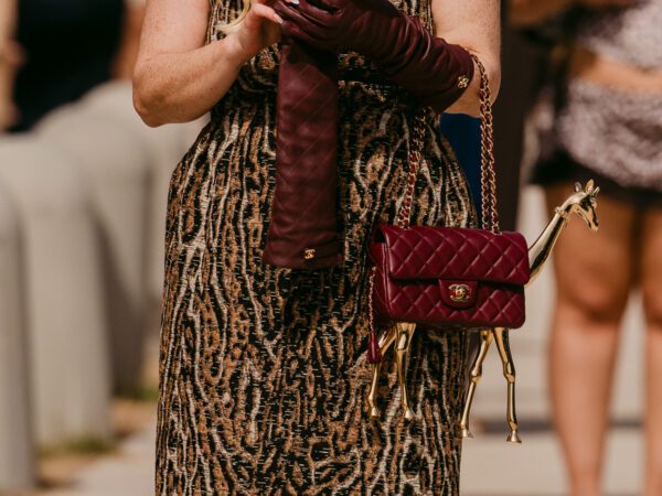
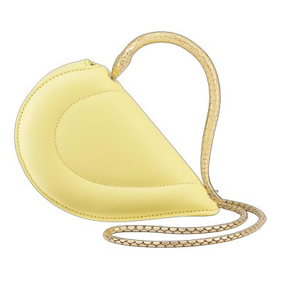
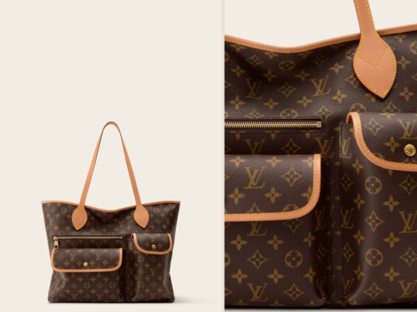
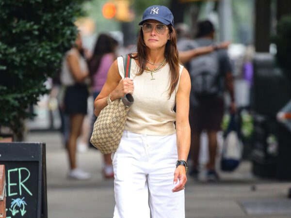
And what exactly is that you ask? Finance bros (tall and handsome, natch!), in boring blue button-downs, Patagonia vests, and those white-soled Loro Piana loafers the label has been (unsuccessfully) trying to trademark for years.
Yes, ladies (and gentlemen), quiet luxury has officially infiltrated the dating scene—true love, after all, is so 2023.


Yet, why is our intuitive response to Mark Zuckerberg’s gray Brunello Cuccinelli tee almost as visceral – if not more so (in that it makes you want to flee in terror) – as that to Z-list starlet Daniella Westbrook circa. 2002, freshly emerged from her little substance problem, parading around in head-to-toe Burberry plaid, replete with a Burberry-clad baby atop a Burberry baby stroller?
Because the first rule of quiet luxury (stealth wealth, old money, what have you) is that you don’t talk about it. Much like punk. Or Fight Club. It’s rooted purely in classist connotations and its appropriation by working classes (like how chavs killed the Burberry-check), which then connotes that once (aspiring) hypebeasts like Monsieur Zuck have got their hands on it, it’s as good as dead.
Pantone, however, would like to respectfully disagree.
Throwing Shade Since 1999
At midnight on December 31st, 1999, the new millennium promised us the prospect of flying cars, plastic cats, and the collapse of society as we know it. What we got, instead, was the pink Motorola Razr, cerulean blue courtesy of Pantone™ (which would go on to inspire that iconic Miranda Priestly monologue six years later), and… yours truly! So, now you know how old I am.
Also, not quite the end of the world?
But how exactly has Pantone come to command such authority over the realm of color? In 1963, Lawrence Herbert, a print technician, devised the Pantone Matching System (PMS) as a standardized scheme of color reproduction—a process previously reliant on arbitrary means of shade-matching by ink makers worldwide.
By 1968, its expansive roster of pigments (today, its library houses over 10,000 different hues) had become the industry standard, and by 1985, the Pantone Color Institute had turned the language of color into a full-fledged field of research!
Cerulean Blue was thus named the Color of the Year as a result of media inquiries (and prevalent pop-culture interest) in the “color of the new millennium” – a shade that Marion Teniade dubs in her Substack as “just right. 1999 is exactly the year that we as a country were feeling rich and optimistic enough to think about interior design as a middle-class hobby rather than an aspiration.”
And it’s since become a way for Pantone to remain culturally relevant throughout the various economic upheavals and political turbulences of the coming decades: 2006’s Sand Dollar, for instance, expressed “concerns about the economy.”
Does that mean it’s never wrong?
Pantone would certainly like to think so. Even though the decision mostly relies on “creative intuition and debate,” Pantone also simultaneously signs licensing agreements with various sectors, from beauty to interiors to hospitality, making sure that its annually anointed Color of the Year is, in fact, the color of the year.
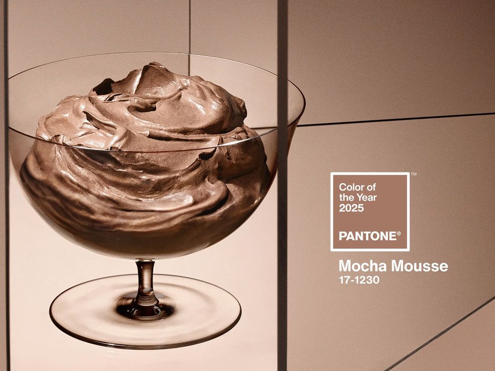
2025: Mocha Mousse Officially Hits the Fan
Now, it’s been a while since Pantone fired off that plainly worded press release in 1999 championing the charms of cerulean. 2019’s Living Coral was a befitting nod to the bleaching of the Great Barrier Reef, and 2020’s Classic Blue was a harrowing premonition of hospital gowns and surgical masks that would soon haunt us.
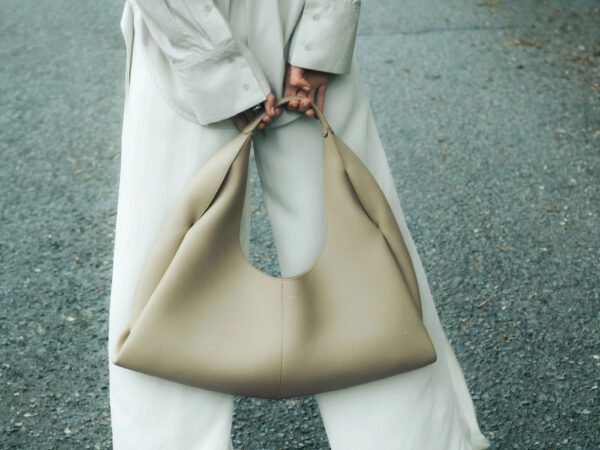
In recent years though, the Color of the Year’s significance seems to be, well, not so significant. Peach Fuzz, for instance (remember that? Me neither) – Pantone’s prediction for 2024 – was eclipsed into oblivion by an onslaught of green: olive green, brat green, and Wicked green. 2023’s Viva Magenta, on the other hand, was a vivid misjudgment of the influx of luxe neutrals that nail the old-money aesthetic.

But unlike Viva Magenta, which quite literally doesn’t exist, Pantone’s prediction for 2025 is Mocha Mousse (government name PANTONE 17-1230), an entirely organic (perhaps a little too organic?) shade that aims to “honor the substance of our physical environment” and “commune with nature, while looking elegant and refined.”
Leatrice Eiseman, executive director of the Pantone Color Institute, adds that it’s also “something you absolutely want to dip your spoon into and taste” – hopefully referring not to the act of nature bit. Instead, she alludes to the TikTok trend of sweet little treats – everyday indulgences like “a drool-worthy whipped dessert dolloped into a luxe glass dessert cup” or “sinking into a soft, shaggy chair.”
Therefore, in solidarity with Mocha Mousse, Pantone has launched home fragrances, lit up the London Eye in shades of brown, signed makeup, jewelry, and furniture deals, and even partnered up for a bespoke brown Motorola Razr to go with it!
But it’s also glaringly reminiscent of stealth wealth—The Washington Post deems it “A Win for Quiet Luxury”—just when we thought we were finally over it.

A Loud Year for Quiet Luxury
Clearly, despite all its talk of “sensorial warmth” and “thoughtful indulgence,” the fashion industry has a hard time getting excited about Mocha Mousse, given that we’d just cycled out of the onslaught of bland beigeness and boundless brownery that stealth wealth was. Plus, retail-speak says, “If it’s brown, mark it down.”
So, why is Pantone still pushing a color that’s literally so 2023?


Well, for one, Kim Kardashian would be proud. Her SKIMS shapewear line, which was recently valued at $4 billion, recently opened the doors to its newest flagship on Fifth Avenue, welcoming you to its vast sepia universe in case you needed some more beige in your life (or at least, in your next TikTok haul).
But even aside from the Kardashian konnection, we aren’t quite over with the beige blitz just yet—only now, it’s no longer quiet luxury; it’s silent luxury (“as in, ‘don’t tell anyone,’” jokes Vogue’s José Criales-Unzueta).
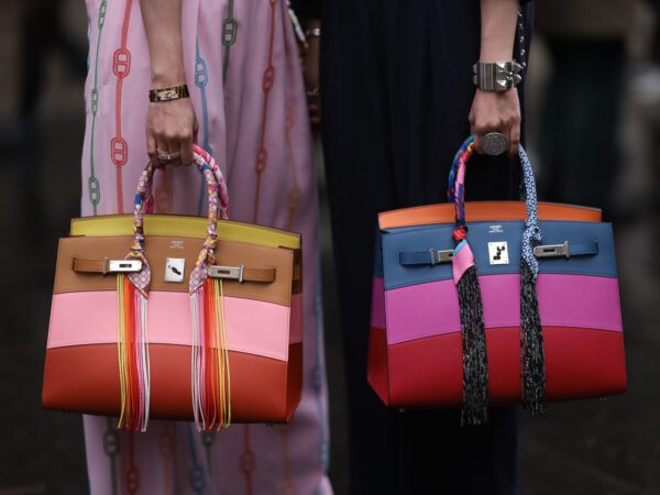
Because while most of us stand at the precipice of yet another Recession, already unable to afford much of what luxury has to offer, the 1% who are – the Celine, Prada, and Goop-clad Gwyneth Paltrow in their ski-and-run trials – have already turned their backs on the trend. The rest of us are left logging onto an incognito window in search of “tailored Bermuda shorts” from mid-market labels in our attempt to emulate but not really live, that luxury lifestyle.
And season after season, as the browns and beiges continue to trickle down into the collections of Uniqlo, Gap, Banana Republic, Zara, or even Shein, Mocha Mousse simply offers a trompe l’œil of stealth wealth – for us to fish out of a clearance bin!
Ultimately, Pantone hasn’t gotten it wrong with this one—in Miranda Priestly’s words, it represents millions of dollars and countless jobs.
featured image via Pantone

Not interested in wearing brown. I’ll stick to my loud and vibrant clothing. Fifty shades of beige is dull, unexciting, and boring.
Also, quiet luxury is stupid. Once you’ve made all of these so-called luxury fashion houses TikTok famous, they’re no longer “quiet”.
Amen to this!
“Something you absolutely want to dip your spoon into and taste” – hopefully referring not to the act of nature bit.
You got me there!
And I totally forgot about Peach Fuzz and will probably forget about Mocha Mousse soon.
Slightly off topic, but this conversation reminded me of my master bedroom color in my newly purchased home. When I first saw the room I thought “what were they thinking” because the color was shit brown. After moving I immediately painted it a beautiful, soft, tranquil green for which I’ve received many compliments. The bottom line is that Nothing looks good in shit brown even if presented as “color of the year”.
Shit brown…does than include skin tone? Asking for a friend🙂
I actually really like this color for home decor.
I love the color Viva Magenta! My cell phone cover is called Viva Magenta…it came that way from the manufacturer-lol. It’s Valentino’s signature color as well. 🙂