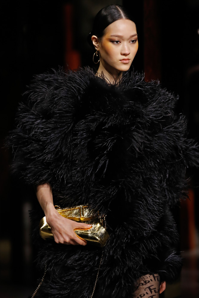
Kim Jones has cemented his vision for Fendi, and it’s bold, beautiful, glitzy, and glamorous. At the brand’s spring 2022 runway show last week, it was clear that Fendi, under the creative direction of Jones, is focusing on the more fun aspects of fashion, dipping into its archives to facilitate a resurgence of Fendi’s playful side. The collection as a whole is a modern take on Studio 54-esque, disco-era fashion.
“Our woman has let loose a bit – she’s going out, dressing up. We’ve all been locked away for so long that I think that’s what we all need right now.”-Kim Jones”
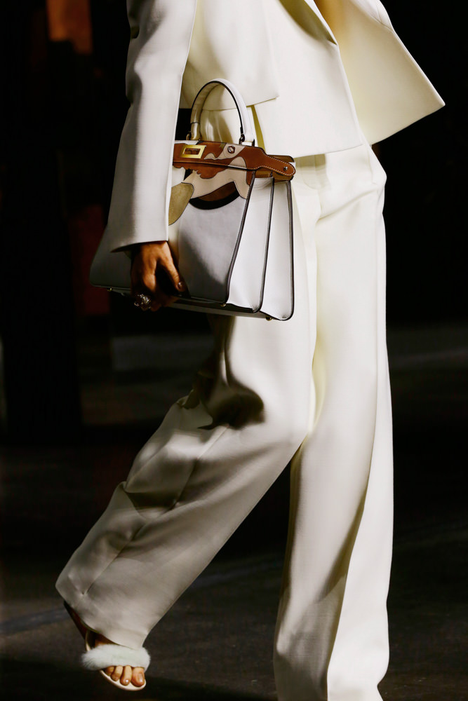
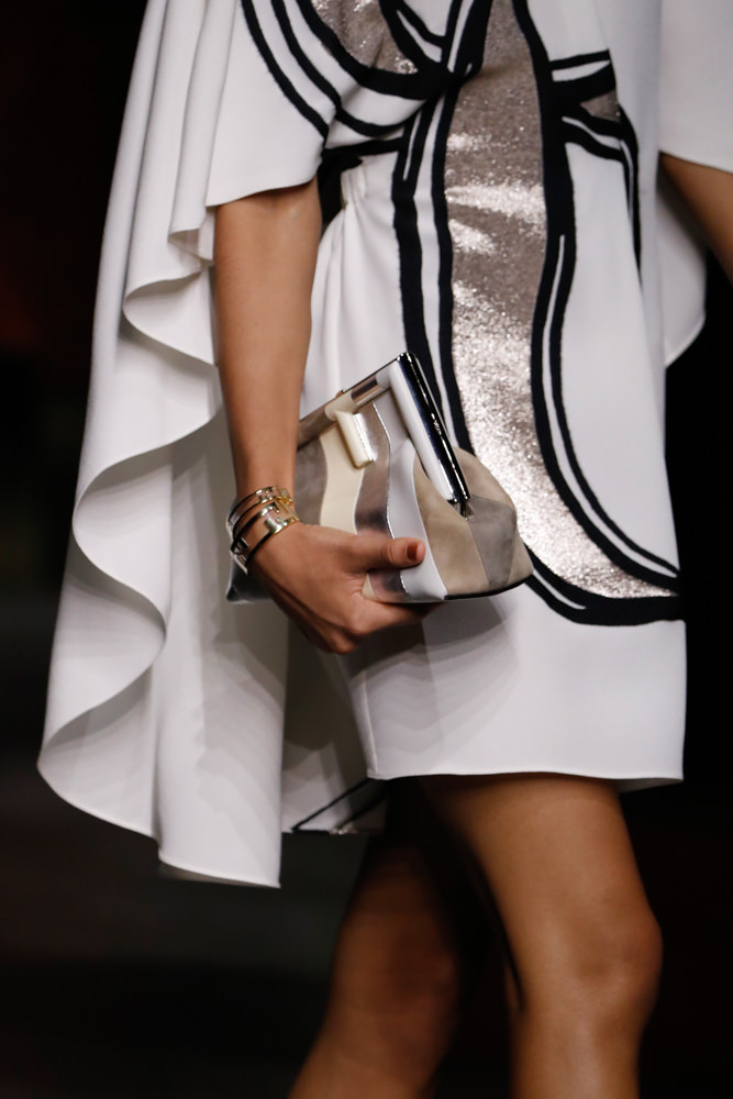
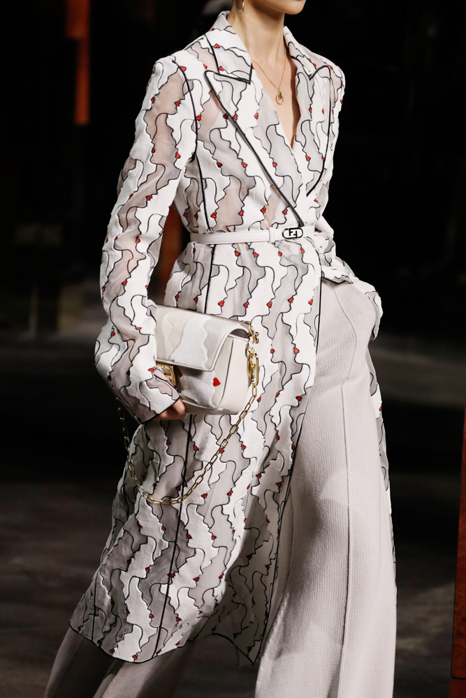
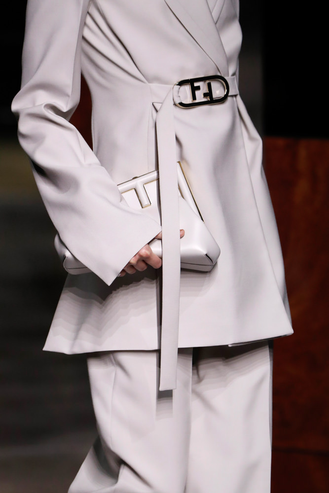
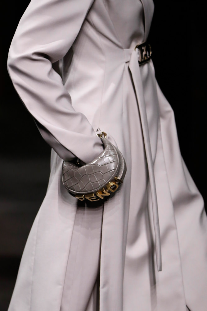
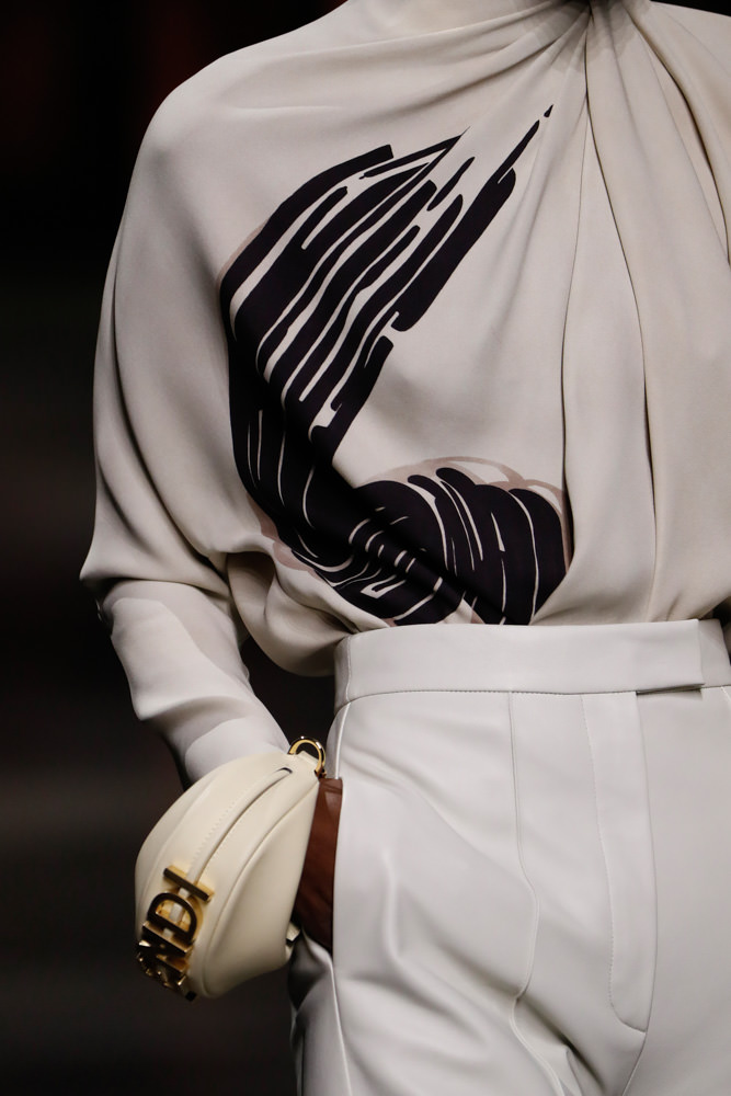
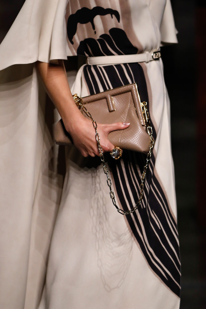
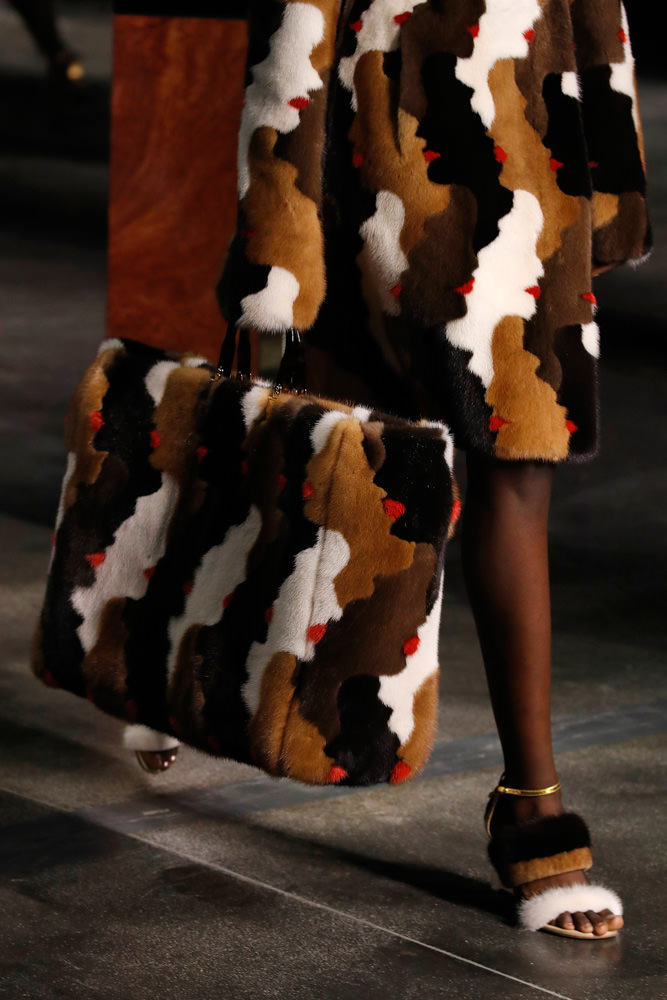
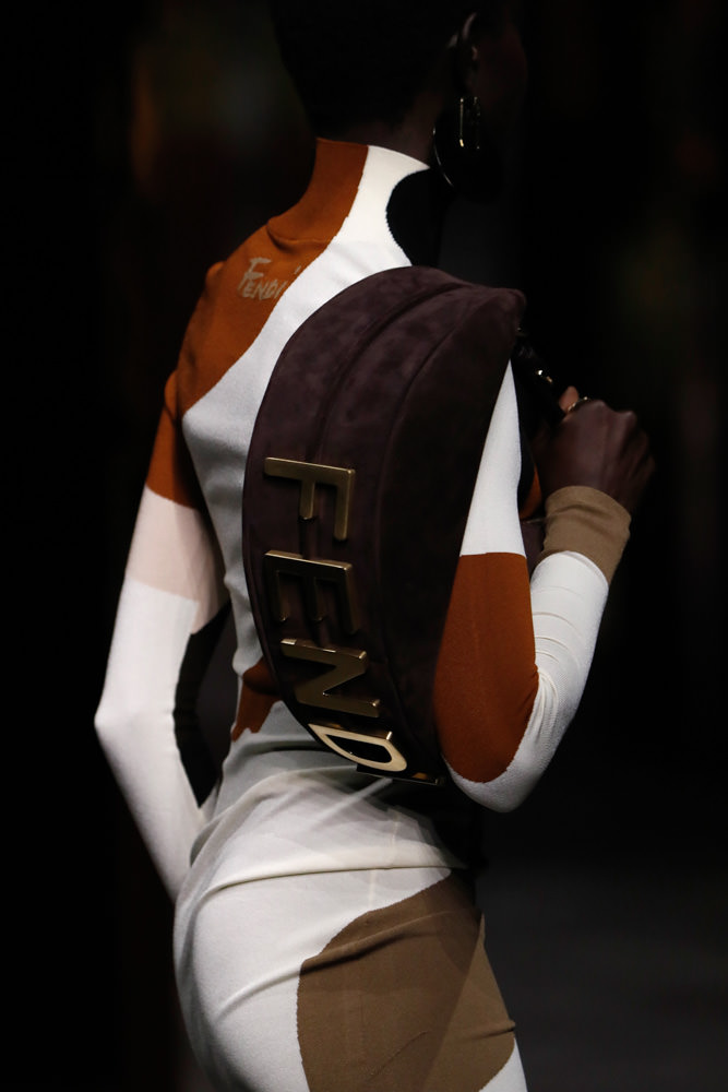
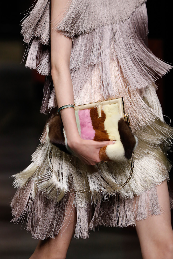
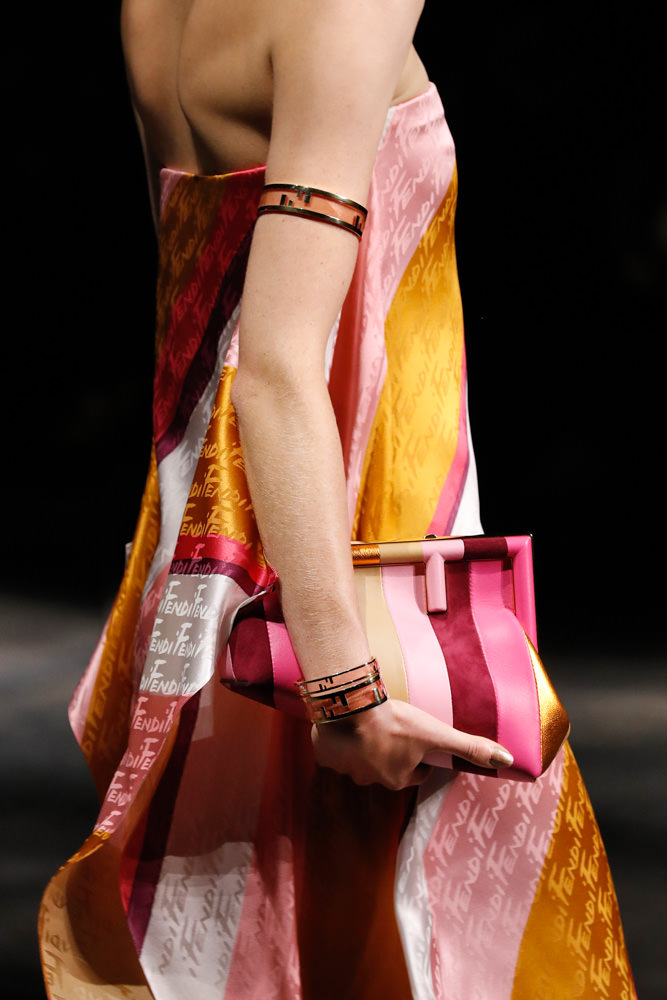
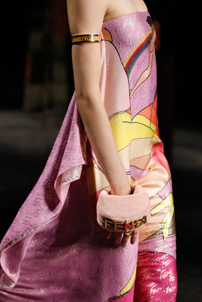
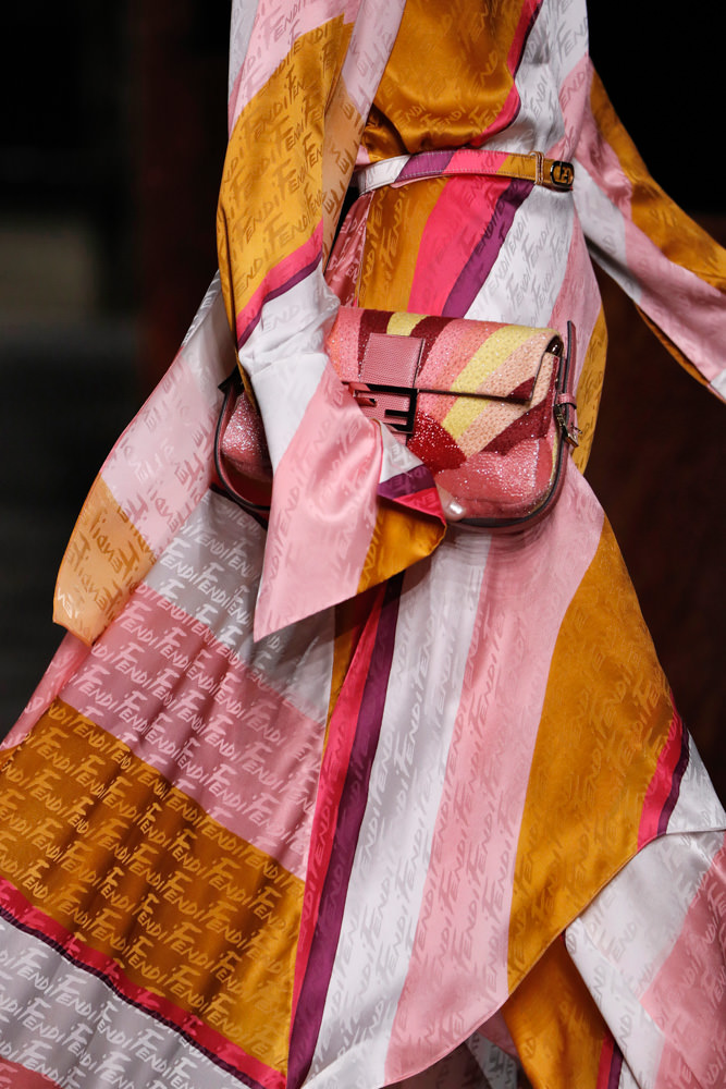
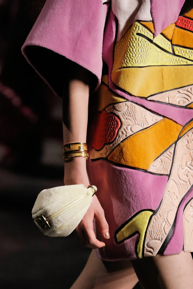
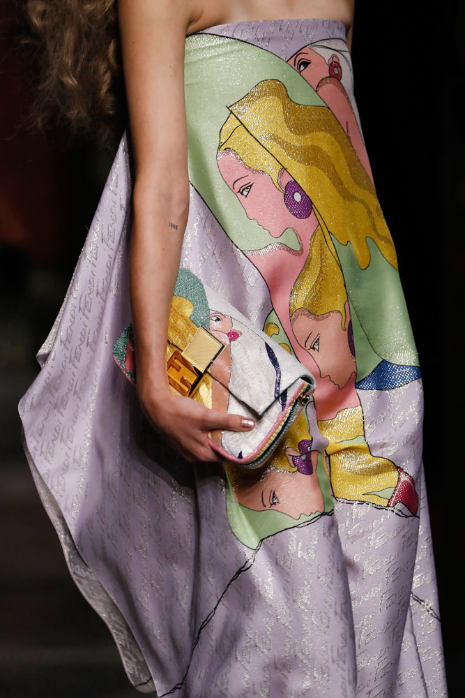
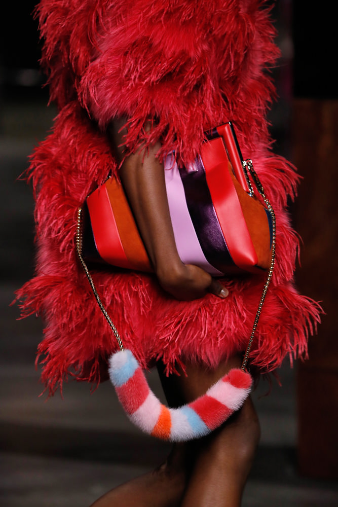
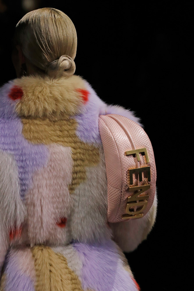
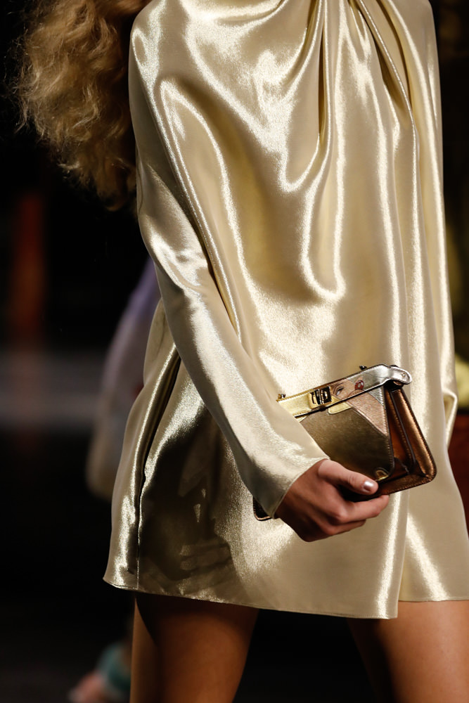
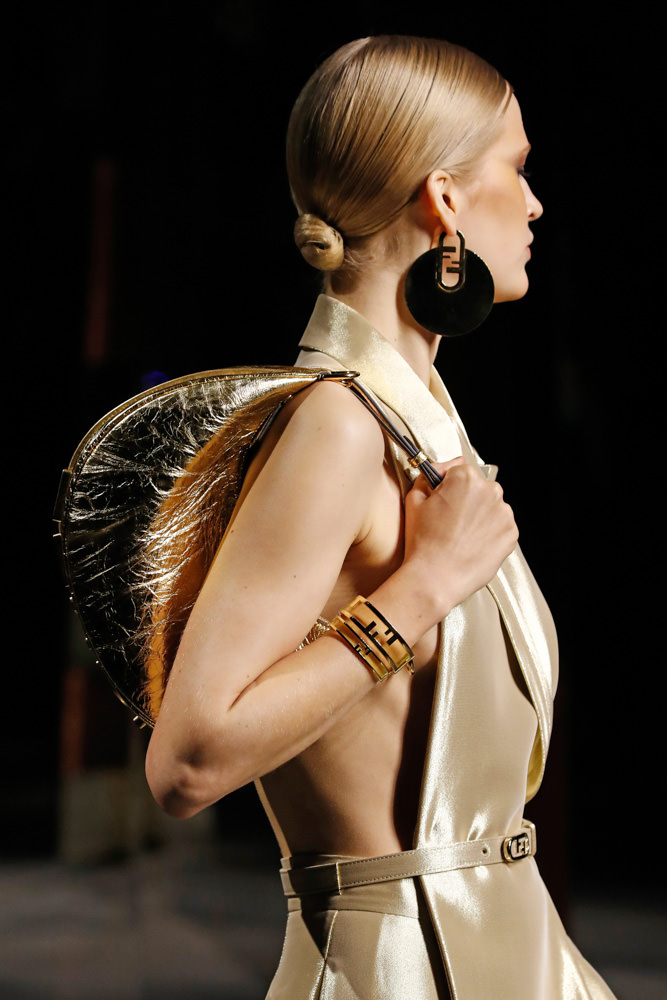
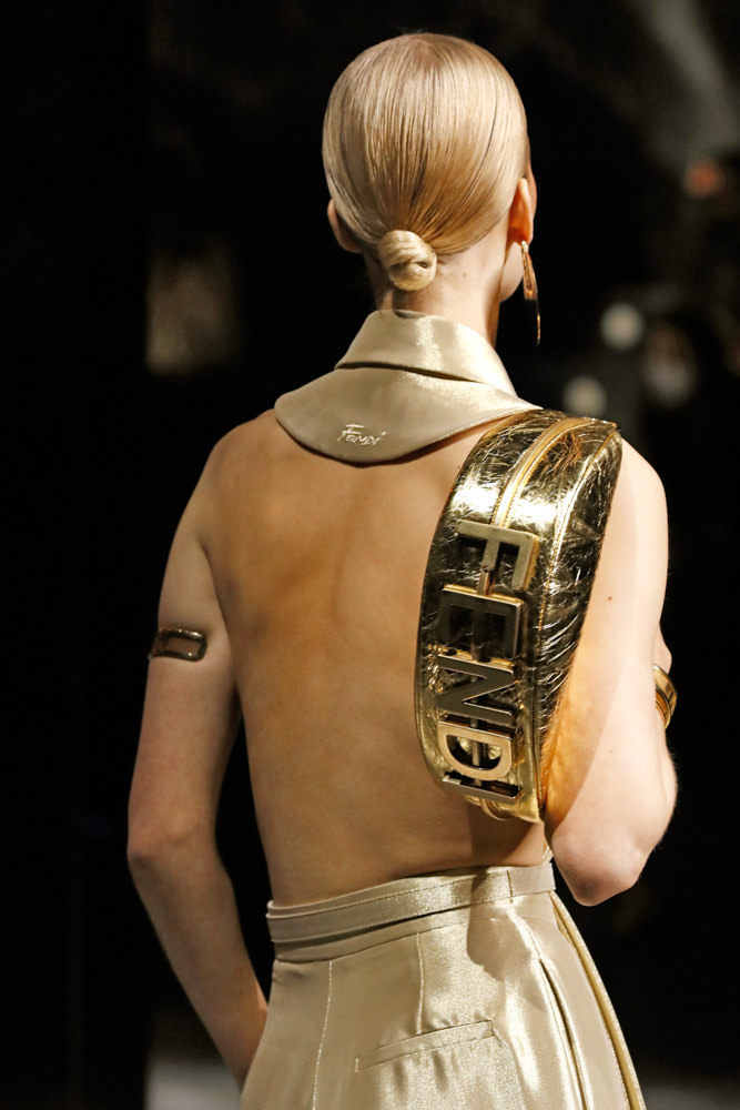
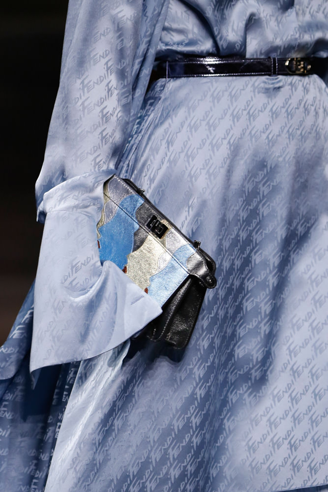
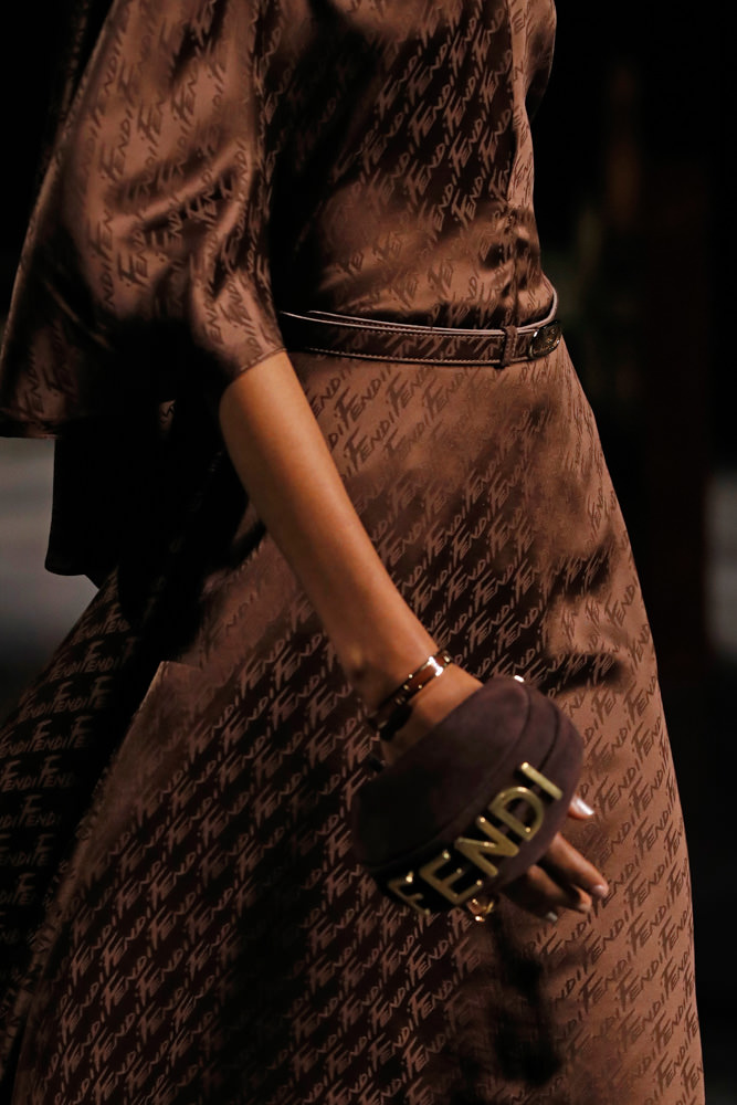
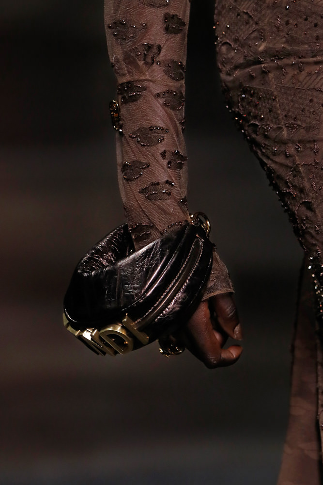
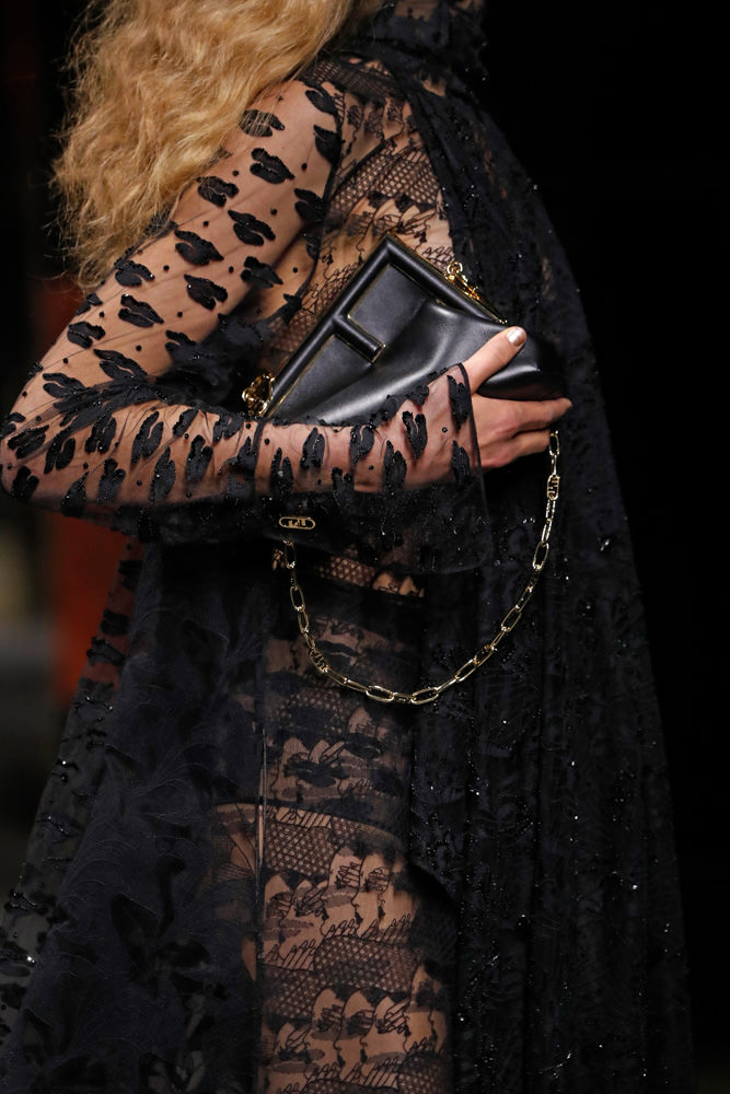
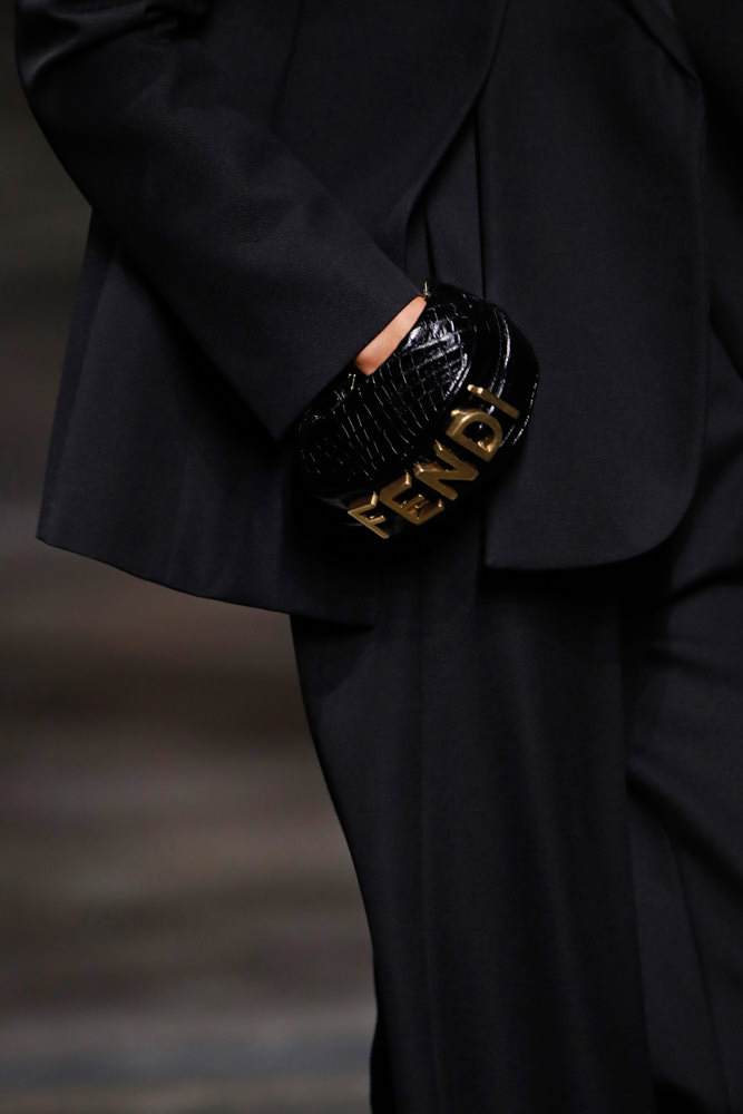
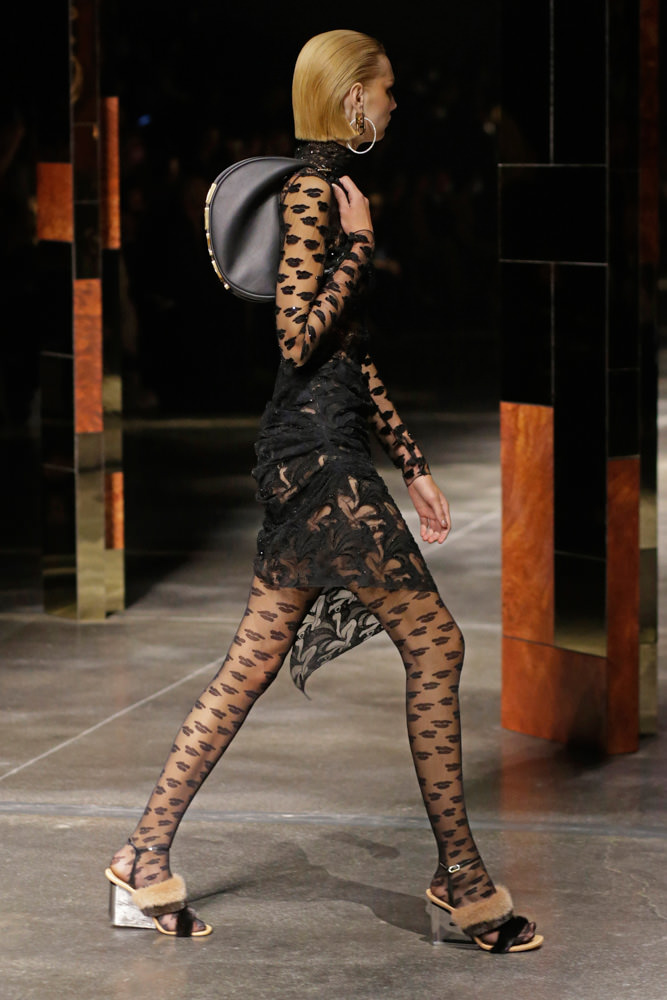
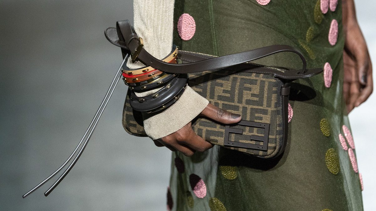
In collaboration with the Estate of fashion illustrator Antonio Lopez, Jones has revived some of the late artist’s works and infused them into Fendi’s latest collection. Some of the House’s most iconic bags, like the Peekaboo and the Baguette, became blank canvases for Jones’ interpretation of Lopez’s vision. The Fendi Baguette is transformed into a stunning tapestry-woven rainbow while the Peekaboo appears featuring graphic artwork. The Fendi First, Jones’ first bag for the House, is seen in this collection as well, reimagined in stunning hues, leathers, and textures. The return of the hobo is celebrated this season as well, with a new silhouette that appears in multiple sizes, clutched via hand in a tiny version by models or slung over the shoulder in larger sizes. View bags from the runway below.