It is known that the painter Vincent van Gogh once said, “There is no blue without yellow and without orange.” While I certainly wasn’t around in the 1800s to ask him to further clarify his point, I take it to mean that he wanted the listener to consider the importance of colors not just on their own but for their relationship with others.
If you have been following the other posts in this series, you will know that blue and yellow are primary colors and orange is a secondary color. I previously discussed how choosing colors from those categories can help build the foundation of an outfit as they are the most fundamental of all the color groups, but in order to create a truly balanced palette one would most certainly need to include a third tertiary color (or a neutral color but we aren’t there just yet!)
There are six official tertiary colors: red-orange, yellow-orange, yellow-green, blue-green, blue-purple, and red-purple. These key six are all magnificent colors that are also arguably the most impressive out of the entire color wheel due to the hundreds of variations within them. They hold special places in our imaginations and like their neighbors on the color wheel, they retain that influential power to dictate our perceptions, tastes, and moods.
More often than not, many peoples’ favorite and least favorite colors fall somewhere in the tertiary range. We all know someone who may be disgusted by dingy yellowly pea green or bewitched by the serenity of vibrant turquoise, but the sheer magnitude of the tertiary color range is sometimes enough to even put our own tastes at odds with each other.
Just to give you an idea of this, I have disliked the colors true orange and yellow-orange for as long as I can remember. I find them garish and distracting and being surrounded by them feels off putting to me, but oddly enough, I somehow still love almost every shade of red-orange because it feels warm, inviting, and kinda sexy to me. There seems to be no real reason for this disparity in my perceptions but who knows. Perhaps my unconscious bias was formed, well… unconsciously, and therefore I will never truly understand the power that the color orange and its derivatives have over me.
But I know I am not alone in this occurrence. I have met plenty of others who have an aversion to certain shades; I have even heard of people that have Chromophobia – the fear of colors. Usually the phobia is for certain individual colors (in their true form and as mixed tertiary shades) such as Porphyrophobia for purple, Cynophobia for blue, Leakophobia for white, etc. It’s definitely a bizarre and rare occurrence but apparently this deep angst seems to fade a bit when the scary color is paired with other feel-good colors. This is probably the best modern example that demonstrates Mr. van Gough’s idea about how certain combinations can reveal our own emotional touch-points.
So I want you to take an inventory of some of the following tertiary colors that you feel personally drawn to (or repulsed by) and compare them with existing colors in your wardrobe to see which pairings bring you and your outfits to life.
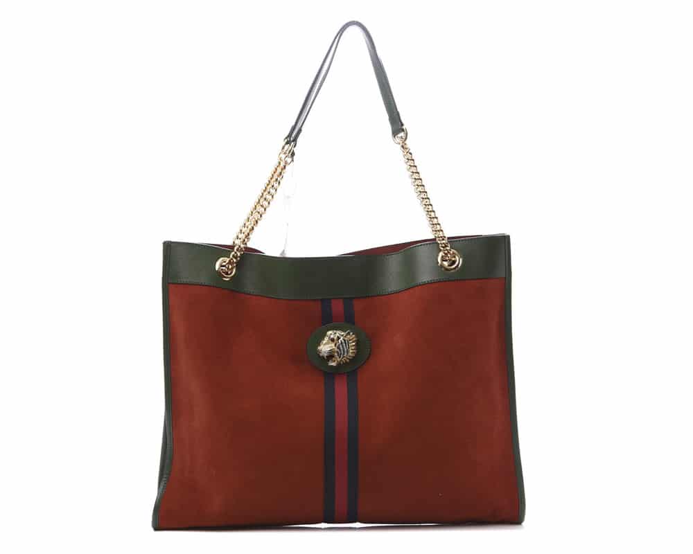
(Side note: most of the Shade Suggestions I included in the previous posts are tertiary colors! Anything other than the PURE unmixed version of a color was included for entertainment value and because I will find any excuse to collectively drool over purses with you all. Ok…on to the fun part!)
Red-Orange:
Zesty, Alert, Active
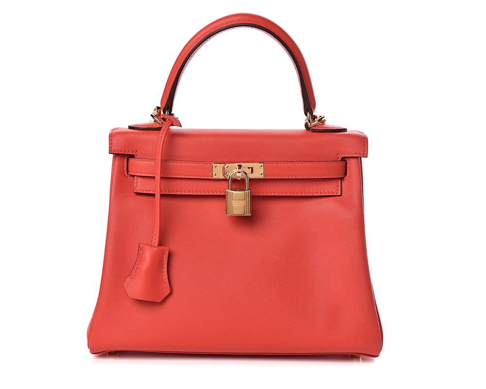
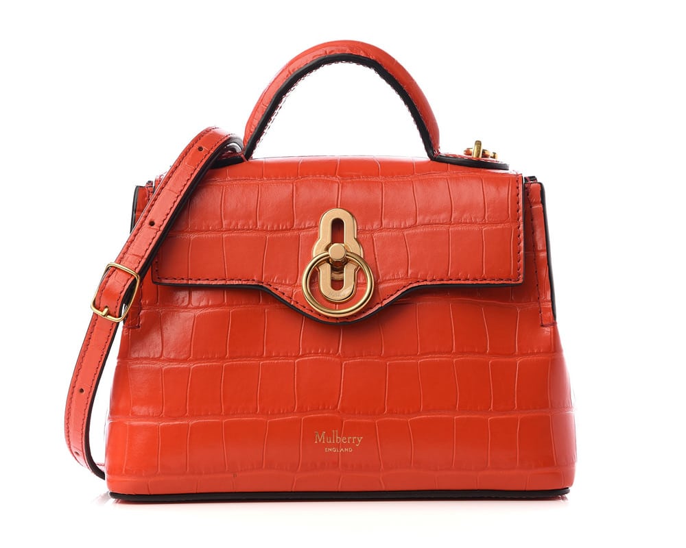
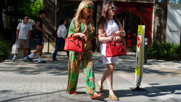
I already mentioned my bias for red-orange, and it’s probably because this color looks tasty! And not only by my standards but many people’s. Red-orange is the most common favorite color of many chefs because it is vibrant, showy, and stimulates our appetite. It reminds us of juicy blood oranges, tomato sauces, fresh shellfish, chilled happy-hour cocktails, and spicy peppers roasted over open flames; or at least the very active social events where these delicious things would be found. Adding a touch of red-orange to your outfit is a sure way to have you lookin’ like a snack. 😉
Shade Suggestions:
Fun: Tomato (medium red with dark orange undertone)
Classy: Chilli Red (dark red with orange undertone)
Casual: Coquelicot (bright red with orange undertone)
Yellow-Orange:
Enthusiastic, Cheery, Vivacious
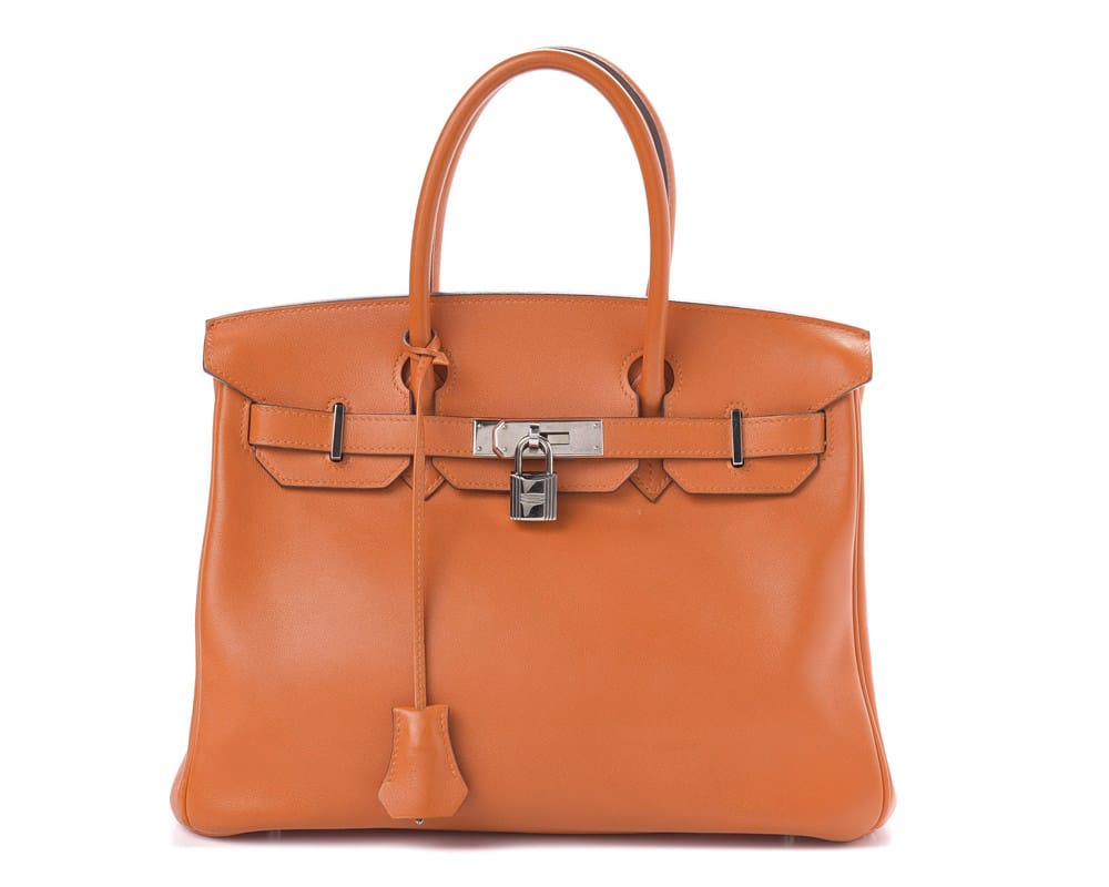
Despite my own aversion to yellow-orange, it is still largely a beloved color. It makes us feel alive and most people are drawn to it in some way. We associate it with the energy and warmth of sunshine and its electrifying appearance wakes us right up!
Shade Suggestions:
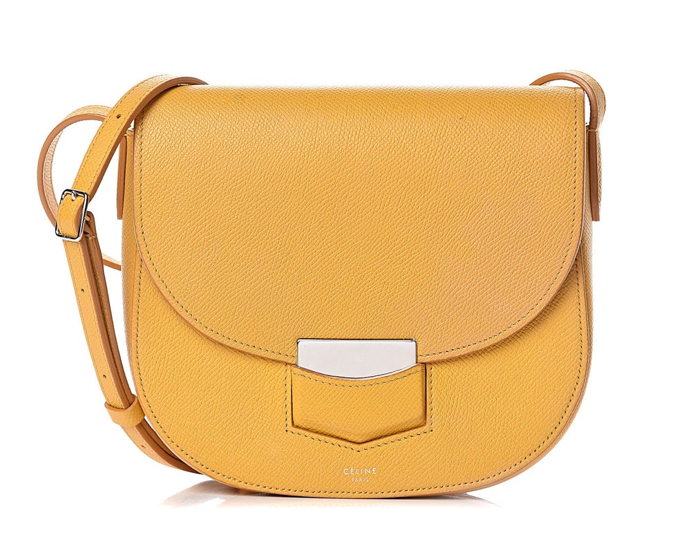
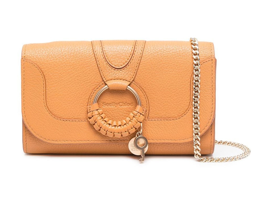
Fun: Mango (medium orange-yellow)
Classy: Saffron (dark golden yellow-orange)
Casual: Dark Apricot (light yellow-orange)
Yellow-Green:
Growth, Ambition, Prosperity
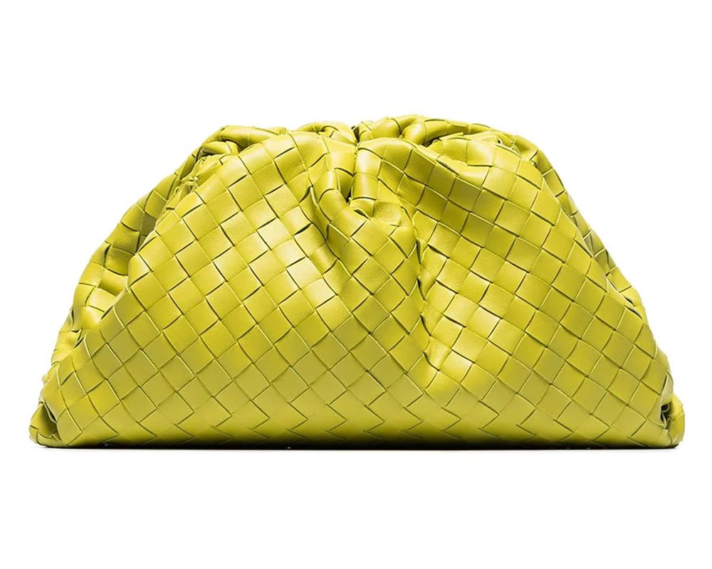
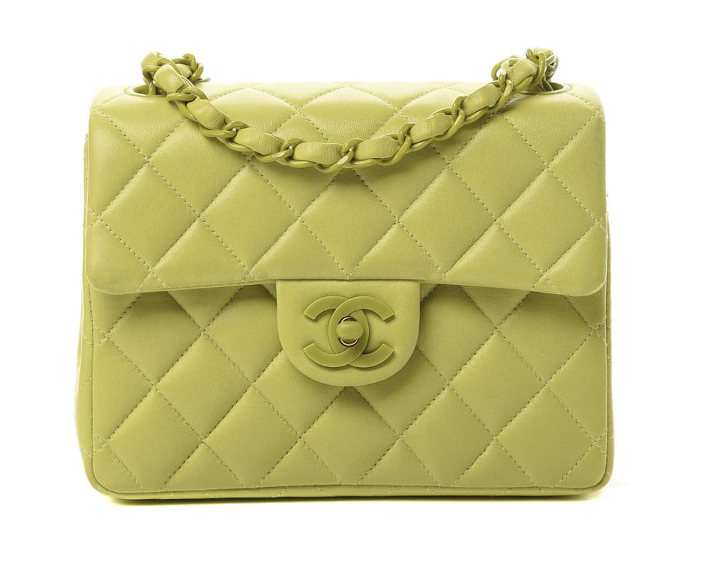
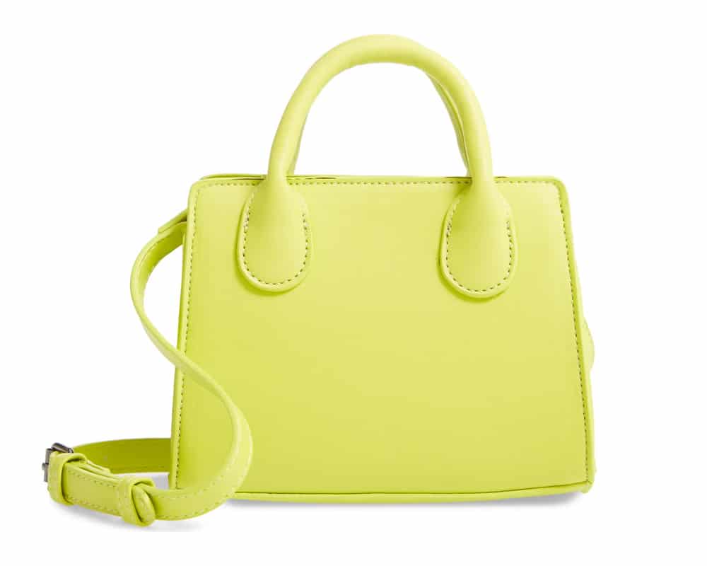
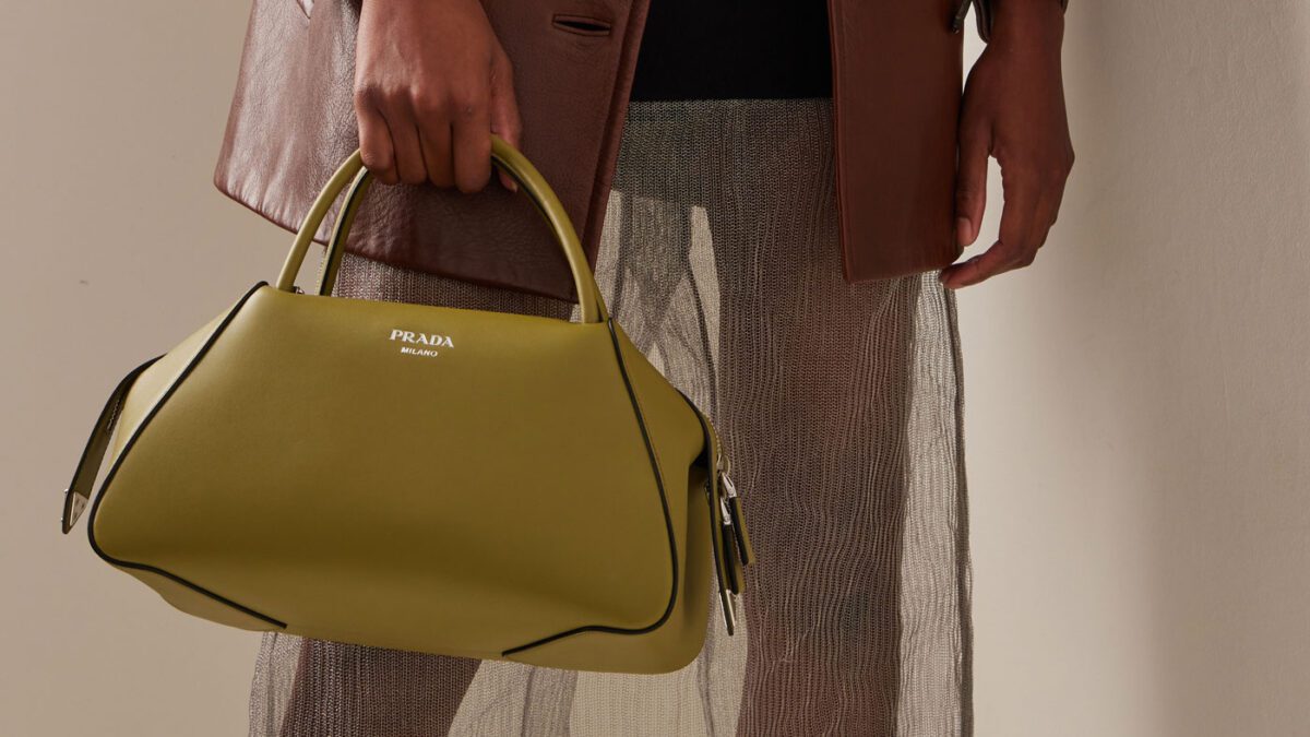
Me, me, me! This color is youthful and busy and the brighter shades don’t play well with others. Despite their electrifying appearance, there are still some more muted shades of yellow-green that are easier on the eyes and help bring us back down to Earth. Yellow-green represents growth in all forms: the new, the unrestrained, the ambitious. Anyone brave enough to rock a yellow-green bag is probably the face of the term #unbothered.
Shade Suggestions:
Fun: Lime (vivid yellow-green)
Classy: Pear (muted yellow-green)
Casual: Chartreuse (perfect middle between yellow and green)
Blue-Green:
Focus, Clarity, Communication
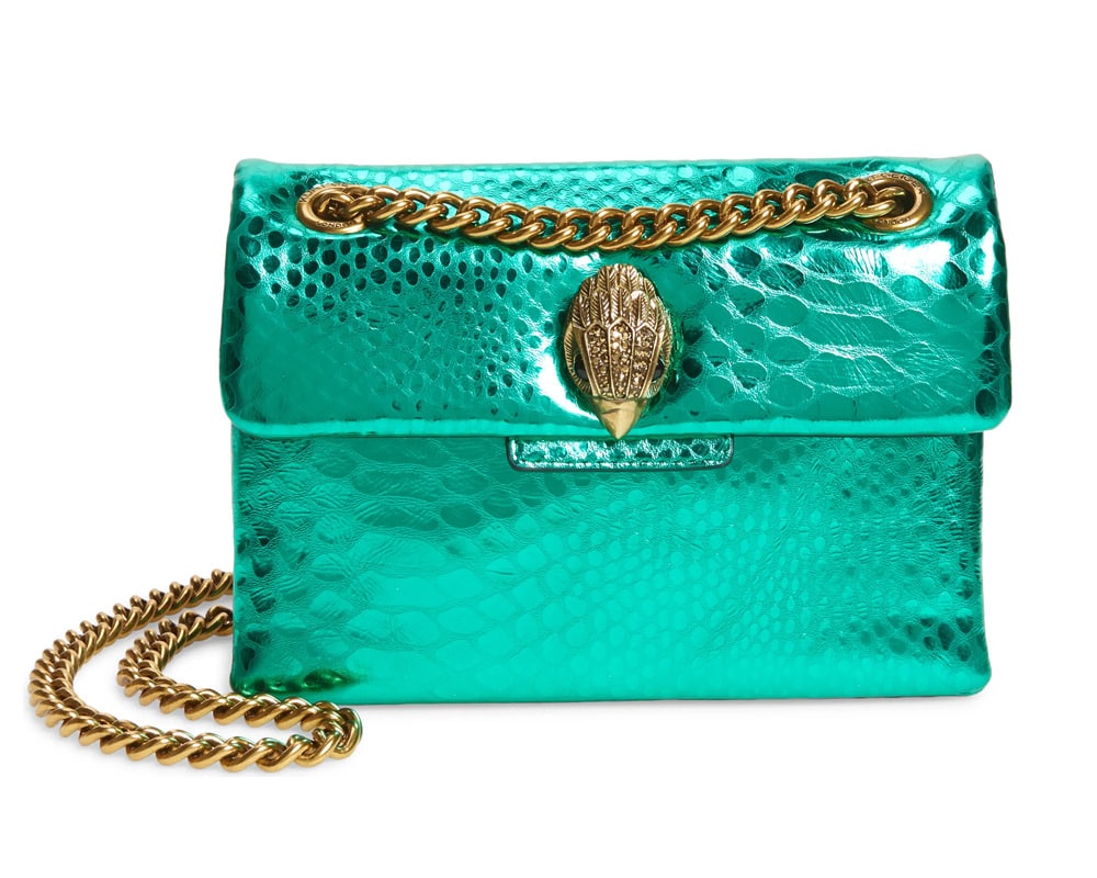
There is something intrinsically soothing about shades of blue-green. They have an obvious link to the ocean and they make us fall into a state of deep thought. Like the waves of the sea, exposure to shades of blue-green brings about rhythmic waves of consciousness that cause us to fixate on whatever may be bothering or perplexing us at the given moment. Blue-green heals us and encourages us to find new ways of understanding the internal world of ourselves and of others.
Shade Suggestions:
Fun: Caribbean Green (midtoned aqua green)
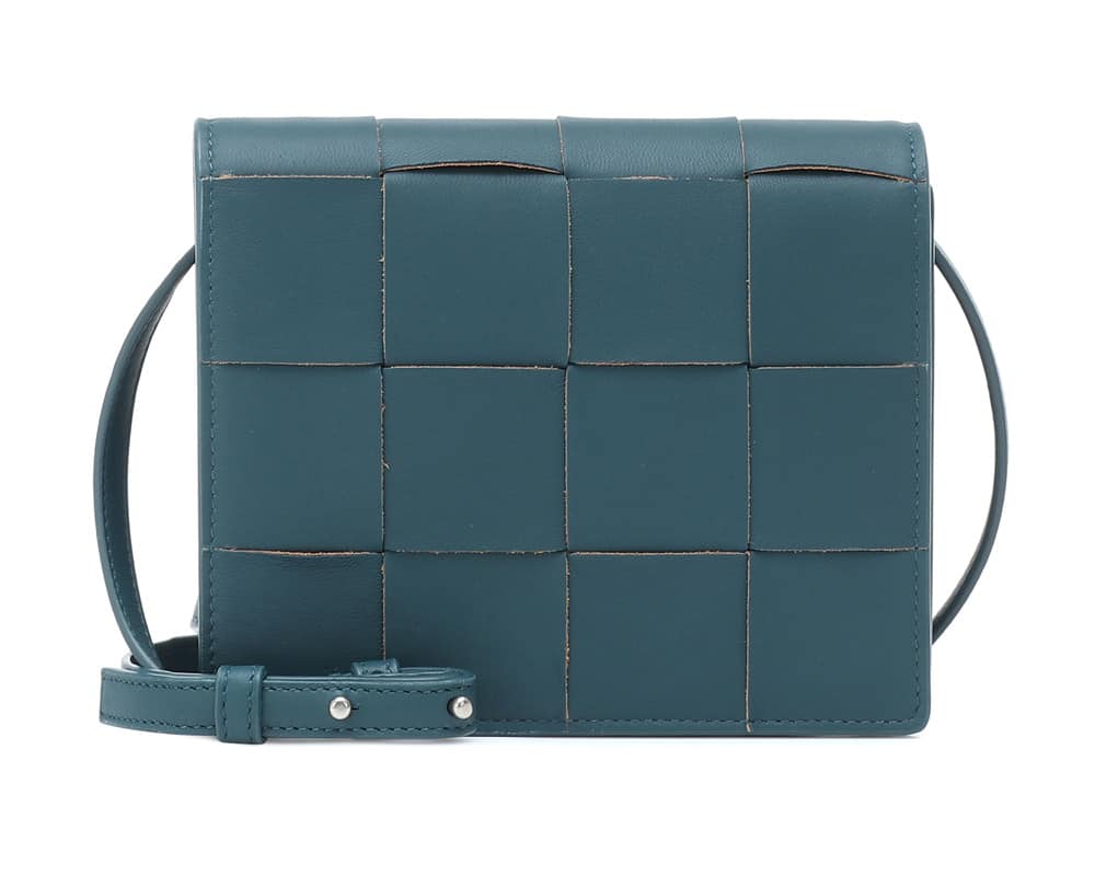
Classy: Teal (dark blue-green)
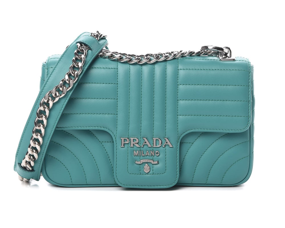
Casual: Turquoise (light blue-green)
Blue-Purple:
Spiritual, Collected, Wise
Roses are red, violets are blue…even though they aren’t. They’re indigo, which technically counts as blue-purple. Blue-purple feels uplifting, inspiring and full of wisdom, thus it is thought to be sort of a spiritual color. We associate it with anything that we feel exists outside of the realm of human understanding: psychics, outer space (in combo with black), and “Indigo Children” – a term from New Age beliefs that are given to some children thought to be born possessing supernatural abilities. You should consider experimenting with shades of blue-purple whenever you want others to know that hanging around you is where the magic happens!
Shade Suggestions:
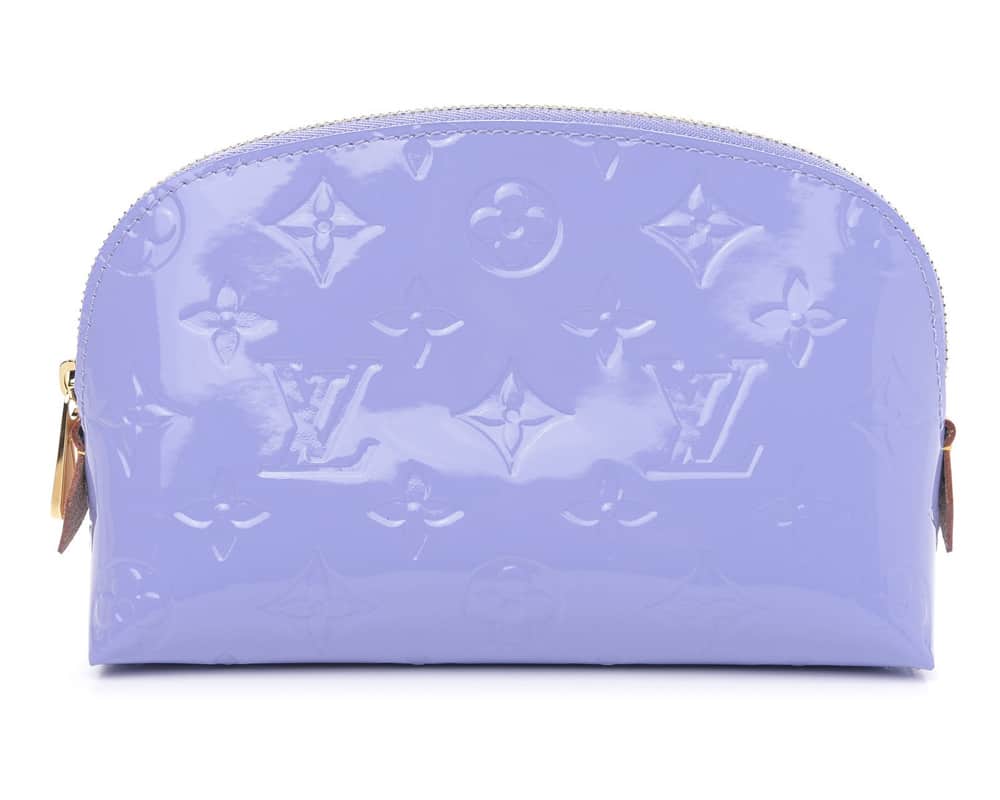
Fun: Periwinkle (light purple with blue undertone; like a blue-based lavender)
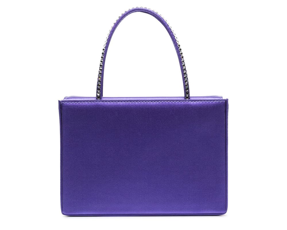
Classy: Indigo (standard blue-purple)
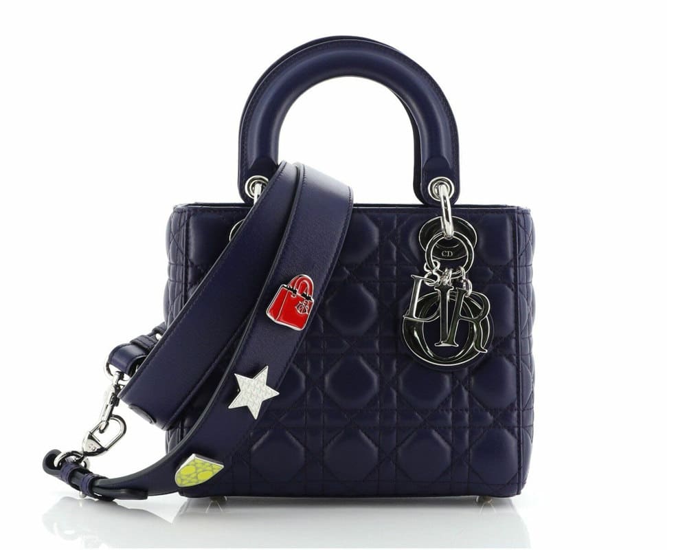
Casual: Black Currant (very dark blue-black with purple tint…this is very hard to find an example of!)
Red-Purple:
Compassion, Admiration, Generosity
Shades of red-purple represent sugar, spice, and everything nice. It is romantic yet bold and gives off a tender, compassionate feeling – which is probably why it is the third most common Valentine’s Day color, right after soft pink and bright red.
Red-purple is a generous color, letting you gradually take in its beauty without ever demanding too much of your attention. Even the brighter shades feel somewhat calm and can make the wearer appear very sure of themselves. This color is never too insistent which honestly makes it all the more alluring.
Shade Suggestions:
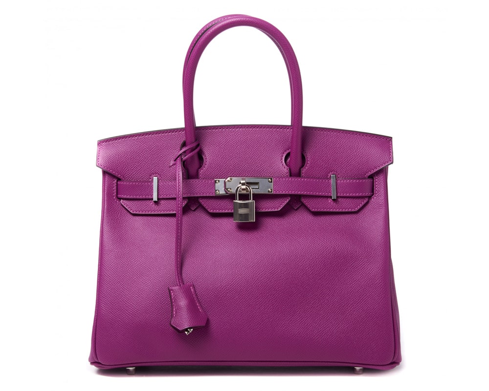
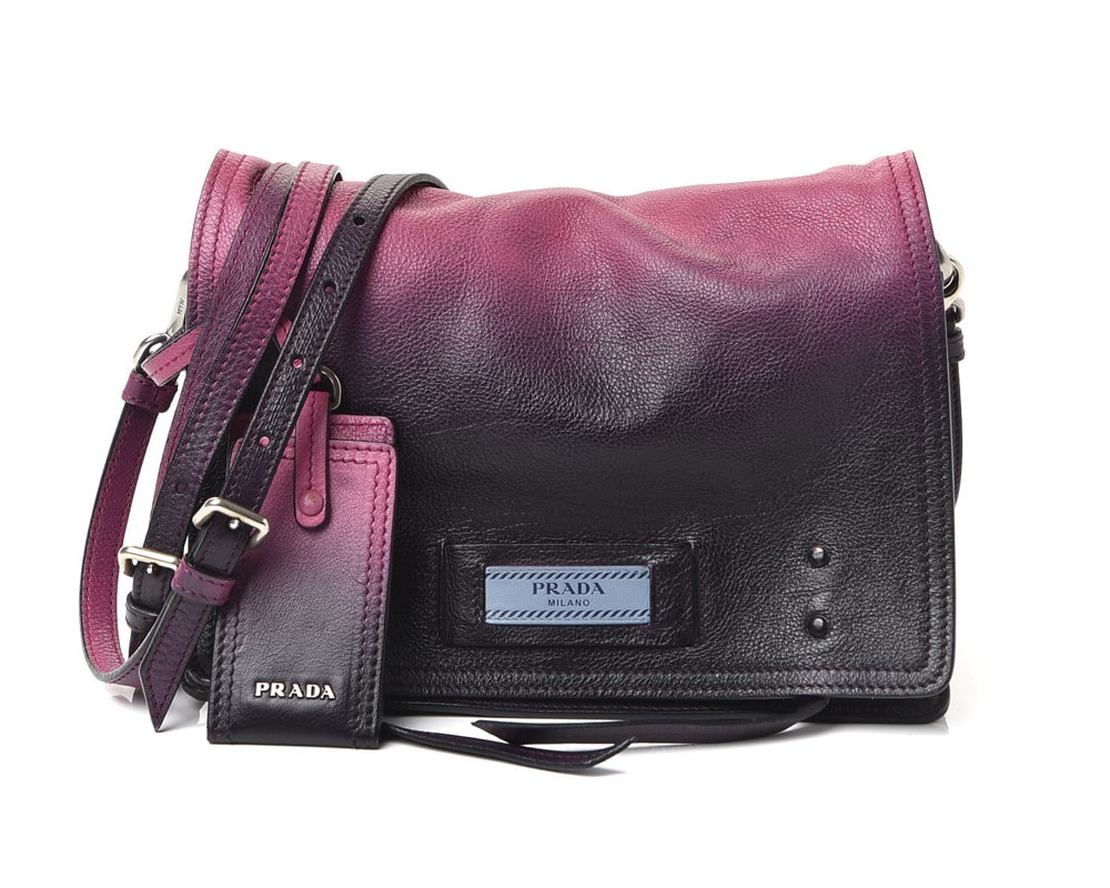
Fun: Deep Fuchsia (vivid mid tone purple-red)
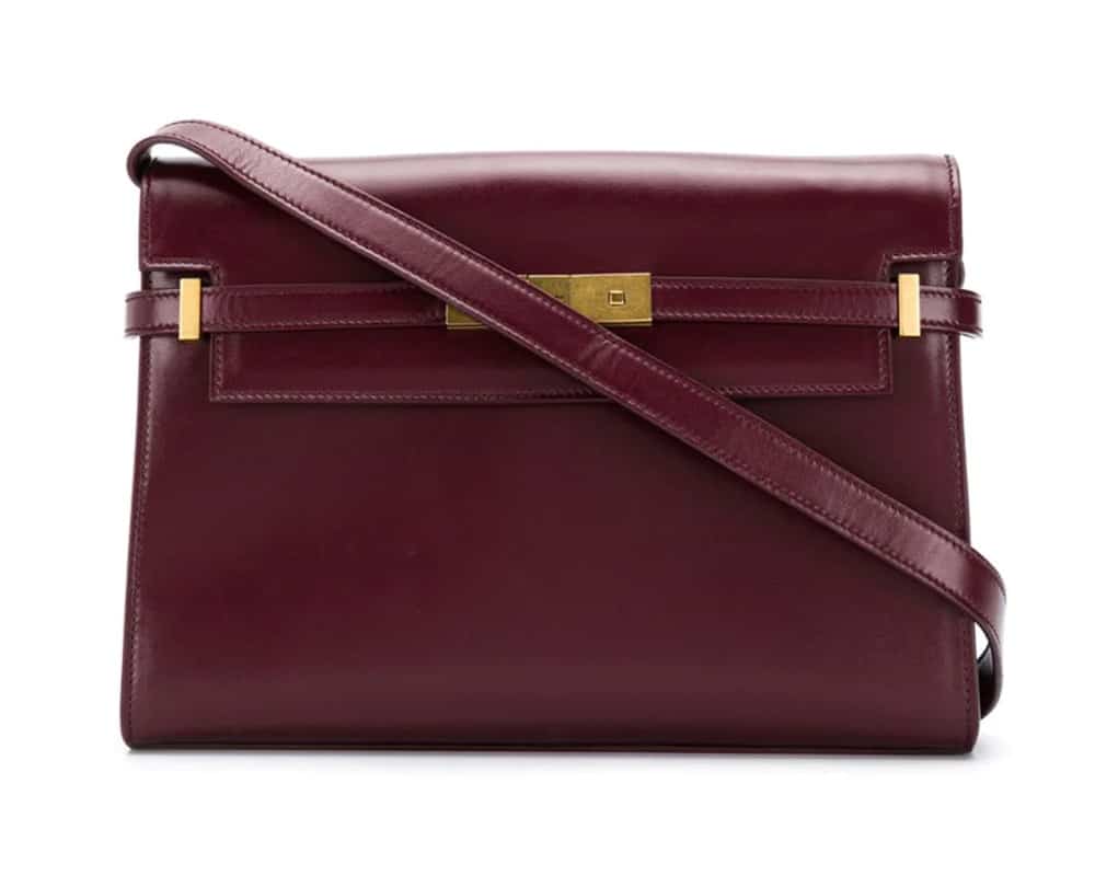
Classy: Sangria (dark purple with strong red undertone)
Casual: Amaranth Purple (dark rosey-purple)

