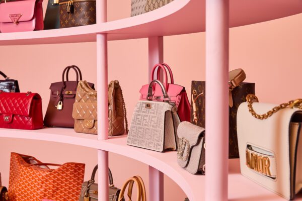
Most of us purse lovers will shamelessly admit that many times we match our outfit to our handbag as opposed to the other way around. By taking the accessory-first route, we make our bag the star of the show so it’s important we know how to coordinate it with the other colors in our wardrobe so that it can bring everything together in perfect harmony.
Too many times we will find ourselves reevaluating a wishlist item because even though we like the design and are intrigued by its color, we just can’t figure out how we will make it look good with other garments. Sure, we can stick to only buying neutral colored-pieces or attempt to customize the palette by adding colorful scarves and charms to the bag (which I’m guilty of…), but how do we create real harmony?
By learning how to balance colors, of course.
No matter if our personal style choices lean more towards the vibrant and energetic or the calm and understated, understanding colors – how they evoke certain feelings, where they fall on the color wheel, which shade is likely to be the best fit with our other attire- will help us take control over our whole look. Giving a little extra consideration when we choose colors is enough to make a simple jeans and T-shirt combo look incredible.
In our first lesson, we went over the origins of primary colors and what they represent. This time let’s take a look at how secondary colors (the result of two primary colors mixed together) can work alongside primary colors.
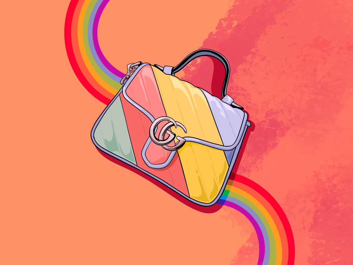
ORANGE
Risky, Flamboyant, Dynamic
Orange is a flashy, extremely mentally-stimulating color. Every shade has a way of demanding our attention and causing us to become so enthralled with whatever it covers that it can almost become overwhelming (in a positive way.) As we move further into the autumn months we get to stare into the kaleidoscope of shades within the canopies of trees and bask in the warm orange glow of burning fireplace embers. In this way, orange has a certain earthiness to it that is different than green and brown.
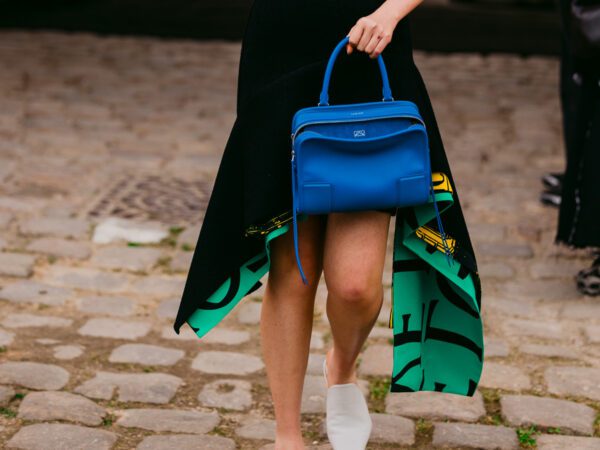
It is ostentatious and pleasantly disruptive, signaling some kind of metamorphosis between what use to be and what is to come. It looks especially nice when paired with blue because the primary shade will balance out the “loudness” of orange with its own calmness acting as a restraint.
Shade Suggestions:
Fun: Tangerine (medium orange)
Classy: Amber (warm yellow-orange)
Casual: Coral (light pinkish-orange)


GREEN
Rejuvenating, stable, fresh
Green is generally seen as an inviting color because it gives off a sense of grounding. There is nothing like taking a walk through a lush garden to put us at peace. Its obvious connection to nature makes it easy on the eyes and gives off a feeling of healthy abundance and liveliness that invigorates us and boosts our overall mood.
It has a particular way of amplifying the feelings of any primary it is paired with. A mix of green and yellow looks extra lively while a mix of green and blue feels extra serene; however, our cultural association towards a mix of green and red makes it look extra Christmasy.
Shade Suggestions:
Fun: Emerald (dark blue-based green)
Classy: Olive (greyish yellow-green)
Casual: Seafoam (light blue-green)


PURPLE (VIOLET)
Enchanting, Sensitive, Creative
Purple is very popular. Its energy is a perfect fusion of its parent shades, combining the boldness of red with the mindfulness of blue. It’s an enchanting color that is expressive and creative and makes us feel more imaginative. The sensitivity of its shades further helps evoke feelings of fantasy with darker shades feeling more refined and lighter shades feeling more fanciful.
It is actually quite rare to find in nature, with most things we think of as purple (like certain fruits and vegetables) actually being closer to a dark Indigo blue. This makes anything that is truly purple (like delicate flower petals and glittering amethyst) be seen as interesting, majestic, and worthy of great care.
Purple most definitely works in conjunction with blue but unlike the other secondary colors, it is offbeat enough to stand on its own.
Shade Suggestions:
Fun: Violet (medium blue-based purple)
Classy: Raisin (greyish red-purple)
Casual: Orchid (pinkish purple)


Sometimes we might surprise ourselves with how well we can work certain colors into our wardrobe. They may not even be what we would normally go for but knowing the characteristics of each color proves to be essential in picking shades that are flattering, complimentary, and able to communicate our attitude and style preferences. They directly influence our moods and when they come together in agreement, they can transform an ensemble and take it from pretty to impeccable.
I never knew it but Seafoam is my favourite fall color!
I like the color pop but bags cost so much I usually stick with black. The darker colors are just easier to take care of. So what are the characteristics of black, LOL!
If I remember correctly she had a first post where she did color theory for the more “staple” bag colors. It should be easy to find in search. I’d link it but my boss is glaring at me so I gtg ?
I really enjoy your writing style.
I agree!
Love this post!
I’m definitely a “fun colors” bag girl. Wardrobe is colorful, and for whatever reason the fact that bags cost a lot makes me feel I gotta go and snag a memorable color vs. neutrals. Can’t wait for the next part in this series!