
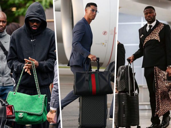
Anyone who has faced scrutiny for their luxury purchases knows that there is one go-to line of defense used to cast off the naysayers: “It’s art.”
Even when met with an eye roll, I tell those critics that much like gold-trimmed oil paintings, antique furniture, or even a glossy candy-colored Ferrari, a handbag’s appeal is not merely material. It is a complete work of art that required careful application of both time and talent to create. It isn’t just something that holds our junk but is the direct result of a master craftsman’s specialized knowledge and hard work. Professional artisans spend years discovering the best materials, stitching methods, and color combinations needed to intrigue enthusiasts. And for most early artisans, this dedication to their craft meant they even needed to figure out how to source those perfect materials.
You see, unlike animal hides and furs, the production of color pigments was still a small-scale operation throughout most of human history. It was an expensive and time-consuming undertaking that, while lent to beautiful results, was usually deadly for those tasked with acquiring the colorants. Colors mainly came from harmful minerals such as lead (poisonous), lye (explosive), or offensive mixtures that involved animal waste (gross.) On top of that, all of the finished pieces were exclusively reserved for the few lucky members of the nobility.
Thankfully the use of synthetic dyes in the present day has made getting our hands on elaborate works of art more accessible and has given us commoners a chance to outwardly express our appreciation for art and beauty. I regard our desires to buy a new handbag as merely a demonstration of our own knowledge gained from endless hours of research and analysis. Like any respected collector, we are simply well-informed connoisseurs tasked with choosing pieces that reflect both our own personal tastes and lifestyle, but also ones that evoke certain emotions within us and will work in harmony with other pieces in our collections.
Like art, name-brand bags undergo rebirths in shape, style, and color; our collections tell the story of our personal and cultural values and how those ideals evolve over time — usually in a way that is directly proportional to what we desire out of our lives during any given period.
So what do our choices ultimately say about us? How are we psychologically influenced by certain properties; whether it be for picking out a screenprint or our next bucket bag? Of course, a handbag’s size and structure can be linked to how ”on-the-go” we are and what contents make up our day-to-day survival kit, but what about the colors we pick? Do the colors we gravitate towards reveal something about our deep inward feelings? Possibly.
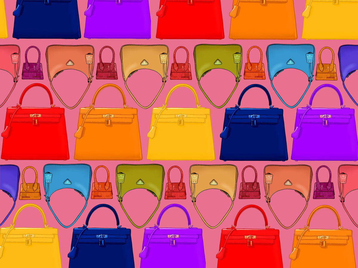
Let’s start off with the three most basic primary colors:
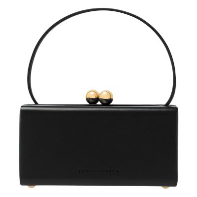
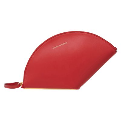
RED
Bold, powerful, captivating.
We have always loved red. In fact, it is one of the most long-beloved colors throughout human history as it is the first color picked up by the human eye. Red’s long wavelengths of light have a big impact on our eye’s photoreceptors and make anything red take center stage. Every shade tends to attract and hold our attention, so it’s usually the go-to choice when we want to make a statement.
Shade Suggestions:
Fun: Vermillion (brilliant true red)
Classy: Crimson (dark red with a slight hint of purple)
Casual: Raspberry (medium red with a pinkish undertone)
[image_carousel source=”media: 239523,239522,239521″ limit=”5″ slides_style=”minimal” crop=”none” align=”center” captions=”yes” dots=”no” link=”custom” autoplay=”0″ image_size=”full” outline=”no”]
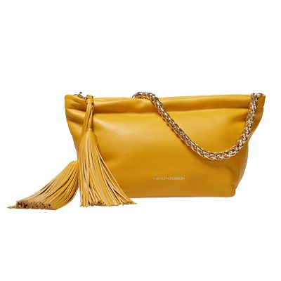
YELLOW
Positive, Joyful, Energetic.
While we love red, yellow actually has the longest track record of use throughout history due to two notable minerals: orpiment and ochre. The former is a toxic and unpredictable substance so its use as decorative pigment was largely discounted after the 19th century, but the latter can still be found on Egyptian papyrus scrolls, decorating the walls of the Taj Mahal, and used in an oil mixture as hairdressing for East African Maasai tribes. Much like its origins, yellow is a wildly expressive color that can become fussy and unstable when used without reserve. However, adding touches of yellow portrays a sense of vitality and makes everything feel more radiant and exciting. Even the softer pastel tints of yellow seem to come off as dreamy and uplifting.
Shade Suggestions:
Fun: Lemon (vibrant yellow with a hint of green)
Classy: Goldenrod (medium yellow with a brownish undertone)
Casual: Canary (medium yellow with an orange undertone)
[image_carousel source=”media: 239547,239546,239545″ limit=”5″ slides_style=”minimal” crop=”none” align=”center” captions=”yes” dots=”no” link=”custom” autoplay=”0″ image_size=”full” outline=”no”]
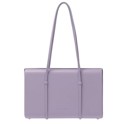
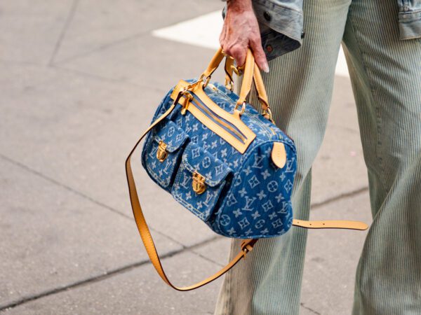
BLUE
Comforting, deep, mindful.
We all seem to be naturally attracted to the color blue. Sea and sky: it reflects many things present in the natural world around us. But despite its popularity in modern times, the use of decorative blue dye was largely overlooked until the end of the 12th century when extracting indigo from plants became common.
I like to think of blue as a neutral color. It’s versatility and wide shade range gives it the ability to balance out any other color it’s combined with. This special dynamic quality means that the deeper it becomes the more dramatic it gets and the lighter it becomes the more serene it will be.
Shade Suggestions:
Fun: Cyan (vibrant greenish-blue)
Classy: Prussian Blue (dark blue-black)
Casual: Steel Blue (muted blue-grey)
[image_carousel source=”media: 239551,239550,239549″ limit=”5″ slides_style=”minimal” crop=”none” align=”center” captions=”yes” dots=”no” link=”custom” autoplay=”0″ image_size=”full” outline=”no”]
Of course, it would be silly to assume that these three colors are the only ones that influence us. After all, anyone who has seen a fireworks display or a glittering string of Christmas lights knows that each and every color has its own way of speaking to us on a visceral level. I believe their properties remind us of the complementary and contradictory aspects of ourselves and choosing the perfect color is a part of how we appraise a bag’s emotional value. Each new obsession is a new opportunity to control how we express those values to the world. Somehow each addition to our collection makes us feel that we too are a masterpiece even when we sometimes still feel like a work in progress.

I love colour and really enjoyed this article. Although I agree mainly with the descriptions of the colours, I see the yellows in a different way to the author.
I would switch the first and third descriptions:
The first one is named as Fun: Lemon (vibrant yellow with a hint of green), whereas I see it as the third one that is called Casual: Canary (medium yellow with an orange undertone), and vice versa.
Guess we are all different!
Funny, I thought the same thing when looking at the yellow descriptions!
Very well written and thoughtful piece. Bravo!
Very thoughtful and well written article. Bravo!
Nice article!
One remark, though. Colors were not always solely for the nobility (blue blood) but merely for the rich enough. Nobility is a short-cut but it is not accurate, since the emergence of the bourgeoisie coincides with a decline of the nobility (in terms of prestige or privileges) and you would find bourgeois living in much more somptuous conditions than some nobles. I get that this is Purseblog, but hey, this was not meant to critizice, merely to inform.
Thanks for this info! Always good to be more informed on any topic!
I love color, I have no black bags whatsoever and I’m on my second yellow car (my Minion!)–can always find it in parking lots. 🙂
Nice article, thanks!
Great article and well-documented, very appreciate the opportunity to move into analysis of our selection of the colors but in the pigments, photoreceptors, and societal meaning beyond the seasonal trend. I got into the pigments and wanted to select my minimal color aquarelle travel palette, so complex but so reduced to a few original dyes. I cannot live without handbag in several colors and I have been waiting and waiting until I could finally see my favorite tone in the market, sometimes for years. In yellow for example, I like a specific warm tone like the Cadmiun yellow (cadmiun disulfide, traditionally) and it is not the most popular color to manufacture handbags. And for the reds, as you said, the red Crimson and red Vermillion are very different and for my medium size handbags, I need to have both options, I cannot reduce to just one red as those 2 are offering such a different option to complement with other colors. I am not sure if this color/tone issue is so important for many of you. It is crucial for me. I would not buy a model if they would not produce in specific color and tone, I prefer to wait. The model is not sufficient for my decision.
Thanks for the great article!
Very interesting article! I’d love a “lighthearted” version of this, like a horoscope but with all the colors instead! I am mostly drawn to white hues, black and cold beige colors! Despite this I do not think that my choices are boring at all! 😀
This would be so much fun! Are you guys still doing your monthly bag-horoscopes? It feels like a long time ago since I saw one. Is there a category for them on here somewhere where I can find them all?
Love the LV bag. Such an eye catching piece. A little black dress walking down the street with that bag would catch everyone’s eyes right on you.
This was a fun article! I’m mostly drawn to navy, black, tan or Hermes “Gold” and Hermes “Raisin” colors. Red bags overwhelm me, but I’m not sure why. The psychology of colors and the attraction we have towards them has always fascinated me.
Very nice article ! I own a orange bag and it won’t be the last colourish bag from my collection, since I’m now thiking about getting a blue or/and a pale yellow bag to my collection.
This has to be my favorite PB article in a very long time. Well done!
We’re glad you enjoyed the read.
This is really, really good! Please bring back Alejandra Machin for more fantastic articles!
Aleja will certainly be a regular contributor on PurseBlog!