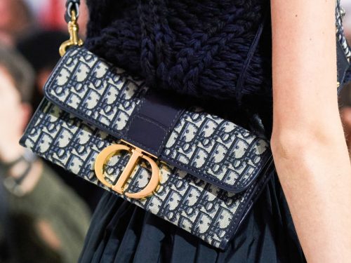

While other premier designers have steered away from overtly using logos on its fall 2019 bags, Dior has continued to embrace the millennial obsession with in-your-face logos. For Fall 2019, Maria Grazia Chiuri continues to tap into the needs, but mostly wants, of fashion’s youngest consumers. Millennial and Gen Z shoppers continue to be drawn towards insta-worthy fashion, which is exactly what this collection contains.
There were saddle bags and buffalo check printed book totes, which walked alongside flap bags with big and bold gold hardware. If the logos and punk-y plaid bags are any indication, the collection as a whole embraces fashion’s current obsession with 90s fashion. The heavy, logo hardware displayed throughout reads punk-rock grunge, but in the chicest possible way. View all the bags from the runway below.
[Photos via Vogue Runway]


Bag 21, love.
I like this collection but that’s a little too much logo for my taste.
I hate the new CD logo as much as I hate Gucci’s GG
Very logo heavy, indeed! I do like the overall vibe of it, especially when taking into account each look overall, the RTW paired with the bags. Everything is very wearable.
Very logo heavy, indeed! I do like the overall vibe of it, especially when taking into account each look overall, the RTW paired with the bags. Everything is very wearable.
Slide 28 – what is with these brands making cheap bags and selling them for $2000?
#5 caught my eye! But the big question is, does it only come with that horrible strap or will there be other options…?
I don’t like the big, chunky strap, either! It’s all out of proportion to the size of the bag.
Title should read, “Dior continues to make ugly bags”.
Dior is in the toilet. Going, going, going…gone. I had hoped MGC would elevate the brand and kick it with some edge. She kicked it alright, into the gutter.
Bags 19 and 27 are my favorite. That’s saying a lot because I’m not a fan of black handbags. The emerald green color on the Saddle Bag is gorgeous. The denim Saddle Bag is very cool. Other than that, the rest are meh.
Agree the emerald is BEAUTIFUL!
I am a billboard! Muahaha! And I even paid for the privilege! I am the envy of those as vacuous ME, GLORIOUS ME!
Seriously I haven’t carried a logo bag since the 90’s and I don’t foresee myself going down that road (thank goodness!)
So true! You summed it up perfectly. Look at me! Glorious me!
Want the shoes in #28.
Ok I’m I love with some of these and I’m obsessed with that logo! It’s the same right side up as it is upside down! So cute! Gimmicky? A bit but I think it adds something to it. That matelasse looks 10x better than Miu Miu’s. That black on black ?
23 would look adorable in a smaller size logo
I think if it had a smaller logo, it would look too similar to the Addict. That’s my guess. I also wonder if 28 is reversible as the inner part of the handles are in the trotter/oblique print.
Hahaha i dont understand the book tote craze (i know i know lol) – seems reversible – reminds me of the balenciaga ikea bag
Goin to the farmers market vibes lol.
I think bag 3 looks nice, but i wanna see it in other colors.
Perfect Collection, to see some more at…
leather handbags
I just hate everything that is happening at Dior these days. I understand this a minority opinion. The glamour and sophistication of Dior, in my opinion, is non-existent right now.
Yes! The last decade produced some glorious, feminine, wardrobe staples! It was so divine! Now, what lady would wear any one of these looks? She’d be looked at, as trying too hard to look young! Notice the Divide in the comments between generations. The younger set love it, while the older set does not.
You’re not in the minority, it’s just that the younger audience I think has more fervor in posting regularly. The “older” (I am saying 40’s) crowd has walked away from Dior pretty much already. We fought it for awhile, and now we’ve just capitulated to the loss. I think also, sensuality (maybe even sexuality) has been removed from “feminism”, which now seems to be T-shirts, messenger bags, logo-mania, sneakers, music festival boho garb and mom jeans. I miss that beautiful mix between sophistication, sensuality, sexuality, empowerment that high fashion used to exude. Now, it’s mall rats.
I’m 29 and I totally agree with you.
I agree so I’m in the minority, too! The classic sophistication of Dior has been missing for a very long time.
Wow, this is the first time I am impressed by the Dior collection. All the bags are beautiful! I would totally buy that leather mesh tote. Gorgeous! Good to see Dior finally step up its game.
I am ALL FOR bag #29!! That green is sublime!!
I like some of the classic shapes, but the leather is too shiny for my taste.
I think that what Maria is doing with Dior is really interesting and exciting, it’s just not my style, unfortunately. I do like the top handle (#20) though, I hope it will come in other colors!
Imagine yourself walking down the Seine on a spring day with one of these beauties on your arm. To me Dior is the perfect French brand. Though this isn’t my favorite collection, it’s still very high up there.
Hmmmm. I like slide #4 & the divine green bag in #29. Everything else is Millenial-wear! Now, I do like the whole head to toe mono-print look. The way the bags blend in with the toile-like jacket, skirt, shoes, is different & interesting. I’m noticing a lot of poodle skirts, with tulle petticoats peeking out. Whereas previous trends have been making underwear THE sole clothing, now it’s back under clothes, but peeking out! I like the kitten heeled sling-backs, too. All in all, I’m liking this whole mono look……..but it’s really just for Millineals & younger. That’s dissapointing, as the last decade produced so many mature Dior staples for every lady’s closet. Newsflash – the money to afford couture fashion lies with the older generations, & not with the Millineals (yet).
Hmmmm….okay…..cant say that I “love” anything in this collection. I would need to love a bag, if I was to purchase it. Not a fan of the saddle bags as they are so impractical to use. The logo mania overshadows some of the designs, and the quality of the leathers/textiles seems to be replaced by logos. Bottega Veneta focus more on leather quality without the logo’s and I much prefer their new designs this season.
Pleased to see the emerald! The tartan… not so much. A handful of pieces here I adore (19, 24, 27, 29) but the rest are bad, and several look like swandri’s. I live in New Zealand. Our farmers wear swandri’s which are tartan bush shirts that look a whole lot like these bags. So gosh darn wrong. ?????
The green Saddle is gorgeous, although I would never carry a bag of that shape
29 is everything to me! I wish more designers would make emerald green bags, it’s a severely underrated color.