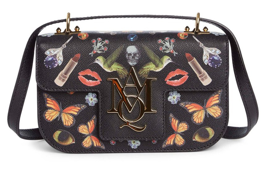
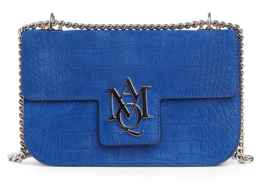
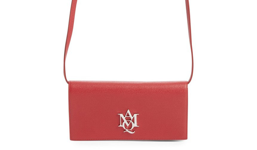
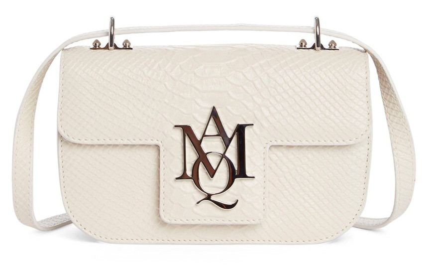
Every Monday morning, I sit down behind my computer to catch up on emails, browse through my favorite online stores to spot new bags and see what I have on my schedule for the upcoming week. Usually, I quickly look over a bunch of bags, hoping one will catch my eye to share with you guys, but sometimes what catches my attention is a bag I really just don’t like. This was the case when I stumbled upon a few new Alexander McQueen bags that have a new logo, featuring AMQ jumbled together on the center of the bag.
Here’s the thing: I love Alexander McQueen bags. I loved his bags for years, and when McQueen passed away, the entire fashion world and beyond felt a major void. His luxuriously gothic aesthetic was easy to spot, and his bags always spoke to me and Amanda. This new logo is way too much: too many letters, too big, too in your face, and not at all what we’ve come to expect from McQueen. I’ve always associated the skull with McQueen, which is still frequently used on the brand’s bags, or sometimes, the brand’s name is simply stamped in gold. This new logo is just not good, and I don’t think I will be alone in thinking this.
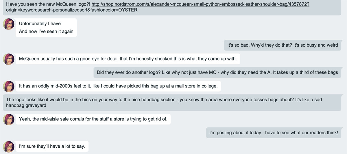
Amanda and I got to chatting about it via Gchat, and here’s what we had to say. Share your thoughts with us in the comments below!
Hagsville.
OMG this is terrible. It’s like an 80’s flashback.
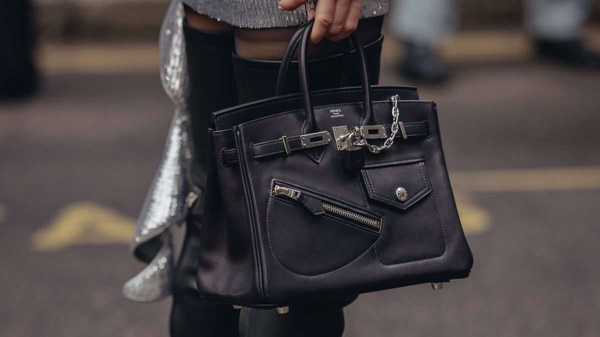
Honestly I’m on the fence about it! I actually like the way it looks on bag 1 and 2. But it looks off on 3 and 4 and the black bag on the cover photo.
the obsession print though? i am obsessed! 😉 i really hope they end up doing the padlock bag in that print!!!
It’s on other bags!! And it’s amazing! I’ll do a story on it 🙂
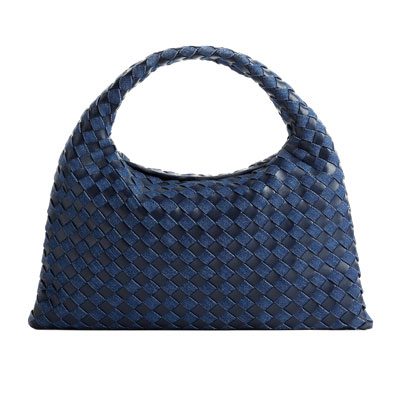
It kinda looks ok on the blue bag (2), but really bad on the black bag. Overall, not a good look.
I think it looks ok on the blue bag because that bag is pretty! I don’t find fault with the bags themselves – the shapes are nice and materials look nice, but the logo really ruins it for me!
What I’ve learned today is I need to update my gchat icon because my hair hasn’t looked like that since 2014
That is true!
The bags are lovely and would have been awesome with the little McQueen skull rather than the new logo. Maybe they are trying to appeal to an audience that doesn’t want a skull on their bag though. :o(
I unfortunately must agree. That logo is utterly atrocious. When I saw it, my reaction went from shocked disgust to perplexity to hilarity. I’m somewhere between hilarity and feeling offended as I type this comment. I know that logos are back, but this is a bit sad, actually.
One word: cheap! The logo looks like those you can see on 30 € pleather bags that imitate designer styles. I actually, on first glance and without reading the headline, thought it was a Mango bag but then, on second look, I realised it had a Q, not O on it…and then I HAD to check the story to find out what the heck was going on with that bag.
Just a Q with a tiny skull emblem would be MUCH better!
I think the logo would work better if it was smaller. I think it’s not a bad logo, just a bit too much logo.
It is absolutely terrible. It looks so cheap… think Juicy Couture?
Very JW Anderson / Juicy Couture? I really don’t like it
That’s exactly what I thought!
What a way to ruin a perfectly good selection of bags….
i do love the jw logo bags though, i have to say…and i was just thinking that i like the amq because its like the jw
Truth is, I’ve seen worse but this is particularly painful because McQueen had that no logo, skull thing going on and it was awesome. Now they’re competing with Michael Kors for the biggest shiniest logo. SMH
Yikes. Not good.
Carrie
http://www.wearwherewell.com
Yikes. Not good.
Carrie
http://www.wearwherewell.com
Is it just me or is the logo placement in slide 2 (blue croc embossed) very slanted?
Good eye. It is placed at a slant. Ridiculous.
Hate it. Also kind of a rip off of YSL (which also isn’t so great). Why can’t they continue to be original like they have been in the past?
Ya I got a YSL feel but it’s just weird bc YSL has been doing that for a long time – McQueen just introduced it.
It reminds me of something C. Wonder would try to pull off during the Burch family divorce.
I think that the logo actually goes with bag one. It cheapens the look of the other bags.
Agree 100%
skull is way better, more subtle, this new logo is like its trying to copy Louie Vuitton
*Internal screaming*
Lol!!!! ????
Definitely don’t like the logo. Also prefer Saint Laurent’s Betty, which has similar bilateral 90 degree angles WITHOUT any logo.
The shape & construction of this bag remind me a lot of Constance bag. Too bad they had put the huge ugly logo on it,
read: MK
That is one ugly and tacky logo. Such a shame that the House of McQueen has stooped to this level. Alexander McQueen bags are usually elegant, with gothic influences.
OMG…This logo is BUTT UGLY
This is so disrespectful to Alexander McQueen
Ugly, tacky, looks cheap too. I can’t imagine what they were thinking.
It isn’t Alexander McQueen. This is something he wasn’t!
Makes me feel cheap and sad.
Oh nooo, I bought 2 Legend totes and love them!!! The discreet name print was a big part of the attraction.
This logo just makes the bags looks soo tacky 🙁 I hope they reconsider it.
Like you said, just the MQ would’ve looked better and also in smaller proportions. Half the bag is the logo!
Noooooooooooooooooo!
I rather like the legend bags… The best thing I can say about the logo is that it reminds me of Christograms. You know, like IHS or Chi-Ro Alpha Omega ones you see in (Catholic) churches? Maybe that was what they were going for?
I may just have to get over the awful logo because the pattern on #1 is amazing. The 00’s mall goth in me is screaming.
Love Alexander McQueen but do not like the new logo…at all…
J.W.Anderson made it right while this one……sigh……
I wonder if the logo change is perhaps an attempt by Alexander McQueen® and the Kering Group© to better appeal to emerging markets in East Asia and the Middle East? In many parts of Asia, wearing or carrying something that is festooned with skulls and other symbols emblematic of death is seen as being highly transgressive. Maybe the new, dull-as-ditchwater logo is an endeavor to court those people?
I feel like it kind of copies the YSL logo.
Sorry….. the BLUE colored bag is BEAUTIFUL