
One of the most interesting things about Maria Grazia Chiuri leaving her partnership with Pierpaolo Piccioli at Valentino for Dior has been getting to see which parts of the Valentino aesthetic they each likely influenced when they were working together. Evidence (Valentino’s Pre-Fall 2017 show, for instance) suggests that it was Piccioli with many of the brand’s more traditionally feminine leanings, while Chiuri’s work for Dior so far indicates she might have brought a balancing toughness (and the appreciation of sheer skirts) to the table. When it comes to bags, though, Chiuri’s work has diverged more from both her previous oeuvre at Valentino and Dior’s traditional look than I had expected.
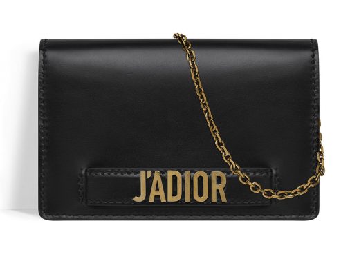
Dior’s Spring 2017 collection, Chiuri’s first at Dior, won’t hit stores until the end of February, but the brand has included some teasers on its website, including a look at the Dior J’Adior Wallet on Chain. The bag features a brand new, very bold logo hardware style that made its debut for Spring 2017, and it’s been a hot topic of conversation every time we’ve featured glimpses of the upcoming bags.

The bag itself is well-designed for a piece at the base of the brand’s price structure. The interior is small but well-organized, with wallet-style slots for cards, in addition to both a zip pocket and slide pocket at the front. What gives me pause, though, is the exterior font used for these logos. It feels slightly brutalist, as though the typeface was chosen because it’s jarring in its aggressive plainness. That kind of look is far from the forward-leaning femininity of Raf Simons’s Dior, and the quick transition might take some time for shoppers to adjust to.
So, tell me: do you love this bag, or not so much?


nah, I’m good
not really
leave it
You guys, it is so bad. And the “J’Adior” play on words is embarrassing and not clever. With so many beautiful designer bags in the market these days, and at such stratospheric price points, one really has to do better than this.
When I saw the picture it reminded me of Moshino… this is pretty bad for Dior
Leave it…. and fire the new creative director.
Seriously? Looks like a vinyl fake sold on the sidewalk.
Leave it. Again, let’s leave these things to Moschino. The bag actually looks luxurious. Too bad they had to muck it up.
Leave, leave, leave…
I can’t what is this after Raf !!! im having such a meltdown over Dior…. the grand house of france in this state…..
I think it looks fresh. I can see the Moschino vibe but b*sh this is Dior.
I don’t. But seriously, it remind me of Galiano’s work.
I loved Dior for their simplicity. I’m not a fan of the new designs at all. Bring back Raf.
Awful. The font and hardware are so cheap-looking. Definite pass…
I went to see it in person. And it’s so freakin cool. The pictures don’t do it justice. It’s nice to see the direction change a bit. She’s putting her own stamp on it. please look at it in person before you judge. I think you’ll fell differently.