The truest thing I can say about Valentino‘s Spring 2019 bags is that they were one of the weaker parts of the brand’s runway show, but that’s not as much of a criticism as it sounds like—the clothes in the collection were utterly and exuberantly gorgeous, so much so that I feel compelled to mention them in a review of the bags, which has happened very rarely over the years. If you haven’t looked at the collection in full, you won’t regret taking a few minutes to enjoy it.
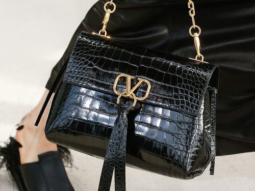
The bags were a bit ambitious too, both in what they included and what they largely avoided. The most obvious addition was a new logo hardware piece that adorned almost all of the bags, fitted with a distinct, dangling pull that blazed Valentino red on most of the designs. A chain-strap flap bag was the only version that opted for a tonal tassel, and those were my favorites of the group.
The emphasis on roomy shoulder bags felt buyer-friendly and modern, but I can’t quite convince myself to love the execution—how the encircled V sits didn’t, uh, sit quite right with me, and neither did the execution of the thick-strapped shoulder bag that most of the models carried. I could see it being refined into something great in future seasons, though, and I’m happy to see Valentino meaningfully move on from Rockstuds, at least on the runway. Some of the collection’s oversized totes, which somehow managed to be both distinct and minimalist with some clever execution, featured a small, simple stud as a handle attachment, but that’s the only place they were found on the brand new designs. Check out all the bags below.
[Photos via Vogue Runway]


i like the V but dislike the extra metal on the side and the circle with the leather strip is atrocious
Before I read the title that said that it was a Valentino I read the logo like “D(ey) V(e) D”. Like some sort of “cool” nickname for someone named David. And now I realised that it also, at the same time, it says DVD. Like in a “movie player machine”.
Doesn’t it also remind you a awful lot of the Versace V, from the “19V69” logo? Seen here:
https://twitter.com/v1969beauty
totally agree with you, lol
I totally agree with you!
I really like 39&36.
Uh where’s the feature for Chloé ss19??? It was only the most striking and refreshing show of PFW …
Not loving any of the bags and really don’t care for the big V hardware logo. But I like the jaunty little red ribbon “necktie” that’s looped into the hardware. It’s distinctive and subtly eye catching.
17 is the only one I liked. Wow… hated them all.
I don’t like any of these.
Auch. Not my cup of tea
OH, its VALENTINO, not INFINITI
Love a good logo. Don’t care if people think that they’re tacky or free advertising. I don’t like this one at all. The V alone would have been fine and cool.
The bags themselves are boring. I do think that the fringe bucket bag in picture 37 is cute.
Aside from that big tote, I don’t see anything with a potential.
I love the new tote design.
While the collection doesn’t feel very “Valentino” to me, I do really like that slouchy tote. It’s a good alternative to the LV neverfull.
Why does this new logo look so similar to the Valentino By Mario Valentino bags they sell at Off Fifth and Nordstrom Rack that they try to pass off as actual Valentino?
they look NOTHING like marios.. nothing.
I like a lot of the bags but do not care for that logo.
Let me say, I don’t mind a logo..just not that one.
It looks contrived and deliberate. I think they are hoping that this logo will be universally recognizable and attractive. I don’t see that happening with this. Maybe if it were smaller?
Love the tote shapes and hardware handle details. Not sure I like the red necktie thingy?
Honestly I’ll take anything over rockstuds at this point… a step in the right direction
The Red ring tie purse here is to die for. love love love this collection gorgeous .