Color trends are hard to talk about because colors—and specifically what makes two similar colors different—are hard to describe. There’s usually at least one color trend per season, and while this season it’s definitely true red, in the past it’s been burgundy or baby pink or neons. What’s potentially coming next, though, is a bit more interesting: true, bright primary colors and their close relations, like the shades you’d find in an eight-pack of crayons.
With the exception of red, these colors pop up relatively rarely in clothing and accessories when compared to their softer or richer counterparts, like pastels and jewel tones. They tend to read as harsh and almost afashionable, probably because they’re frequently used in uniforms, signage and other things that need to be noticed more than they need to be aesthetically appreciated. That particular sort of hostility to fashion’s flattering codes has been a hallmark of designer Demna Gvasalia’s work, first at Vetements and now at Balenciaga, so it makes sense that he’d be the first to really embrace them.
Where a buzzy designer goes, though, others are soon to follow, and we’ve noticed many brands picking up on this idea here and there. Check out 15 of the best examples below.
Balenciaga City Bag
$1,950 via Net-a-Porter

Elizabeth and James Eloise Shoulder Bag
$495 via Net-a-Porter

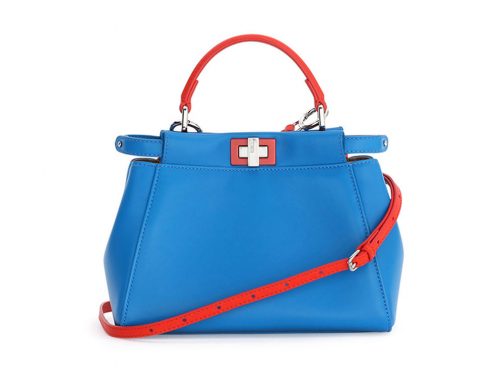
Fendi Mini Peekaboo Bag
$3,450 via Bergdorf Goodman

Givenchy Python Horizon Bag
$4,450 via Neiman Marcus

Jimmy Choo Rebel Soft Mini Bag
$995 via Net-a-Porter

JW Anderson Pierce Mini Bag
$1,480 via Net-a-Porter

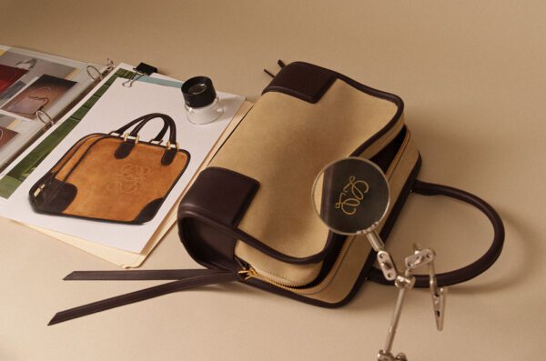
Loewe Puzzle Bag
$2,450 via Neiman Marcus

Longchamp 3D Leather Crossbody Bag
$615 via Neiman Marcus

Mansur Gavriel Mini Mini Bucket Bag
$395 via Bergdorf Goodman

Marni Tuk Bag
$2,420 via Net-a-Porter

Nico Giani Tunilla Mini Bag
$505 via Net-a-Porter

Off-White Diagonal Velvet Shoulder Bag
$995 via Bergdorf Goodman

Roksanda Besa Bag
$1,515 via Net-a-Porter

Sophie Hulme Albion Box Tote
$950 via SSENSE

Valextra Twist Crossbody Bag
$1,650 via Bergdorf Goodman