A handful of days before Maximilian Davis made his runway debut for Salvatore Ferragamo, the brand made a bold statement on social media by introducing its new logo. “Salvatore Ferragamo becomes FERRAGAMO,” the caption stated, and a press release for the announcement stressed the inevitable—a new chapter is being written. A conversation between the classic and contemporary begins.
Ferragamo’s heritage is explored in a new vision, presented through the eyes of Maximilian Davis. While this is a new beginning for the House of Ferragamo, its history will not be forgotten, and it is Salvatore Ferragamo’s handwriting that is translated into the new logo. The font is impactful and refined, meant to convey a tension between classicism and modernity.
The New FERRAGAMO
Then there was the collection itself, which debuted at the end of Milan Fashion Week with a bold red bang. The 27-year-old designer told Vogue, that he “was not sure what to expect,” when he arrived at the Florence-based House. He expressed that the entire Ferragamo family was welcoming and ready for the change ahead. And change he did, introducing an inaugural collection that redefined the brand’s heritage through a contemporary lens.
Salvatore Ferragamo himself was once known as the shoemaker to the stars, and Davis tapped into those roots in Hollywood History, paying tribute to Salvatore Ferragamo’s start. This new view of Hollywood is sensual and elegant. This vision is defined through sheer fabrics, stunning silk, and layered organza. Sleek, polished accessories cement his vision, and a plethora of new bags are introduced this season.
“It was about looking into the archive and establishing what could be redefined to become relevant for today” -Maximilian Davis
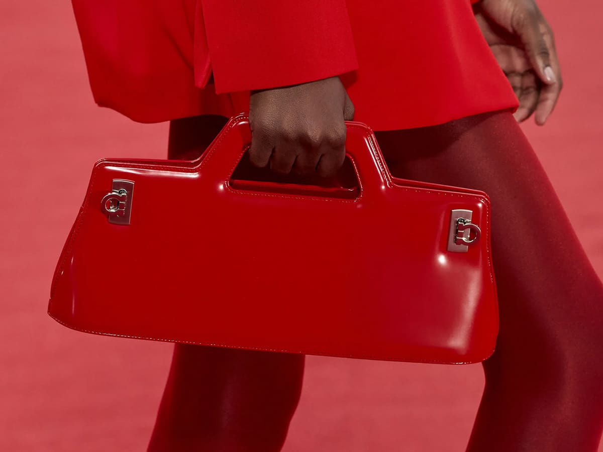
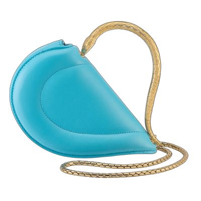
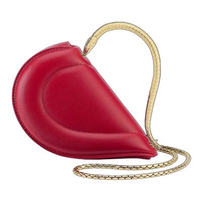
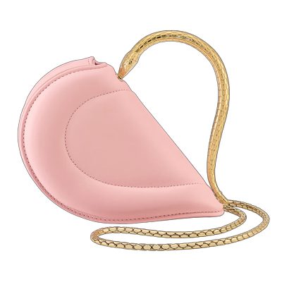
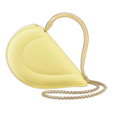
First introduced in 1988, Davis explores a silhouette from the archives, the Wanda Bag, which was originally named after Salvatore’s wife. The top handle bag is reimagined with new proportions, but remains as sleek as ever, finished with the iconic Ferragamo Gancini hardware at the corners. The Wanda appears alongside a slew of new shapes designed by Davis, which are meant to make a statement on their own. The brand’s new signature Pantone red makes a statement throughout, and overall the bags do feel like a fresh take on Ferragamo signatures.
View every bag from the runway below. Images via Vogue Runway.


At least the original aesthetic served certain demographics, although traditional and mature. Now it is unbearably atrocious.
Omg how atrocious – is this designer a mini Ricardo Tisci and will destroy ferragamo like Ricardo destroyed Burberry?
Burberry didn’t need help being destroyed but Ricardo and the Tuberculosis logo finished it off.
I love this collection. First time I ever liked anything by Ferragamo. It’s usually so unexciting. At least, this collection has a distinct point of view.
I really like the orange ombré bag. The cut out bags are very cool.
Looks my Ferragamo days are over. I don’t find any of it appealing.
The cut out bags are… no. The cheap looking little square ones with the “phone pockets” looks 90s and not in a good way. The remake of the W bag and some of the others are better. Definitely better than what blazy is doing at BV.
the egg shaped with tassel kinda cute but also looks like it was meant for a curtain…???
the Simone Rocha eggs are so much better
This is awful!
Anyone familiar with Lamarthe / Lancaster bags? These new Ferragamos remind me of thise…