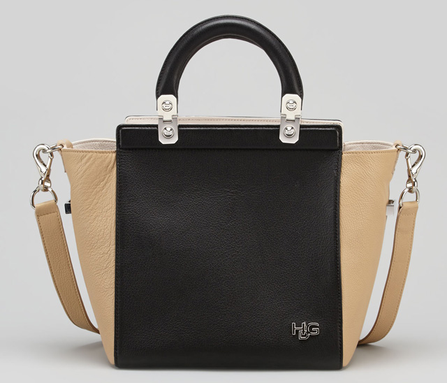
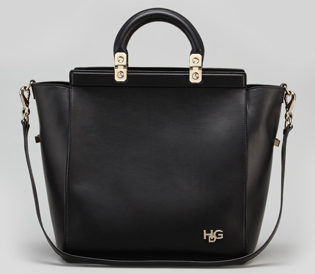
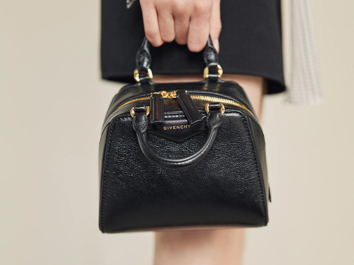
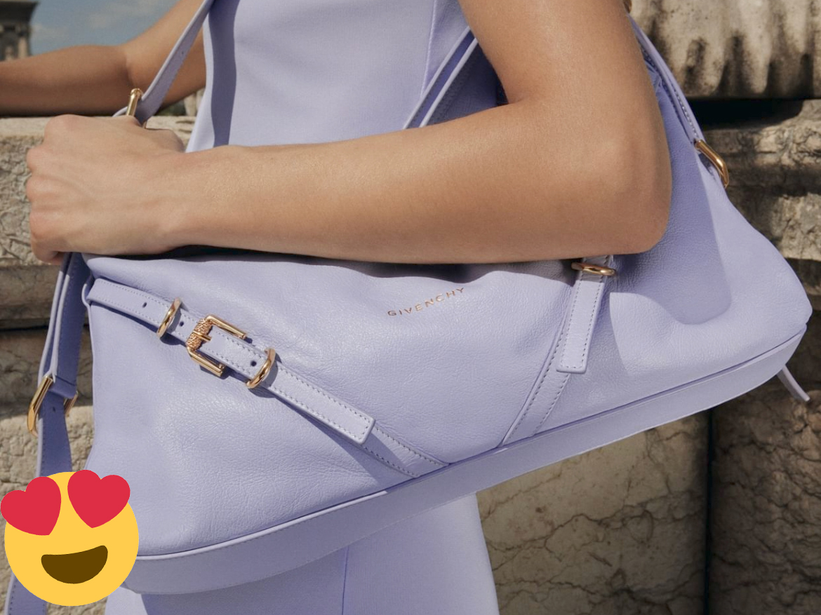
Just when you thought that Givenchy might be the only brand not to hop on the Celine-inspired flared gusset bandwagon, the brand new Givenchy HDG Tote pops up, brand new for Pre-Fall 2013. Although we’ve seen a lot of these types of totes in the past two years, I must say that the nail-head handle attachments on this one are pretty fabulous. Every bag needs its defining detail, and for this HDG, that hardware is it.
Givenchy aficionados have likely already picked up on the fact that the bag is named for Givenchy founder and famed couturier Hubert de Givenchy, who started the house in 1952. It’s always nice when a company pays homage to its foundation, and the use of Givenchy’s initials in this design probably indicate the the brand is heavily bought in to making this bag a success for years to come. Given that, it seems odd that they’d go with a shape that’s so heavily associated with a competitor, but the bag itself is still quite attractive.
If well-received by customers, it’s likely the design’s simplicity that’ll set it apart from much of the flared-gusset pack. Other than the handle hardware and the small monogram at the bottom right, the bag is all smooth, flat leather. Although the Bergdorf Goodman website lists both the bag above and the one below as being the same size, it’s pretty clear that they’re not – the all black version shows the larger standard bag, while the bicolor version is the “small” tote that the description fits. Notice how the handles have a completely different proportion on both bags?
With that in mind, I’m not entirely sure which bag you’ll actually get if you order either of these options, but I can pass along the price information that BG has provided for each:
U know, If a lady dior and a celine had bag sex, im pretty sure this would be the resulting love child.
Love the analogy!
Dior came to my mind, too! Great analogy.
Not a fan of the handles or the frame that they’re attached to. It cheapens the bag. I like the homage to HDG, but it looks like an initial bag. Like I put the wrong initials on it.
Not a fan 🙁 The HDG hardware makes the bag look really cheap and reminds me of a GUESS bag. Givenchy is known for coming up with classic designs with an edge. This bag just seems uninspired.
For starters, I don’t like the handles, at all. Nor do I like the leather plates on the upper hemline. And there’s the initials, which frankly won’t remind anyone that this actually IS a Givenchy bag. Over all, it doesn’t make sense with the aesthetic of the brand.
A little disappointed that Givenchy jumped on the gusset bandwagon….I hold Givenchy to a higher standard as most all of their bags are so creative and unique. Oh well, everybody has a misstep, right? Not my fav but that is a good thing I guess as I if there were another Givenchy on my list to purchase I would go broke.
I totally second that, boring and uninspired…and god knows if I love Givenchy!!
I totally agree with John. Leave the gusset to Céline. To Febdi with its 2jours, and to the classic Neverfull. I think also that the HDG initials not only look cheap, they also detract from the elegance that was once Givenchy. When you look at the bi-colour version, the worst thing is the bag looks incomplete – as thought there was “just enough” material to keep it going.
For a company it’s so many “hits”… This is worth a “miss”.
Sad to say, but true. Especially when LVMH can say so much about ts brands.
Yes – why add the initials in such a cheap way?? Why not just name it the HDG bag?? I sorta like it but it doesn’t quite work. Nothing on the antigona.
I actually feel like there are too many elements going on with this bag. The rolled handles with the nailhead hardware and the rectangular strip up top along with a silver logo, it’s all a bit much. I think the Antigona is still the best choice for those looking for a simple Givenchy bag.