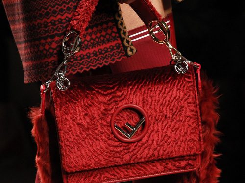

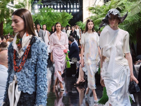
If you had asked me to predict which brand would debut a new logo on its Fall 2017 runway, I wouldn’t have guessed Fendi. The brand already has both an iconic logo print and logo hardware that it has barely capitalized on during the recent resurgence of that look in the accessories market, but for Fall 2017, those things sit alongside the Fendi brand markers we all know and love from the 90s and early 2000s.
The new logo hardware is featured prominently on a slew of new flap bags, and it’s an open circle (what’d we tell you guys about circle details?) with an F resting on its side at the bottom, as though it fell that way. The new logo’s best use by far is as the center of a flower made of leather petals on micro bags and bag charms, several of which made it to the runway alongside the larger bags. Fendi’s Zucca logo fabric, which has long been mostly missing from the brand’s bags, also figured prominently in several pieces, and now is the perfect time for it to be returning to favor among the label’s bag designers.
The collection also included a new tailored top-handle bag that would be perfect for the office, as well as Baguettes with a new, longer strap that will help the classic bag blend more easily into current wardrobes. Check out all the new bags and accessories from the runway below.
[Photos via Vogue Runway]


I think it looks alright, very simple for sure. The bags are gorgeous though as a whole.
The tri bag that has a key ring handle is interesting. I like the way that the handles are attached to the new satchel..I like the logo hardware with the clip. Let’s see how they do in the market, Fendi has come up with some interesting ideas lately but nothing has gone crazy in the market. (With the exception of the Peekaboo that doesn’t go away).
Not liking the logo. It looks cheap. I like bag 31, but I don’t love it because of the logo.
I LOVE 4, 5 and 12. Not crazy about the new logo, but I’m sure it’ll grow on me. I really like the new look of the Peekaboo, as well.
I’m liking this new logo because its more of a stand alone symbol than a logo.
I am not immediately in love with the circle F logo, although many of the bags look spectacular
A lot of nice bags. I love number 3, but it looks like it was done in fur — I wish it was in velvet instead. Also, the new logo is fine but Europeans might notice it looks like the Citroen logo with a piece of the upper “v” snapped off.
Love the new logo. I was never a fan of the right up/right down black & brown logo. It deterred me from owning any of their pieces. I realize many PFer’s love this logo and I mean no offence.
what an ugly logo
the new styles are terrible – i still adore the peekaboo though
This new simplified peekaboo is AMAZING, no more top bar that can scratch up
good observation. I didn’t notice that. Its quite feminine
Karl Lagerfeld, as always the best, love these bags.