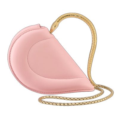
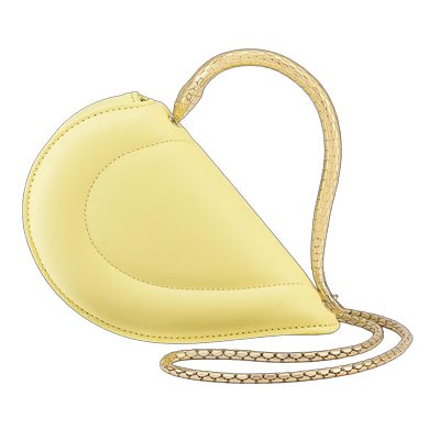
Although the current world order mostly functions as a study on uniformity and the importance of everyone being equal, an interesting theme has flourished within fashion circles: brands are trying their best to stand out, and they are doing so not just through the items they’re creating but through the packaging that they’re selling them in.
What’s the first thing that comes to mind when thinking of Hermès? Valentino? Supreme? Tiffany & Co.?
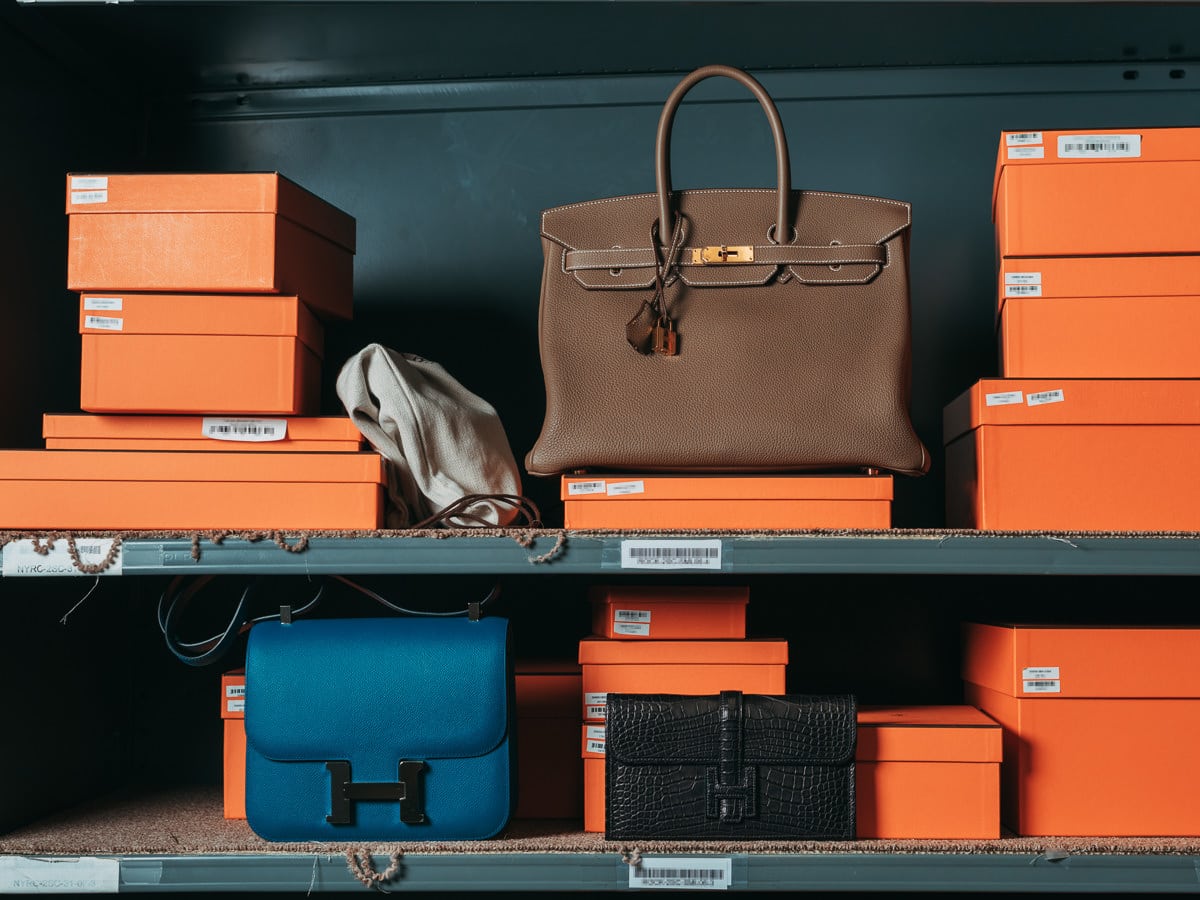
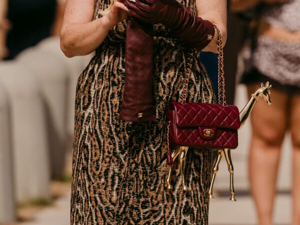
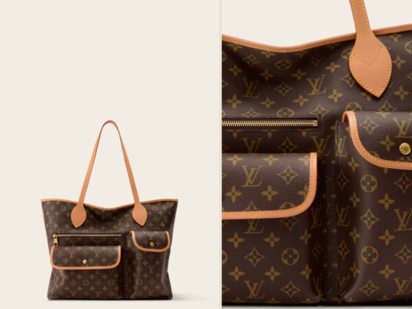
In addition to offering prospective buyers unique styles, they sell a lifestyle and an ideal, mostly through a specific color. And to do so, they have chosen hues that represent themselves in more ways than one. Carrying an orange Hermès shopping bag has become as emblematic a statement of belonging to the it-crowd as owning an actual Kelly is.
A Supplemental Logo
“Colors, when claimed by fashion companies, can act as a type of visual shorthand for a brand that can easily be spotted from a distance—or in an Instagram Story,” writes Katie Deighton for the Wall Street Journal. “They can supplement or even substitute logos and are proving to be useful tools as fashion moves further online.”
And so, Valentino pink and Tiffany blue have become part of the lingo de rigueur in fashion conversations. But how is each hue chosen?
“I think companies really want to pick something that represents what their brand is and who their customers are and the products that they are selling,” says Beth Martin, a retail display design specialist who has worked with various luxury fashion companies. “Tiffany’s, for example, sells these beautiful delicate jewels, and their blue really does kind of showcase that. Glossier’s millennial pink highlights the customer’s ethos and what they are selling. You want to choose a color that lets you stand out but also represents your customer and what you’re selling.”
The feelings that a color evokes need to correspond to the lifestyle the brand is touting and who the customer is and wants to be. Louboutin’s shoes, for example, are sexy, powerful, and usually worn by assertive, established women, characteristics that are readily related to the brand’s iconic red, a passionate hue.
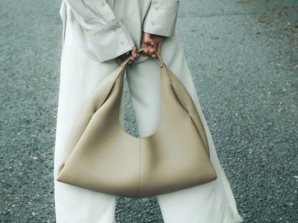
Bottega Veneta’s green, on the other hand, reminds of tradition and craft excellence while subtly relating to the company’s Italian roots.

Tiffany & Co. is by many considered the purveyor of the practice, with its iconic blue appearing on the cover of one of its first sales catalogs for the very first time back in 1945. The company trademarked the shade in 1988, and in 2001, Pantone, the standardized color system that has recognized many a fashion brand’s tint selections, defined it as a custom hue (1837 Blue) used by the brand exclusively.
An Ethos, Defined
Interestingly enough, although many brands today rely on market research and studies to land on a specific color, some of the most recognized selections through the years were born out of chance.
Take Hermès, for example, whose citrus-colored shopping bags have become the stuff of legend. As explained by Martin, the historic fashion house originally utilized cream-colored boxes that suddenly went scarce during World War II. “The only ones they could find were orange so they started using them and the color ended up becoming this iconic thing,” explains Martin.
Unlike other companies, though, Hermès has decided not to trademark its secret color. “That also goes to their branding practices,” says Martin. “They are more quiet about it and more subtle.” Color clearly speaks to many aspects of a business.
Although always important when defining the ethos of a company, choosing a color in today’s crowded fashion landscape bears even more meaning as the industry has expanded to include the metaverse. It’s no longer just about appealing to a customer through a shopping bag but about being recognized online and through other modes of direct communication with potential buyers as well.
Take Bottega Veneta, for example. The brand recently launched a new app. The logo? A simple green square.

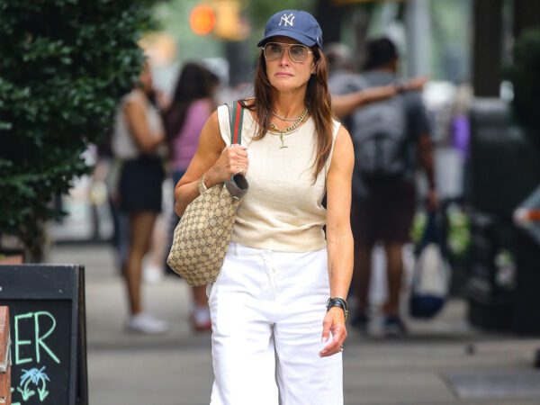
Glossier’s millennial pink, on the other hand, has sprouted hundreds of think pieces, and the color itself has come to define much more than a beauty company but an entire generation of customers, both online and off.
“When it comes to luxury goods, companies put so much thought into the packaging to make it part of the experience,” says Martin. “It’s like a magical experience to open a box.”
As is often the case with fashion, it all comes down to aspiration. When seeing someone walk down a Manhattan street holding an Hermès shopping bag, a sense of mystery kicks in. After all, whether buying a relatively affordable tie or a ten-thousand-dollar purse, the item will be packaged similarly—a fact that paradoxically makes the entire shopping experience accessible.
All you need is an orange box and a bit of certitude, and folks might actually think you’re someone who can afford a Birkin.
“…Folks might actually think you’re someone who can afford a Birkin”. 1) I “actually” don’t care what people think re: my purchases or if they some alleged presumption of me and 2) Only those in “the know, know”. What I mean is that sometimes people have no clue about the bag that’s being carried and/or they may presume it’s fake. I dress casually, for comfort, but appreciate the quality and craftsmanship of bags. Because I dress down people may think my bag is fake, which is perfectly fine with me. I quit caring what people thought about me years and years ago. Life is too short to give a damn about other people’s opinions of you.
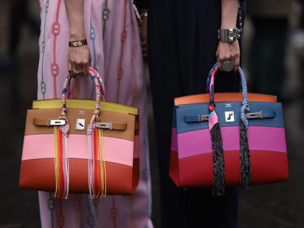
I think that if one said “only those who know, know” reflfarding the Birkin ten years ago, I’d agree with you. But given all the robberies, the mainstream attention birkins get from the likes of the Kardashians and Kanye’s ex gf, to any reality tv show, the Birkin is pretty mainstream. I recall in my mid tier grad school, male classmates who didn’t have the first idea about fashion could recognize the Birkin and knew it was really expensive.
But I’m glad you don’t care what ppl think of you, it means you’re free 🥰.
While Valentino has some gorgeous pink bags this season, their signature color is red.
I find it very weird that a company should be able to trademark a color.
Bottega Green was just introduced by the sacked, tacky and uncreative designer Daniel Lee. The real color of Bottega Veneta has always been in the shades of brown (ebano and espresso). It represents classic and understated luxury. Before I used to think of Bottega as Hermes’ Italian equivalent. Now I thought of it as just Balenciaga or just below Celine