
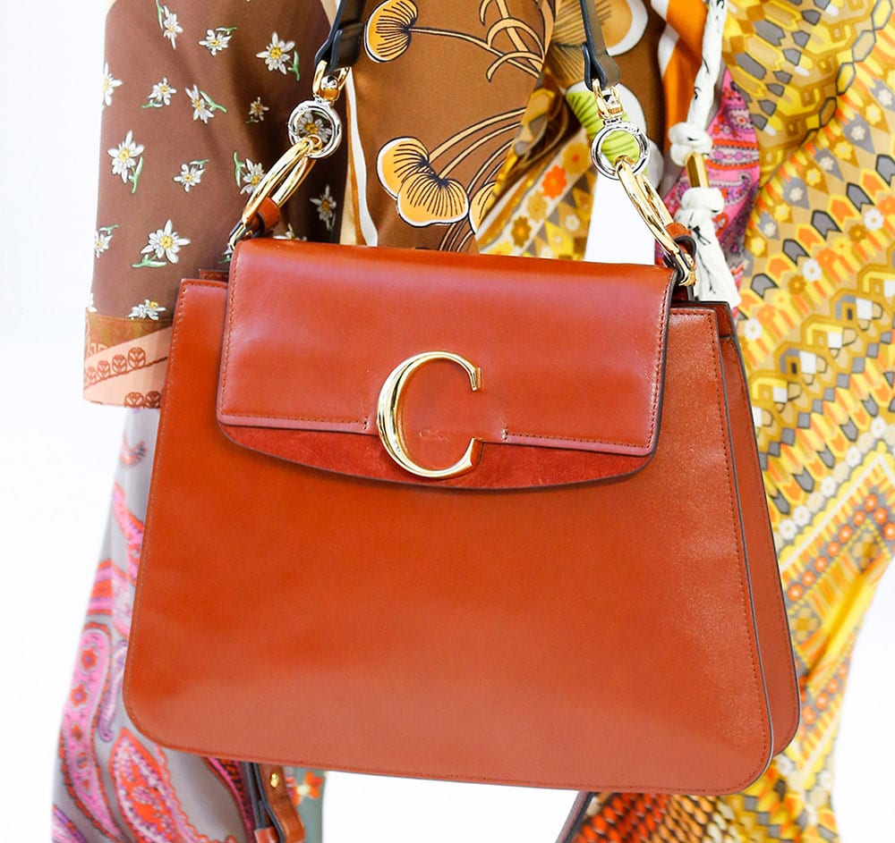
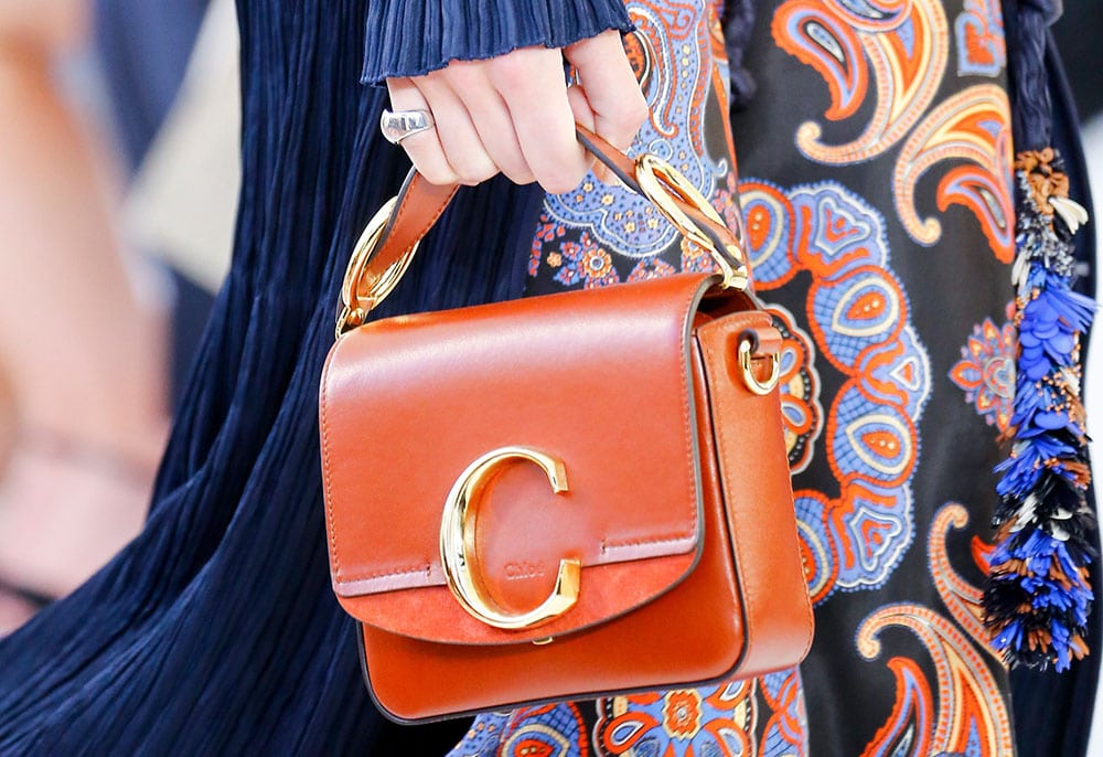
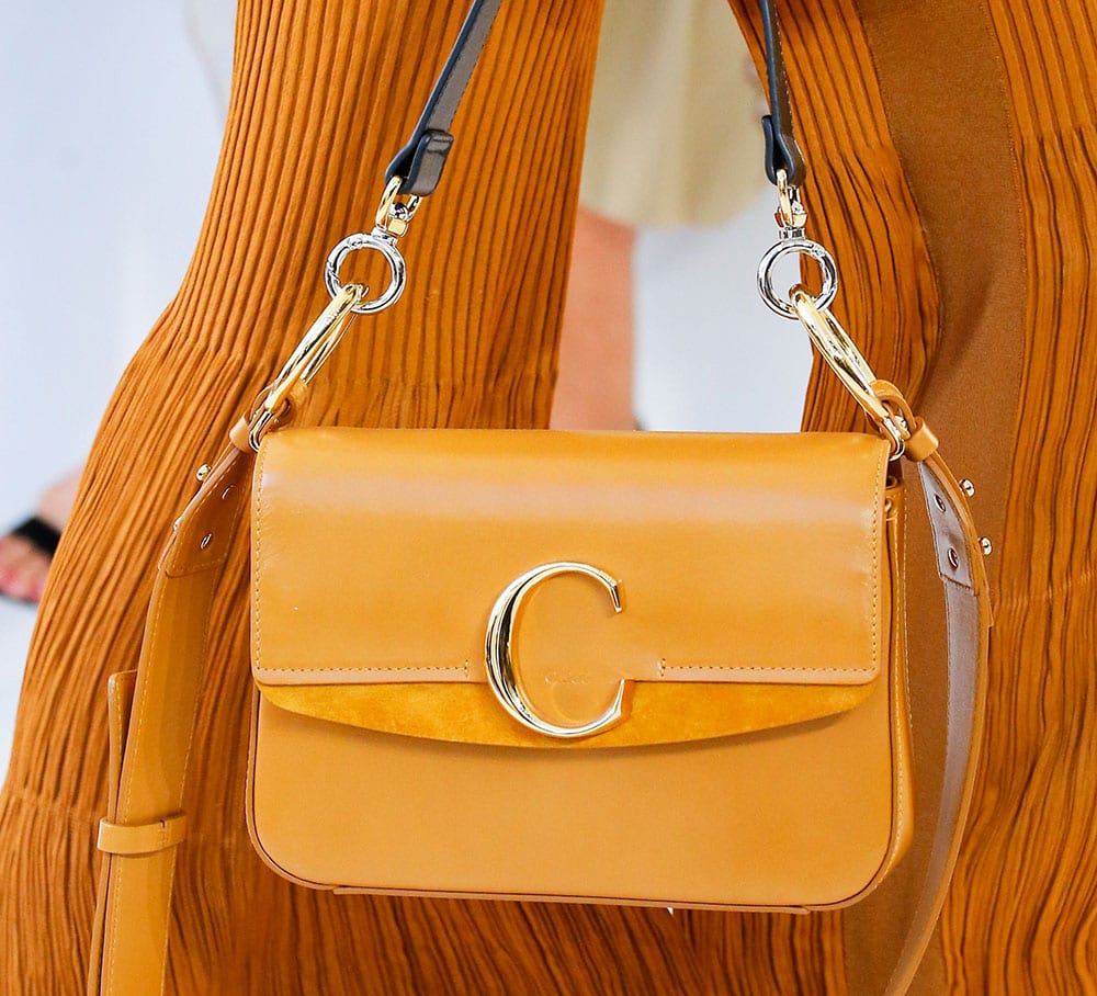
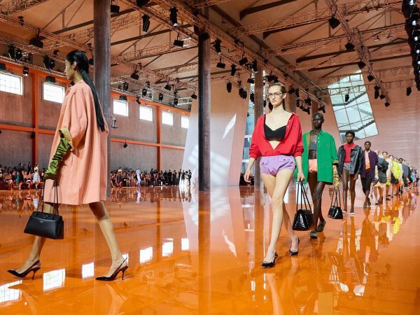
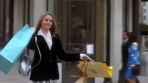
I think there are too many Cs. By the time this article gets published, Chanel‘s show will have already happened in Paris, and between that, last week’s Céline show, and this Chloé show, I’ve looked at too much C-shaped hardware to move forward. The brands need to argue among themselves and decides who gets to keep the C. I’m guessing Chanel will win, and they should. But, truthfully, I don’t care who ultimately gets ownership of the C-shaped hardware closure for flap bags. I just want to see less of it.
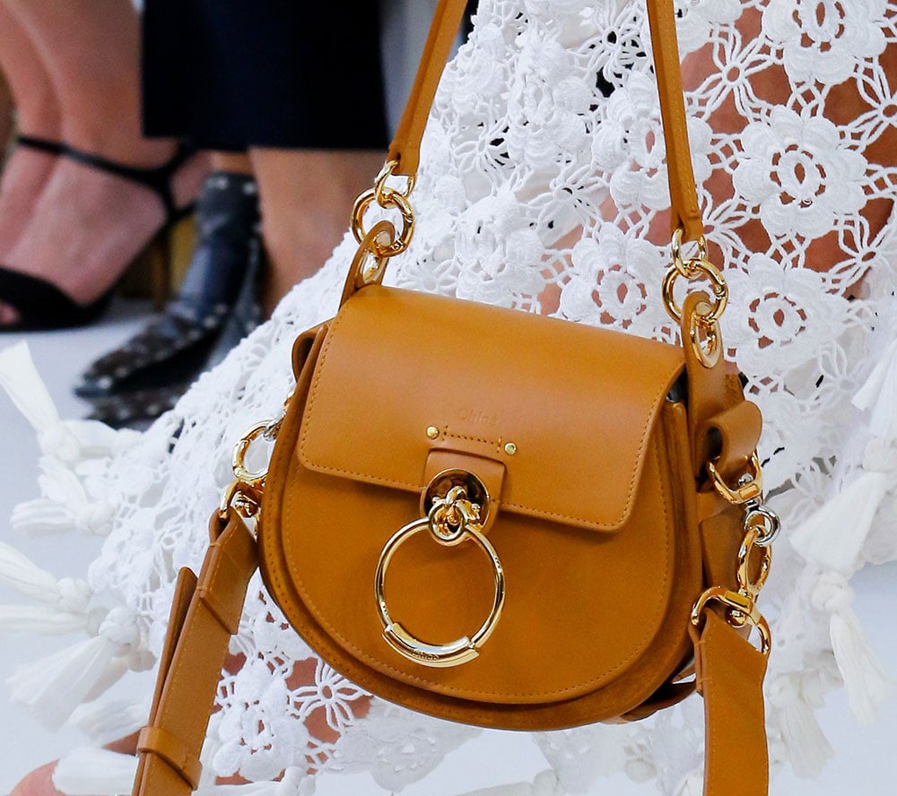
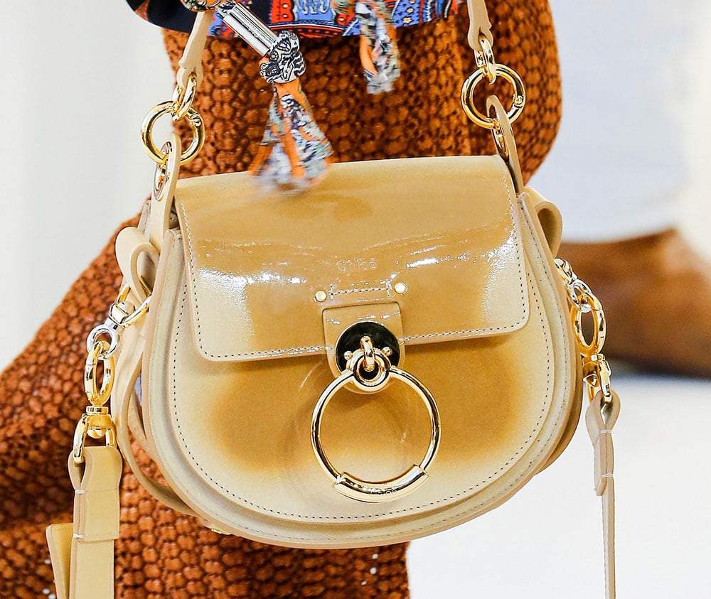
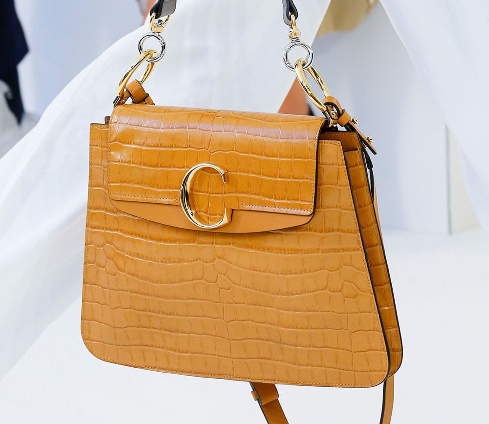
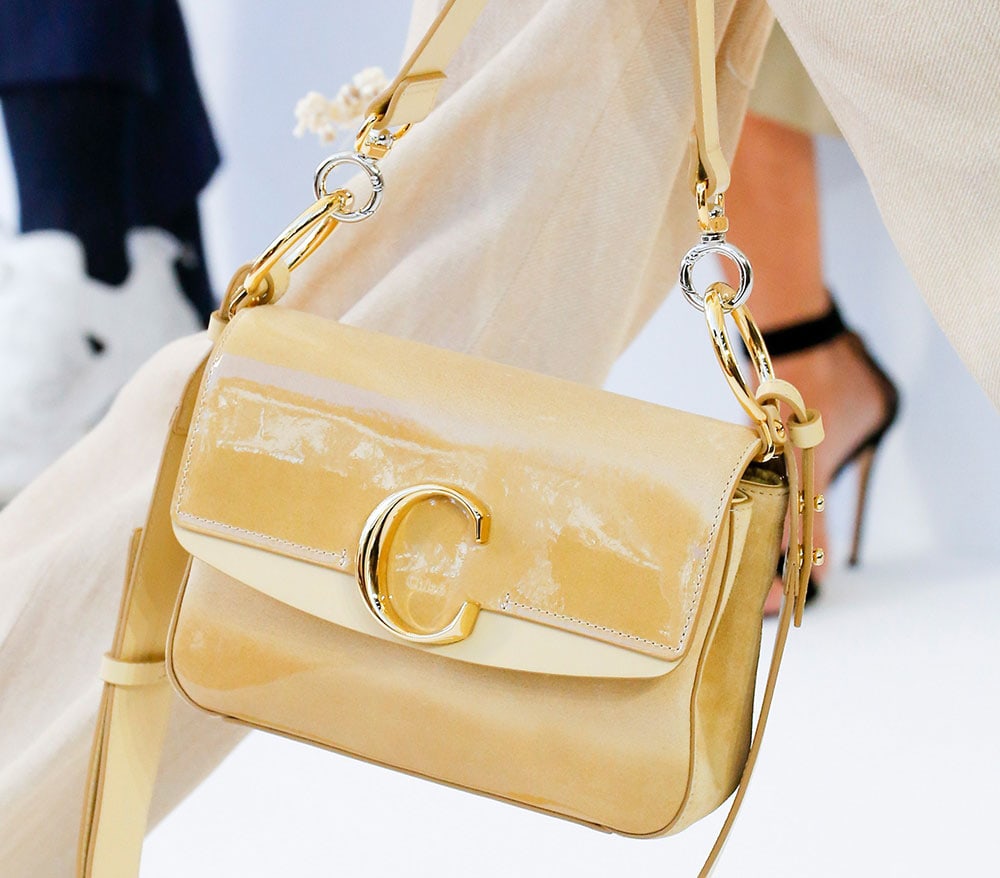
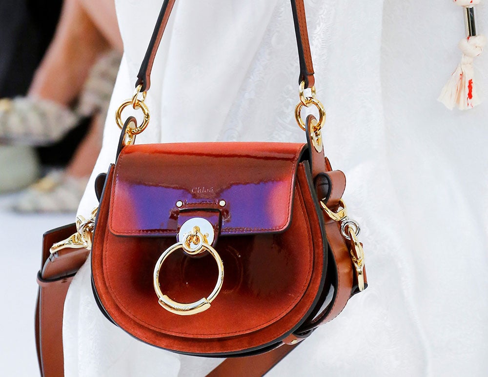
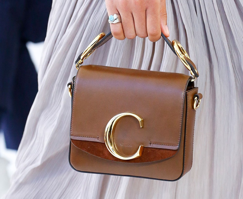
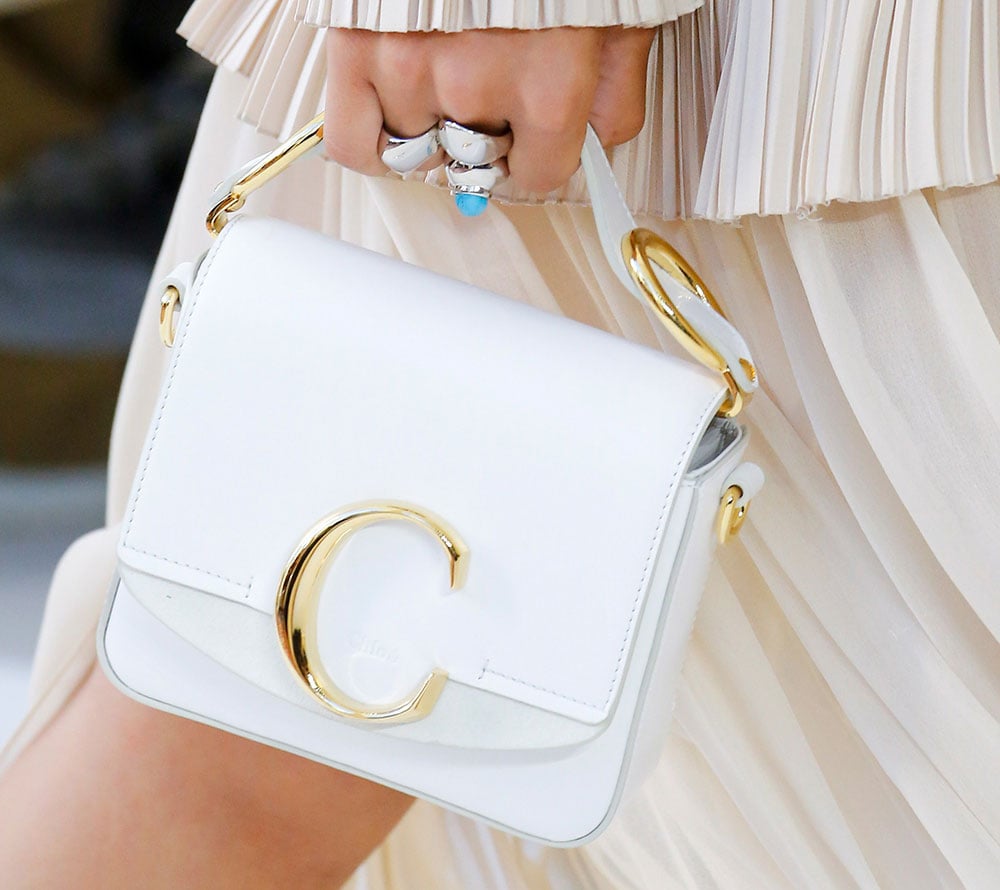
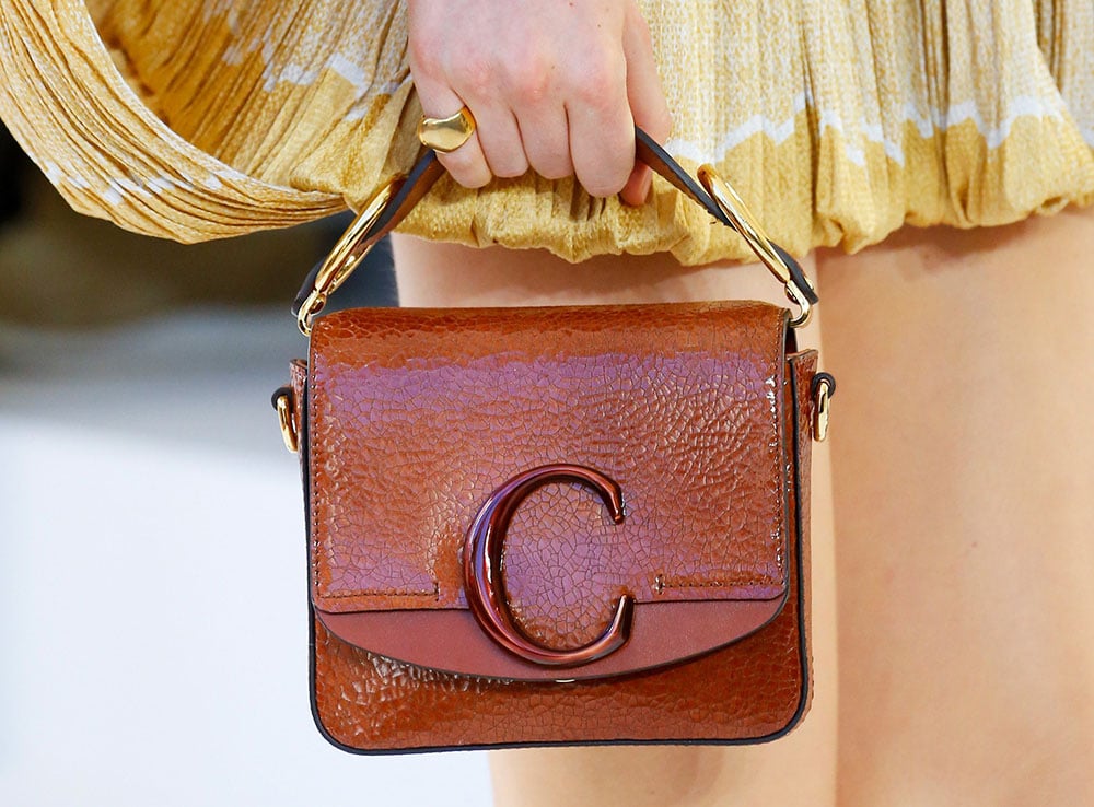
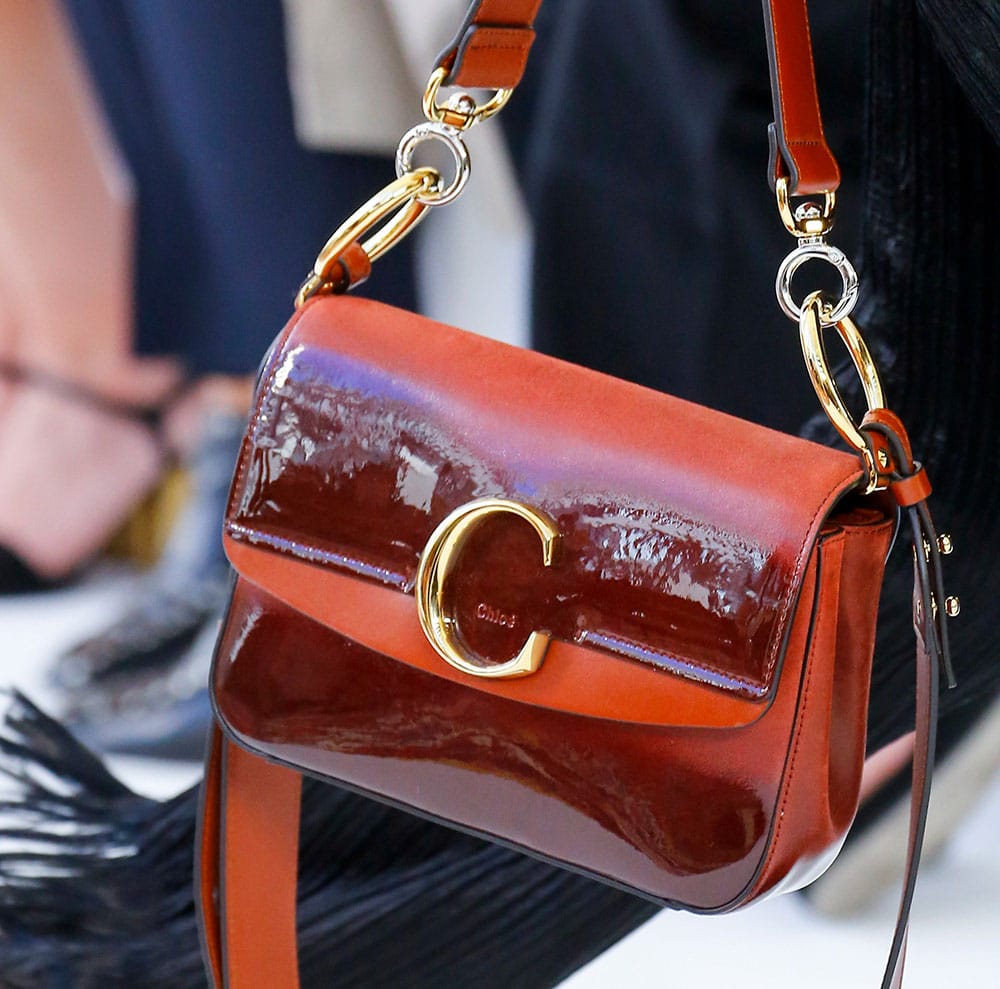
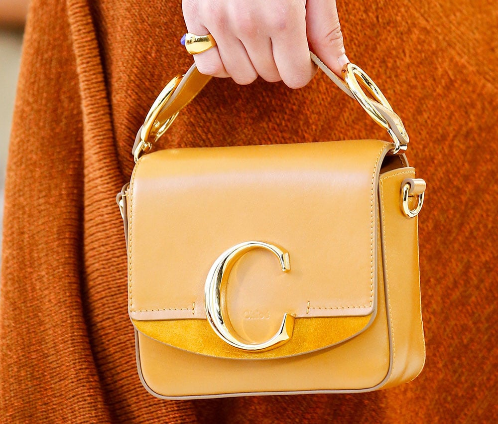
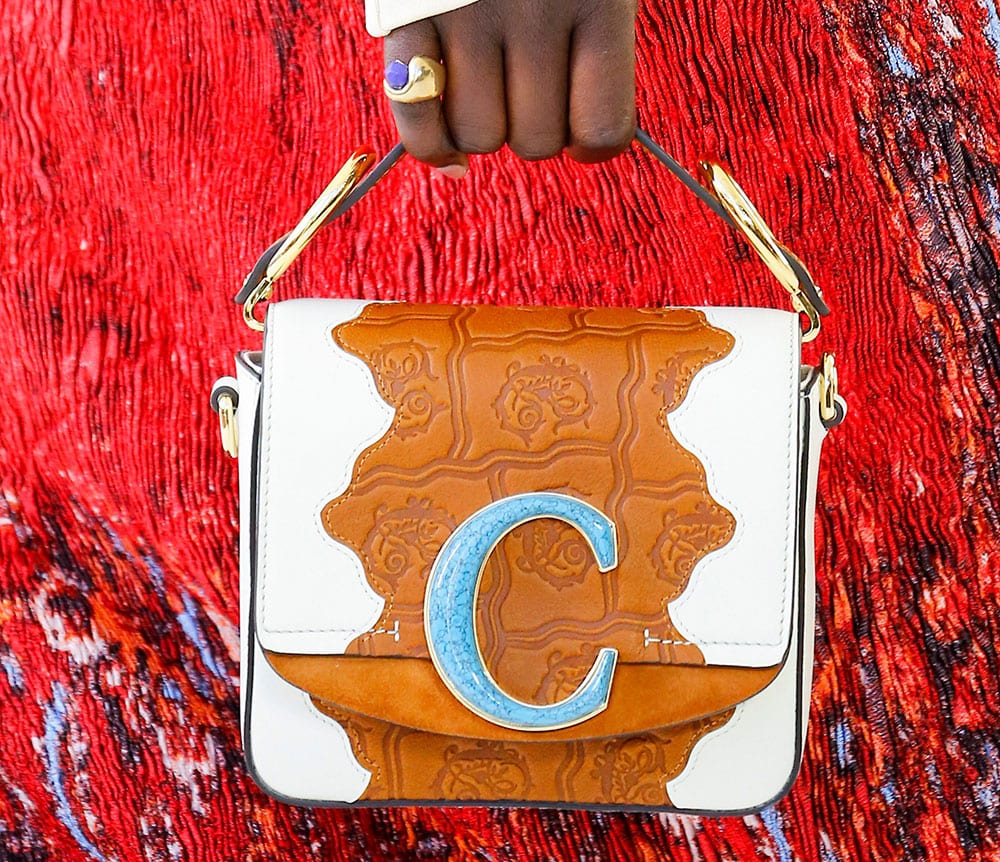
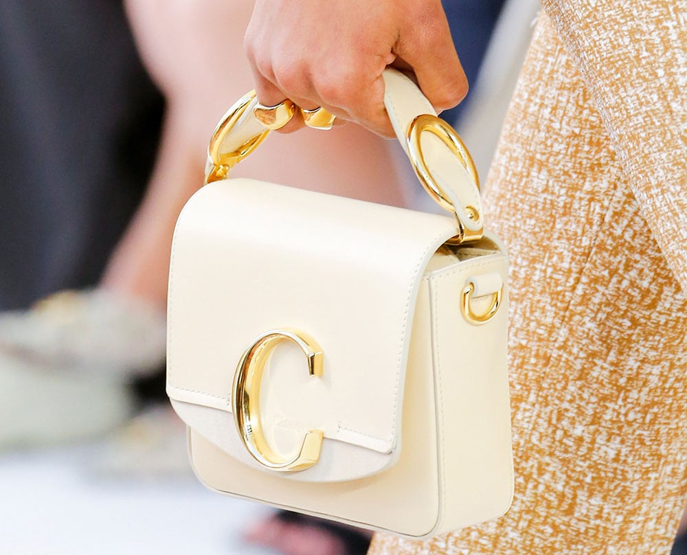
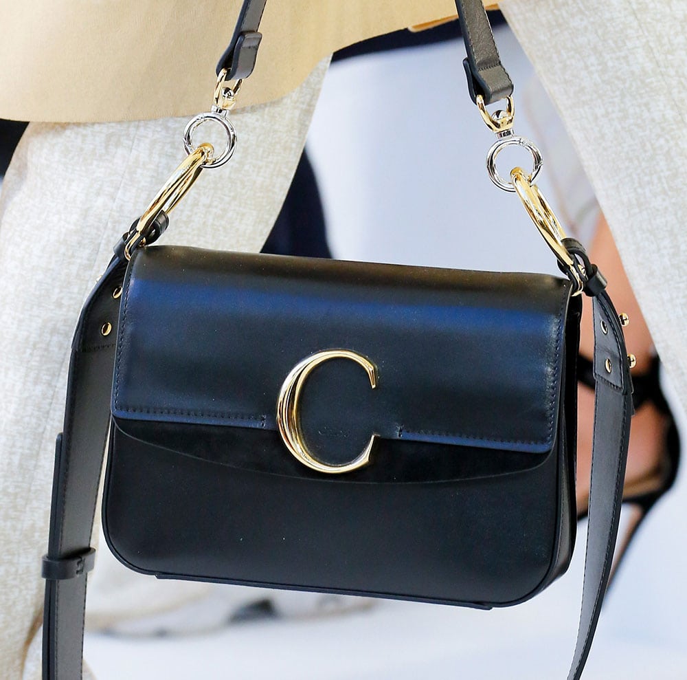
In Chloé’s otherwise strong show, there were tons of silver, gold, or enamel Cs dotting bags small and large, a continuation from the brand’s Resort 2019 collection. The implementation on these bags was slightly better, but a logo’s purpose is to be distinctive, and this use of the letter is anything but. That’s not entirely Chloé’s fault, but it’s Chloé’s reality, and the omnipresence of the logo hardware felt like an aesthetic crutch for a collection of bags that was otherwise not all that interesting. There was a lot of tan.
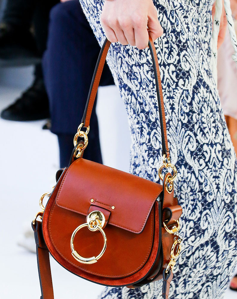
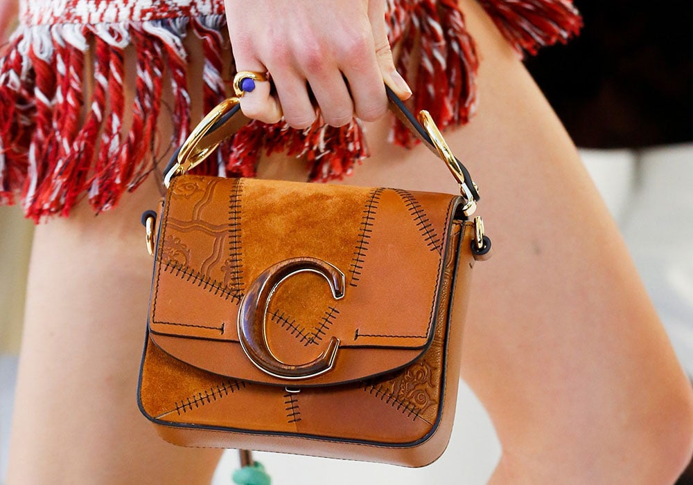
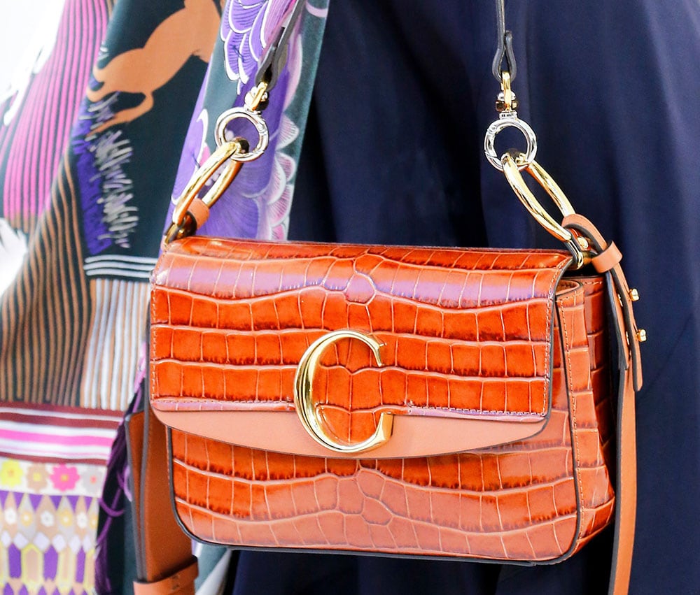
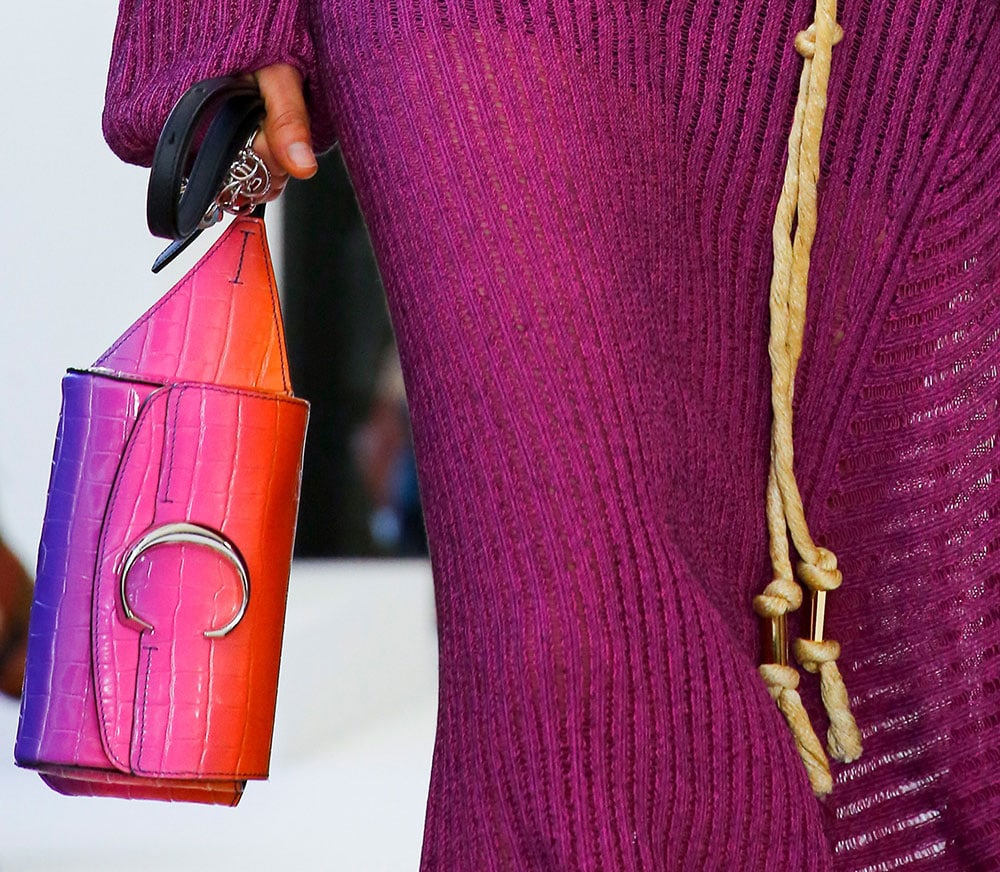
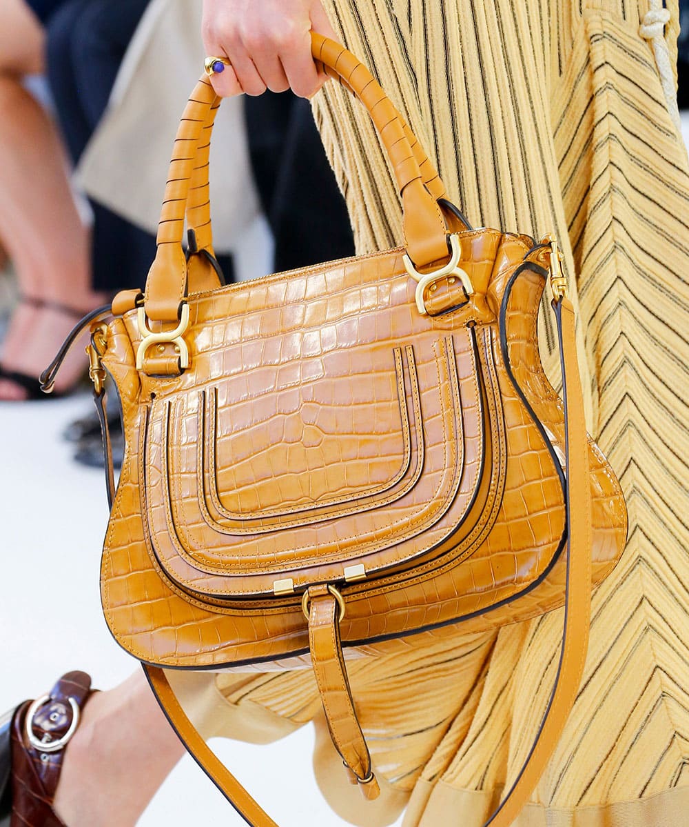
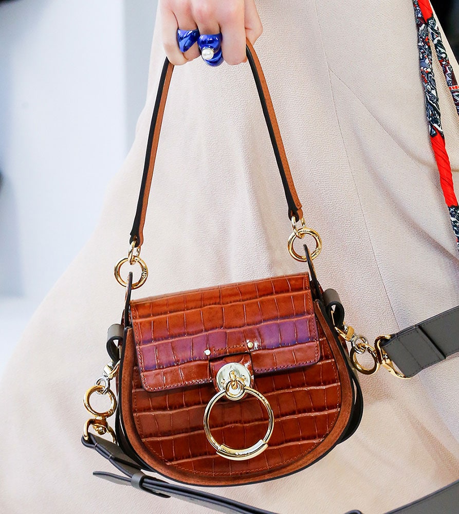
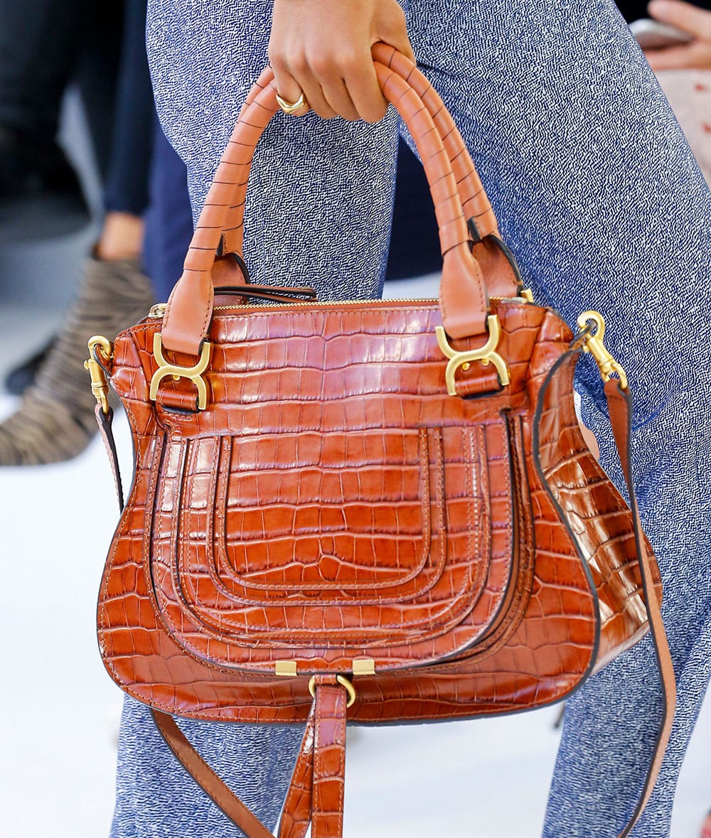
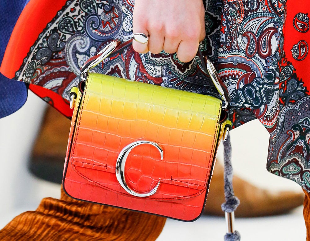
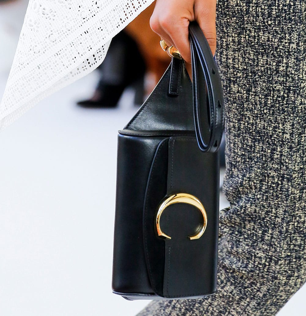
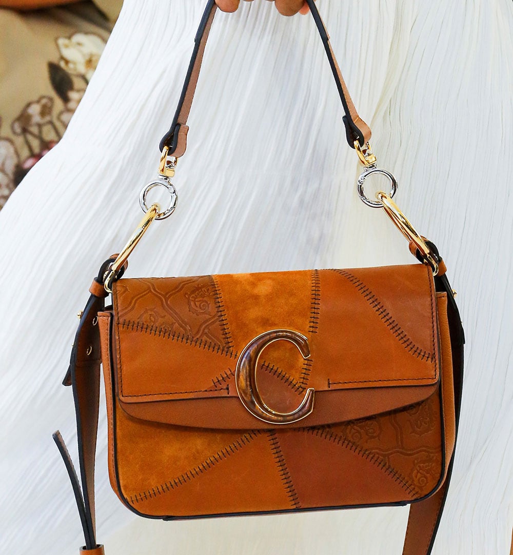
The high points came when Chloé diverted from the tan-colored C-bags. A brilliant green-to-orange gradient made one of the show’s most omnipresent shapes feel much fresher, and there were new versions of the Chloé Tess Bag, which looked intricate and detailed when compared to the show’s more common pieces. There was also, delightfully, a reappearance of an old favorite that hasn’t seen the runway in years: the Marcie, redone in croc (croc-stamped?) leather, a welcome blast from the past. Check out all the bags below.
[Photos via Vogue Runway]

When I saw the pic on your homepage, I thought the same thing. Stop with the Cs!!! And for that matter, the Fs and the Vs—all the big letters. Ugh!
Hmmmm, I don’t think bags are NRL’s strong suit. Chloe has churned out hit after hit for the past 10 years, but none of these seem like original it-bags. The Tess is a revamped Drew and the new bag is a revamped Faye, then the new boxy bags are very boring. I liked CWK’s work better, but the show overall wasn’t too bad.
Who are you wearing?!?!
Is that a coach bag? A Chloe bag? Or a Céline bag??? Sorry… Celine…
Over it.com/getanewlogo
A guy once saw the CC Hardware on my Chanel and asked me if it was Coach LOL
I think I’d break out in hives. Ugh. The WORST. I hope you didn’t even answer.
LOL
I am gonna say, I’m in love with that little square one! It’s so cute! Call me basic. Whatver. I’ll make an exception. If I don’t end up liking the flap bag from Celine, this one will do. It’ll satisfy the square bag, C logo craving just the same.
i dont dislike the “C” logo and it may even look good on the right bag such as # 11
I was going to say the same as your opening paragraph.. and to add to it, not just the Cs.
I am officially on overload of large metallic Letter Logos. Enough!
Honestly this is the most disappointing handbag season I can remember in a long time.
I agree, this season has the worst bags in years.
OH, CHLOE is spelled with a C!
It looks like the C wonder logo. Go to qvc for reference point.
C for C%^T lol
We should all go on a shopping strike. Refuse to buy anything until designers come to their senses and stop designing for Instagram.
Judging by the comments on here, it seems like no one is buying these kind of bags. Makes me wonder how these businesses are staying afloat!
YES!
Your first paragraph made me laugh out loud and it’s so true! The new designs are ugly. 🙁
These bags are amazing! The structures, the colors… can’t even fathom that people think they’re ugly. These are going to be hits, I’m calling it now.
Okay, some of the bags are actually quite nice, but I am distracted by the Giant C. I like the new materials on the Marci, which will always be one of my favorites. But the giant C could be Coach, and also Celine, who is also going with large C’s now.
I’ve always liked the subtle “Chloé” embossed in the leather.
Coming from the Celine post, these bags look good.
Oy…
this past week I think I’ve been redirected to TJ Maxx instead of Purseblog. HELP!
oh no….
Chloe is already known for their distinctive hardware, they didn’t need to go the route of creating a letter logo. I get that logos are seeing a resurgence, but … just no. Not feeling it with Celine, not feeling the new Valentino, and not feeling this.
Not very impressed with the details of the bags but I do like the proportion of the bags and shapes. I especially like the the ombre effect leather, the should have used that more, it would have punched up the bag collection a notch. Also really like the asymmetrical wristlet?, shoulder?. Totally hating the “C” logo.
The croc marcie saved the show. The large C is just hideous.
Ugh. Reminds me of Guess bags you would see in the mall circa 2004
Wow they look Cheap alright. I though celine was bad but this is definitely worse. Never liked any chloe bags though
being someone who enjoys dressing in chloe for most of my life im happy with the show in terms of pret a porter the clothing to me has less hippy more edgy side to chile while still keeping its easy flow so easy edgy …… i have never liked nor enjoyed chloe bags but i must say they are not looking good ……. im sorry but…. they seem so common… i do hope they do better ……
That croc Marcie!!!!! But the large Cs look like cheap plastic to me, at least in the pictures.