It’s rare that color causes a real obstacle to my appreciation of a particular design. Although not every color fits into my wardrobe, I can usually see how they might fit into the wardrobes of others, and thus, I can appreciate their merits. The middling beige-tan color of the Marc by Marc Jacobs Framed Hobo, though? No thanks.
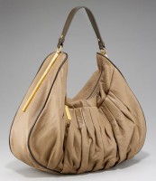
If I were in a diplomatic mood, I might say that it’s the color of a latte. Instead, there’s a grey undertone that I just can’t shake, no matter how faint it might be, and the wrinkly pleated leather at the center makes it sort of look like brains. There, I said it. Brains. Does anyone else see it, or have I had one too many Diet Cokes today?

It’s just a little too squishy and beige. If it was squishy and, say, red? I’d be all about it. Purple? Great. Even black or a blue-undertoned grey would look great, but the combination of the leather and the color is just too off-putting. Other than that, the texture of the leather looks oh-so-touchable and the shape looks perfect for everyday use. Eventually this design will arrive in other colors, and when it does, I’ll be glad to forget about this one. Buy through Neiman Marcus for $498.


I don’t care for the color much and your description is stuck in my head! hahaha (ipad)
It may be squishy brains, but it looks like huggable leather! (ipad)
I love the leather, but to be honest, I don’t really like the bag itself. The shoulder strap looks like it’s inadequate compared to the rest of the bag which looks quite substantial.
I would really need to see it in person.
At first glance, I liked the bag but after reading your description only one thing stands out, BRAINS!(ipad)
The shoulder strap looks so weird- tiny and thin, compared to the rest of the bag!! I do actually like the color, and I don’t mind if it looks like brains. (iPad)
love the style, but yes, definitely in a different colour… something more bold… (ipad)
I don’t like the strap, the color, or the brains(ipad)
I like the shape and I like the colour, but for me it’s the pleating that makes it unworkable. (ipad)
BWAHAHA!! Brains?! Hee.
I actually don’t mind the color but I’d need to see this style IRL to know whether I truly like it. Anxious to see what other colors it comes in! (ipad)
Ugh, yuck. I don’t wear tan or salmon colors on my clothes or bags, so this is an automatic no for me. (ipad)
It’s strange to structure the depth of the bag (and add contrast piping!) while pleating the front. I’m with you, Amanda – this would work with another color. And hopefully new permutations will leave out the contrast piping! (iPad)
Go easy on the Diet Cokes Amanda. =) LOL! Actually, I see intestines…..Like the color, but not feeling the style. (ipad)
Omg I didn’t see it before, but now it’s all I can see (the brains). How unfortunate b/c I think the basic shape isn’t so bad, just poor execution.
http://highmaintenancewoman.blogspot.com
Nordstrom carries this bag in black!
This is available on Zappos in black or white and it is worlds better (ipad)
It does look better when it’s in black and more filled up so the pleats line up more smoothly. I don’t care for this color combination nor the contrast piping. It looks kind of cheap! (ipad)
boring! (ipad)
beautiful bag! I’d love to smell it! (ipad)
hm…too wrinkly (ipad)
haha! i actually don’t mind the color but would definitely prefer it in a bright pop of color. (ipad)
I have no problem with leather pleating (or squishy brain leather) but the color is too pale. The alternate color trim around the bag is awful. (ipad)
You are right on with the BRAINS. I wanted to like this bag, I think I was attracted to the touchable leather but I have to agree with you.
I like the hobo shape but not the color (ipad)