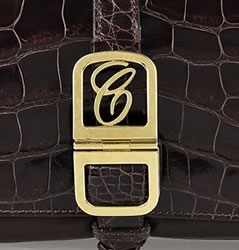
We are not accustomed to Chloe having a cursive C emblem on the front of their bags. Actually, so not accustomed to this that I had to not only do a double take but also a triple take to make sure this was the Chloe brand we know so well.
The rest of this bag is entirely simplistic, as an alligator shoulder bag should be. The Chloe Emma Alligator Shoulder Bag shows sleek and sophisticated dark brown alligator skin and golden hardware. It is the golden hardware that caught my eye which is where we see this new emblem Chloe is using. I must say, the accessories from Chloe the past few seasons have not been as strong as others. Available via NAP for £5,805.
What do you think of this bag?






I think I like the emblem and it’s the bag that looks outdated.
super tacky
AGREED!! Looks like a hotel chain’s emblem.
The bag itself is great. The emblem reeks of insecurity on part of the manufacturer.
I thought Chloe was so La-Ti-Da in its distinction that no emblem was required. There are Chloe bags that I adore, but I’ve not purchased any.
I have some Bottega, but if they dare start putting emblems on theirs, I won’t buy them any longer. People who know, know.
Don’t get me wrong, I have some LV. When you’ve been around a million years and are part of generations of nobility, you’ve earned your iconic stripes (and “LV’s with flowers”)
As far as I’m concerned, Chloe is not in THAT league. It may have been on its way, but this cursive C business definitely stands for Cheesy and Clumsy. A Cartier you are NOT.
i hated it but didn’t vote that part because its not cos its ‘outdated’
i recall the first time i saw this i was like ‘eh’ i hope the emblem passes..not so.
the C doesn’t look like its classic enough to pass through time..while the bag does, so the two doesn’t jive
not to mention if you drop that much for a bag you don’t want it to have a casual, doesn’t look well thought out–fresh out of art school with a graphics degree ‘designer’ designing it.
I have this bag in black calf/lambskin. It is TDF. I did wonder about the emblem when I bought it – was surprised it was Chloe. I like it – it’s not too showy and I like the extra sophistication it brings. I give it a thumbs up.
It looks like Estee Lauder’s emblem, something you would get free with your purchase at Macys, yuck! Do over!
OMG i knew it looked like something familiar!
Agreed! It just looks old farty and cheesy…I definatly don’t like it in the gold tone, it looks very cheap and cheapens the look of the whole bag. Intially I thought it looked like a cheap faux croc because of the emblem.. :\
I’m in total agreement! It’s a VERY special gift with purchase.
+1
Estee Lauder is exactly what I thought when I saw it too.
I’m with with whit – I didn’t vote even though I hate it – I don’t hate it ’cause it’s “outdated”, I hate it ’cause it’s cheesy and, as Ann said – very “gift with purchase”… ick.
Changed up the wording a bit – you both are right – it is not outdated, it is just not liking the emblem
looks really cheap =/
come on chloe
Attempting a “C” logo is to be avoided, Chloe!
Chanel, Cartier, and Coach — none of them told their designers to pick the second best “C” logo available.
Chanel and Cartier have “C” logo wrapped up. Céline seems to know that. Chloe needs to learn it.
At least they could have spent some money on a proper logo. This “c” is undesigned and generic.
does anyone know if a prada handbag numbered BR2247 is real? please advise? thanks, vegas50s
Nice Post. I dont know if every blog needs conversions! Or is conversion = interaction?
Because the interaction between a blog and its readers is so necessary! And tbh a funblog
can also have funny title and less points of interest,l if its done well!
Hate it… kind of reminds me of Estee Lauder, not sure why.
just imagine this beautiful bag without the hideous “C” ! this kind of logo doesn’t work on an exotic bag!! by definition an exotic bag should stand only by its fabric not on bling bling things all around!
I’m surprised by Chloe maison’s choice…such a mess!
i don’t like it. it looks like some kind of cheap high street emblemi agree with some that the bag and the hardware both look dated and bordering in the vintage-would-i-buy-it-or-leave it in the $20 bin that i picked it up from?
please go our google photo room,we offer lots summer spring fashion-apparels with our detail informations.
you will save more than 50 off for every styles handbags!
I like the logo but not on this bag. Maybe on something else that has a tongue-in-cheek vintage yet modern feel to it.
Unless a logo is the size of my head, I don’t mind. A visible logo is not a deal breaker for me.
looks very tacky….
It is not a tacky hideous etc. “C” – its a rather generic “C” which I can live with BUT it is almost identical to “C” in CHOPARD – have a look yourselves at http://www.chopard.com
that’s what i was about to comment… it is SO alike!
it looks cheap
Love the bag. That emblem however looks cheap.
the font is very much similar to estee lauder. i don’t think chloe really need that.
It reminds me of Celine Dion haha
The new emblem is horrid! Cheap and generally unattractive looking. Definatly not up to par.
The “C” is the same font as my handbag line, Cousin & Co. google us!
I love Chloe and have purchased two Chloe bags this year, and I have my eye on a few others. But if they start using more of this logo, I won’t be a repeat customer. It’s sad 🙁