Over the weekend, Burberry debuted its Fall 2019 collection, and though it wasn’t very bag driven, the bags that did come down the runway provided us with further insight into Riccardo Tisci’s new Burberry. Tisci has continued to make his mark at Burberry, and it’s incredibly apparent with his latest collection for the brand. Tisci has always been inspired by streetwear, and his affinity towards it was ever-apparent during his incredible reign at Givenchy.
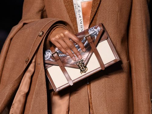
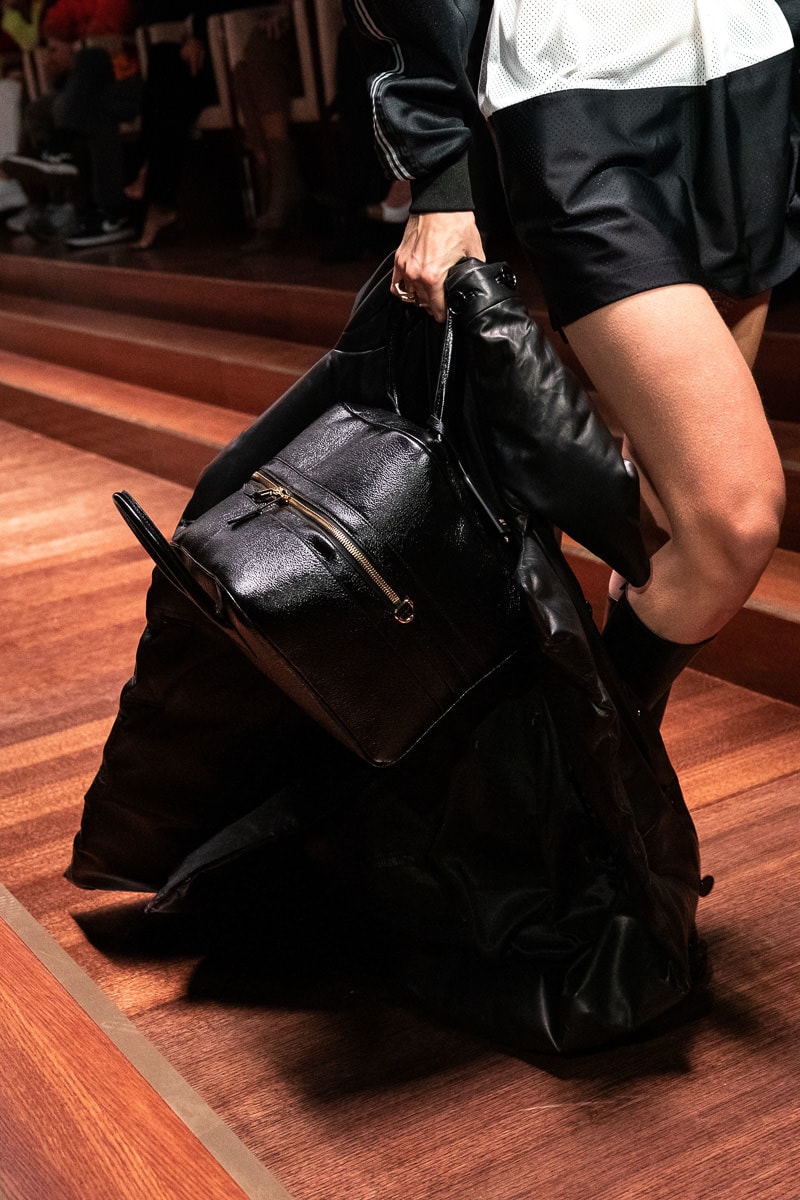
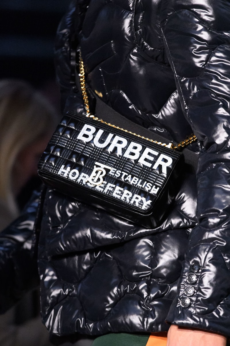
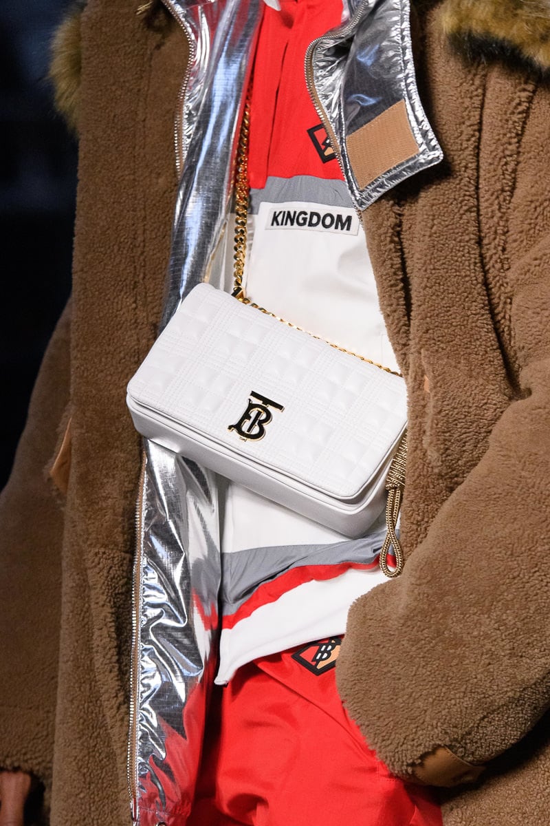
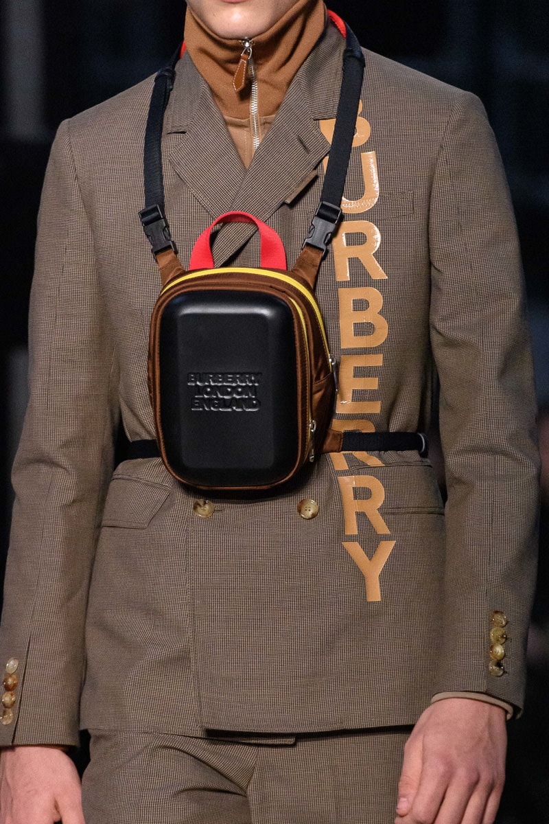
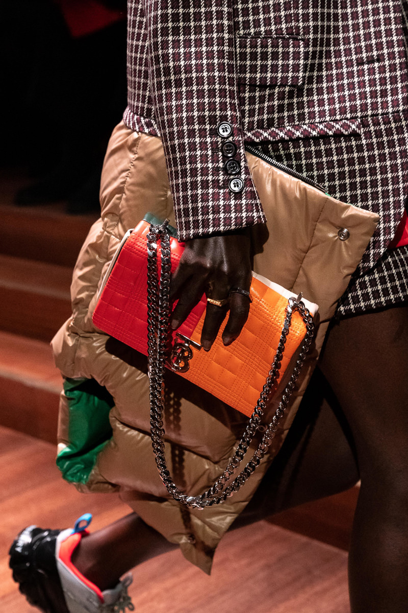
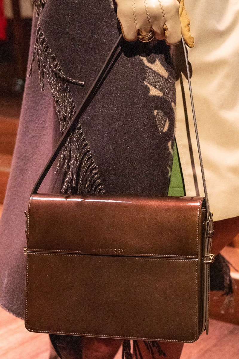
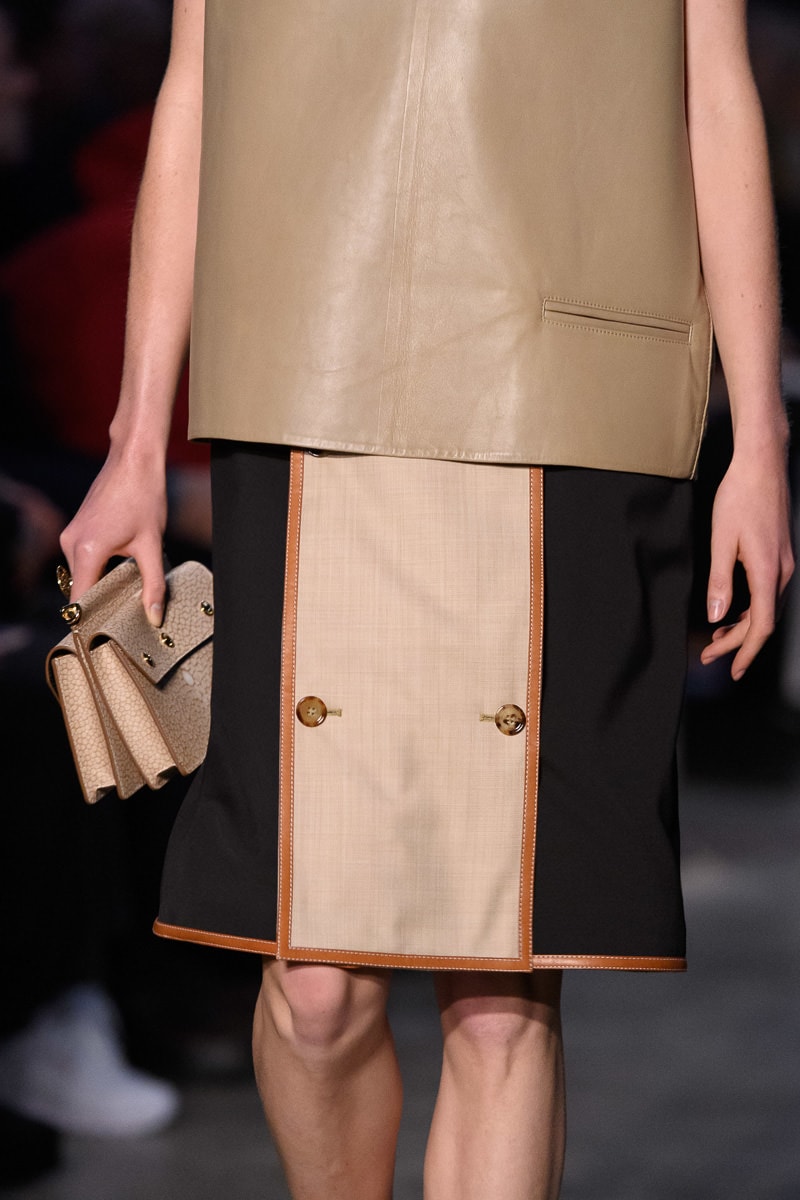
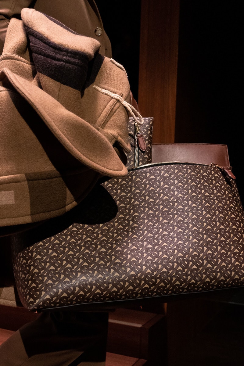
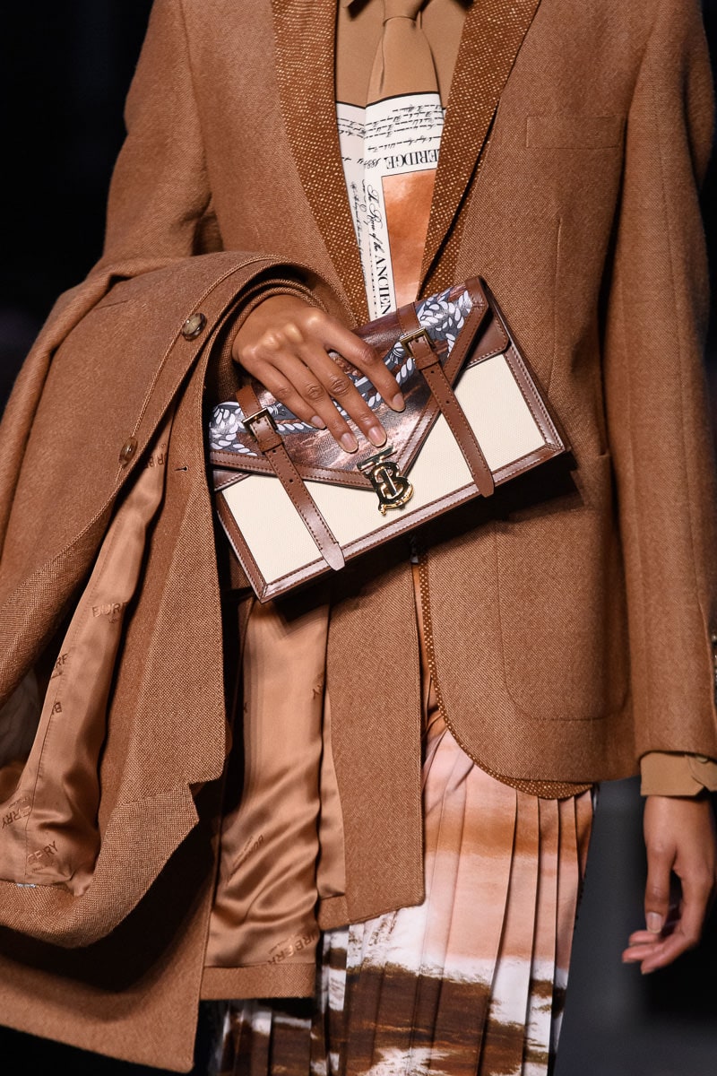
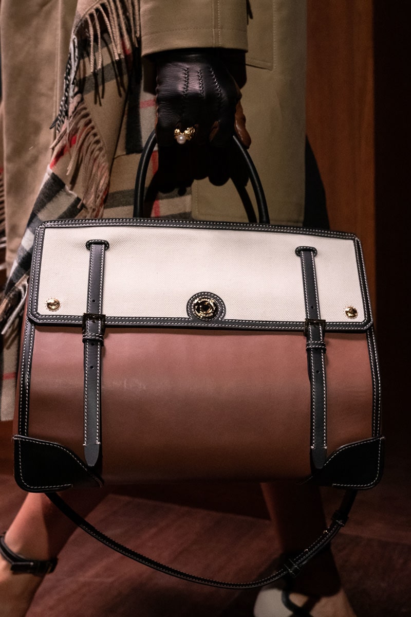
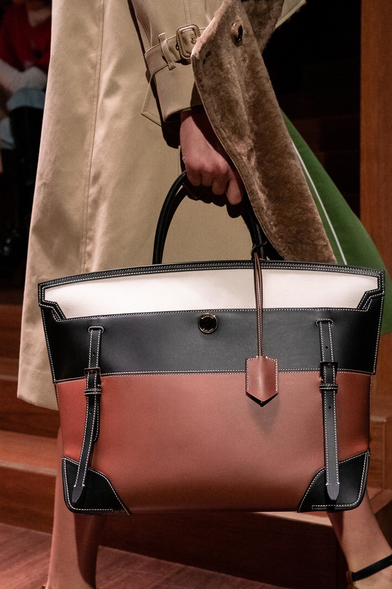
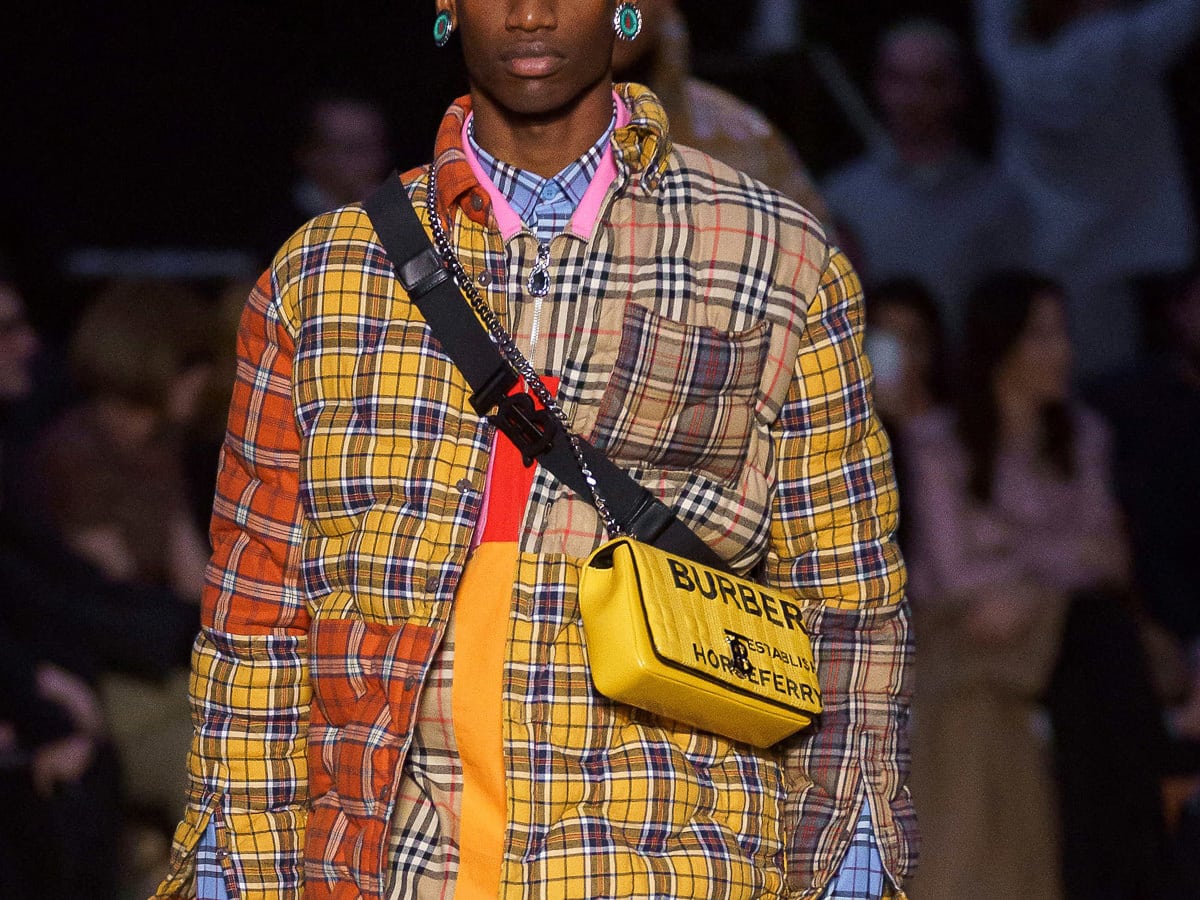
There were body bags, cross-body bags, structured bags and logos galore. Most interestingly, Burberry’s iconic checkered pattern was noticeably absent from Tisci’s bags. The top-handle day bags from previous collections are structured, but sleek, standing out in striped color blocking. The collection also included quilted, and textured leather flap bags, complete with Burberry’s new ‘B’ hardware. Other versions appear to be screen printed, emblazoned with ‘BURBERRY’ in big, bold lettering.
[Photos via Vogue Runway]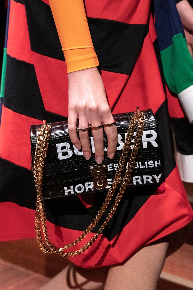


I’m predicting that these bags will be on the arms of Instagram models who have failed to develop a sense of style and they will wear them for three months or so and then move on…
My goodness, those are pretty awful
TB logo = No thanks.
The only decent bags in the bunch are 8, 11, and 12.
Can we talk about the nice garment in slide 8 that has been ruined with the giant lettering? If one thinks this is fashion, then one’s an idiot.
where that noose sweater
My eyes are bleeding after looking at that TB monogram
Ricardo will ruin Burberry, yikes!
I mean and here I was thinking there wasn’t a way to ruin it. Burberry to me is the Coach of Britain lol
i loved burberry prorsum – i have some pieces which are my favorite!
Le Sign
So much going on with bag #5.
They look like copies of so many other designer bag styles. Nice to see the big logos on the side least one forgets what one is carrying!
10-13 are ok. The rest – how can you be taken seriously carrying any of these? And on the other side of the spectrum, none of them are nearly fun enough.
I only liked #10; 11 & 12 are ok. The rest are simply horrible. I’ve never liked the bold logo emblazoned on anything, and this collection is a perfect example of why that is.
what a monstrosity
Cant believe Burberry is even going in this direction, over all the look lacks taste. shiny quilted slings with big logo printing so tacky. and some bags look even cheap versions of mulberry. . . . i feel bad for Burberry.
eeeew
The suite in pic nr 5 would be quite nice if it were not for those awful, giant letters. 🙁
Burberry, even though Karl Lagerfeld died there is no need to cry so much that your designers obviously went blind. Take a few days off and check again, please. Thank you.
it looks like many of these bags are trendy items that will be sent free to instagram influencer to pimp out.
i would carry a burberry workbags if they had something nice but this brand doesnt have any luxury allure when it comes to bags. i still associate burberry bags with grandmas.
OMG! They’re plain ugly. And the “T” doesn’t make sense.