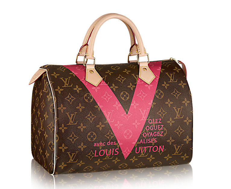
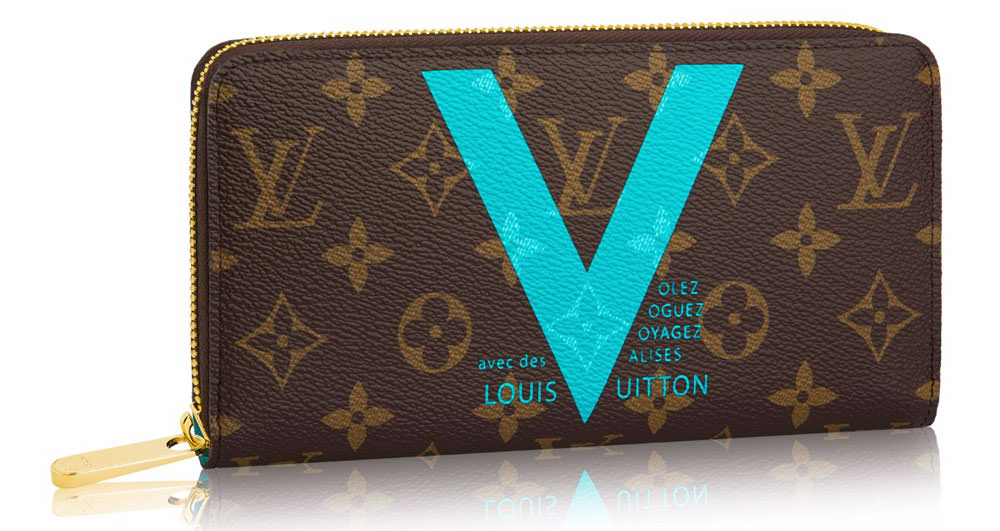
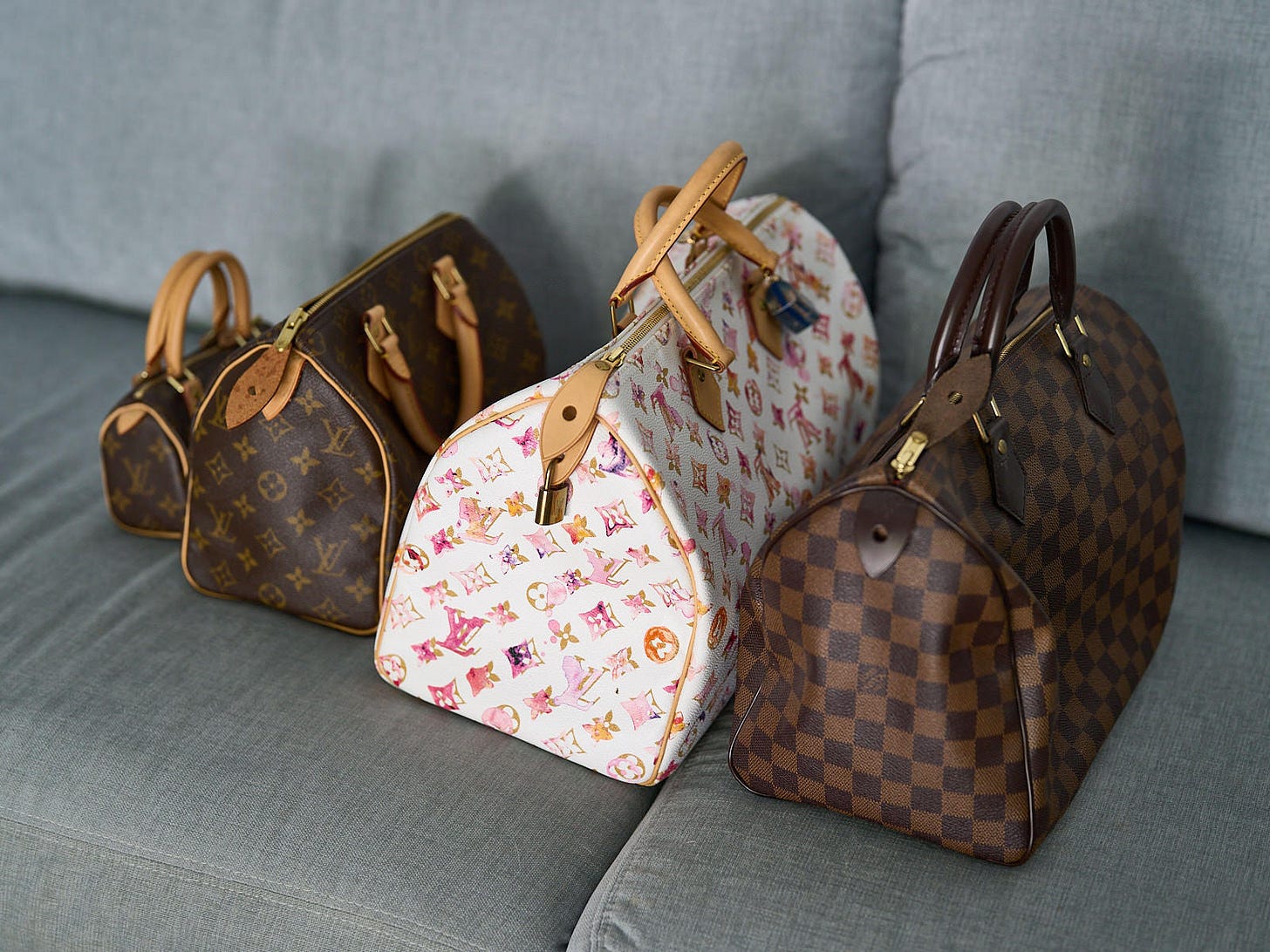
In order to keep its huge fan base satisfied, Louis Vuitton has reinvented its iconic monogram prints in dozens of ways, starting during the tenure of Marc Jacobs as creative director. That tradition has continued under Nicolas Ghesquiere, and for Summer 2015, the brand has released a series of bags in two new prints.
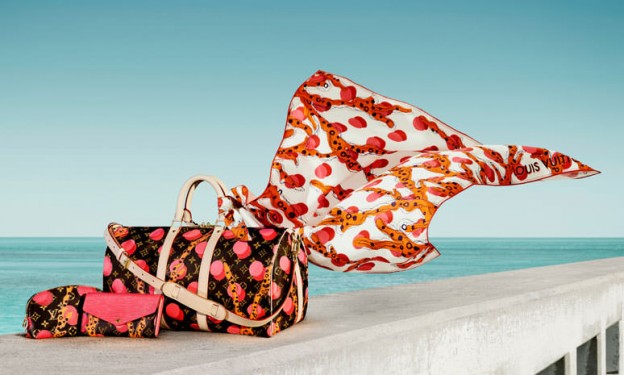
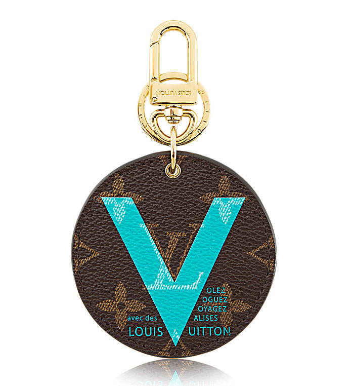
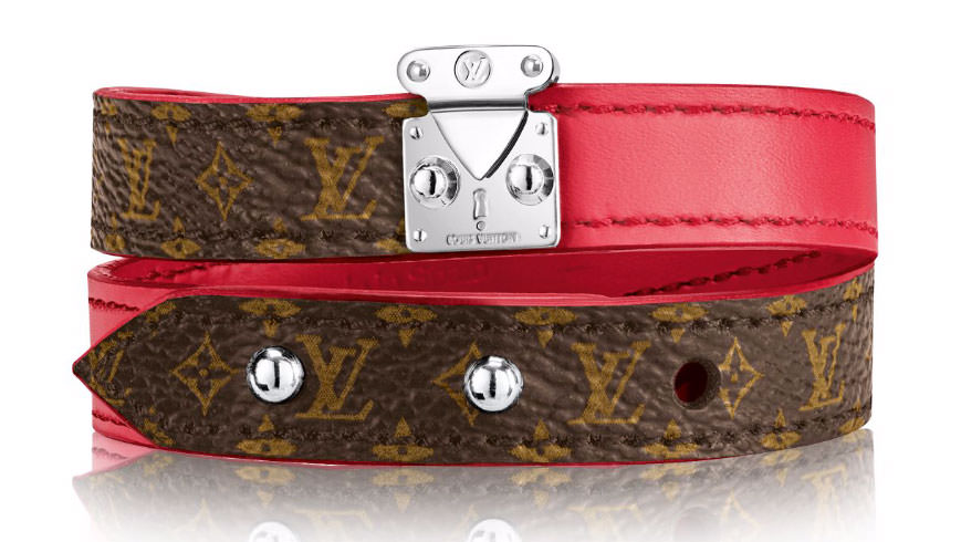
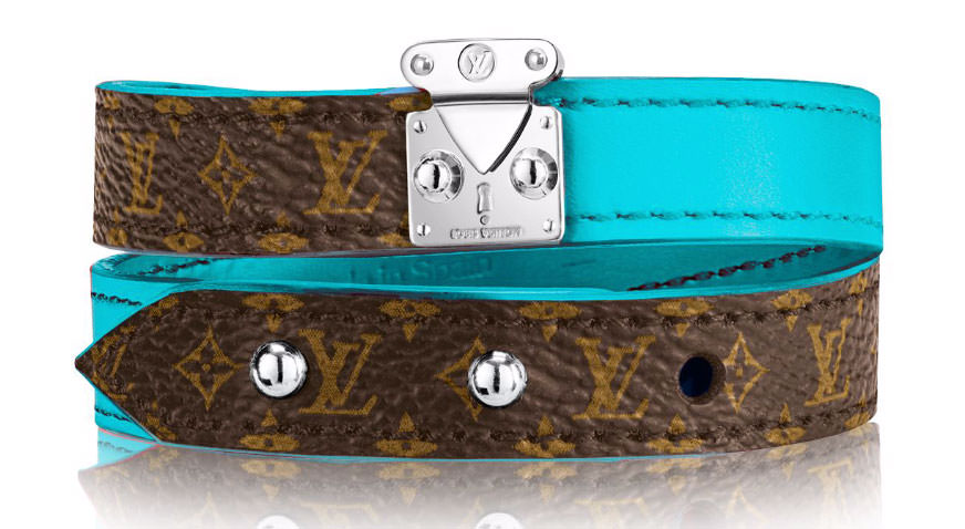
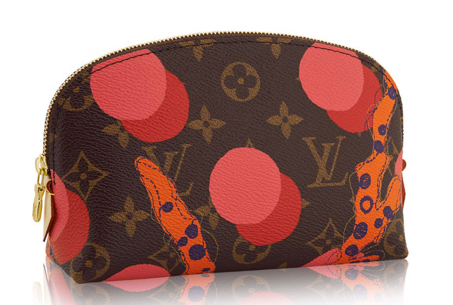
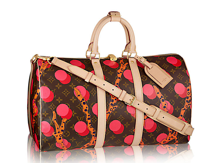
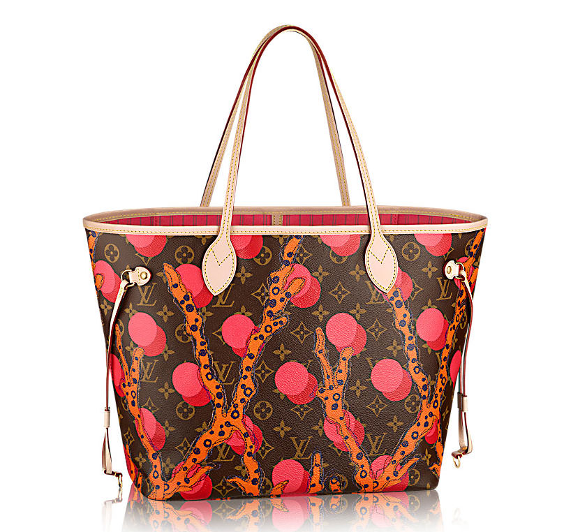
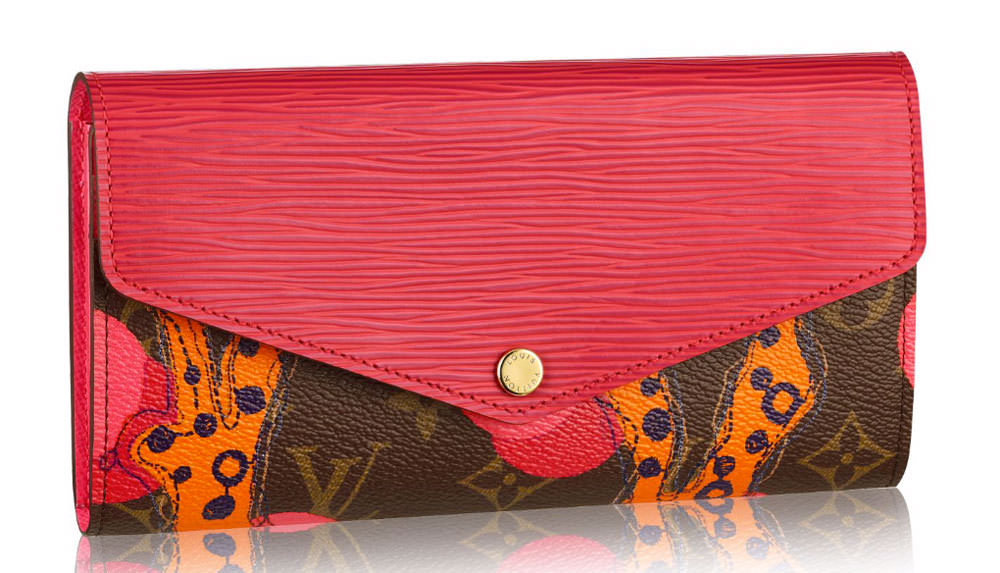
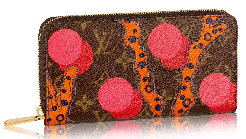
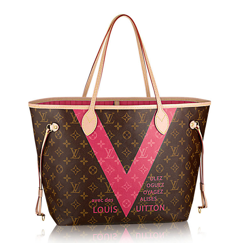
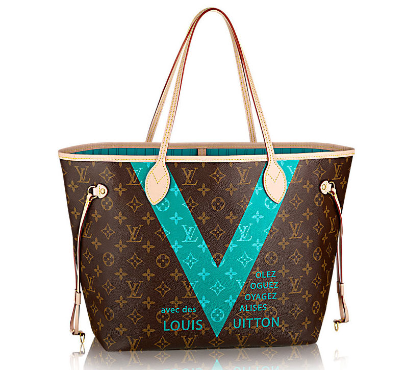
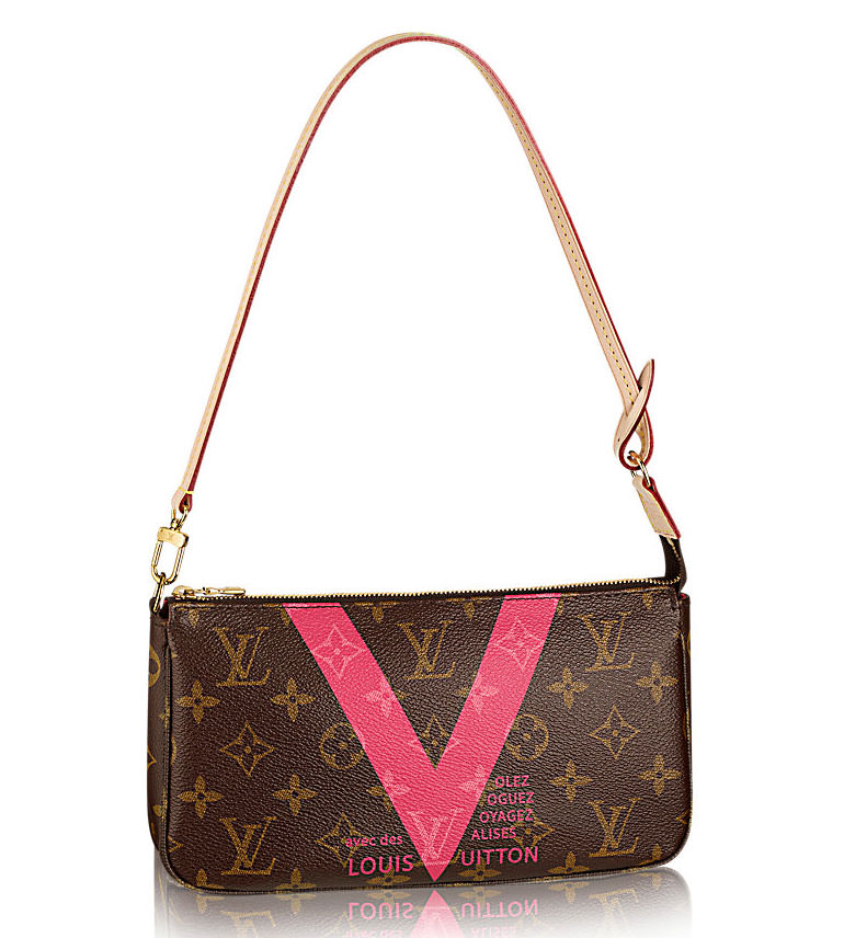
The first is a simple V in either pink or turquoise, which is in line with the use of the V in some of the brand’s other recent bags. The second is the Ramage print, which is a bright and swirling in shades of pink and orange, inspired by undersea life. Check out the bags from both collections below.




Hideous.
Takes garish to a new level. Note is only on the cheap bags and accessories.
Will sell out in a heartbeat.
i don’t know whats going on with this new pattern, not my cup of tea at all i guess
I’m not sure what the orange skribble is all about, but the pink and blue V is kind of cute. I would love a bag that was the entire print in pink.
No matter how garish, obnoxious, or ugly the design, LV devotees will eat it up.
I thought the exact same thing. I just do NOT get the appeal of LV and that ugly brown canvas monogram madness.
i too wish they explored the look of Goyard and give us many Monogram color options, in t i would love an all blue or all yellow monogram neverfull as a summer bag. so the “V” option for me is a good summer easy bag option.
I would never be caught carrying one of these, but to each his/her own.
Not feeling it. I think LV has lost the plot. Yes, these bags will sell, but not to the kind of buyers who will become lifelong customers. I liked LV bags when they were something professional, sophisticated women would want to carry. These new designs are garish and won’t stand the test of time. If someone thinks they’re cute and they have money to burn, then fine. I will put my money into bags I can carry with pride today — and tomorrow.
Hmmm. The same was probably said about Valentino’s Rockstud & Camo bags & just look at them now(happy owner). So you don’t think a “Lifelong customer” would buy these? Not so sure. It’s fun, colorful & may appear to a young consumer even. I own nearly 2 dozen LV in addition to other bags including but not limited to a Chanel I paid $5k for. Perhaps I’m speaking only for myself but I carry ALL of my bags with pride because I like/love them, my taste varies, I don’t purchase knock-offs & the best reason? I paid for them.
I have been buying LV products for 20+ years and the injection of colour – Just bought the zippy in Ramages design and adore it … Food for thought !
Actually, I feel the same about many of the Valentino Rockstud bags. Some of the shopper totes, especially, look cheap and tacky — as was noted by quite a few people on some previous threads. A strip of studs tacked around a tote does not equal high design. These latest LV designs remind me of their gimmicky cherry designs of a few years ago. Your same arguments could be made about them — but I NEVER see those bags anymore. When I spend upwards of $3k for a bag, I don’t want flash-in-the-pan stuff that will look dated and trite just a few years down the road.
“Gimmicky cherry designs”? seriously? I wouldn’t call a collaboration with one of the world’s leading artists “gimmicky”. Takashi Murakami is truly one of the major artists of our time; his current hammer price record is $13.5 million dollars. He’s exhibited in museums and galleries around the world; it’s no wonder his collaborations were Vuitton’s most successful.
I’m a graphic designer for over 25 years. I’ve worked in fashion and did collaborations in various design disciplines. I see MsPit’s point for the collaboration as well as Guest123’s point about gimmicky patterns. Sometimes designers become so involved in the design process we end up talking to ourselves. I believe that’s when something becomes “gimmicky”. But then the gimmick becomes a best seller…WTF!!!!? Leads to the big question: if something is a commercial success does that means its good design, a gimmick, or something in between? (ok, now i’m overthinking this but you get the idea!!!) Thank you for the debate ladies!
With all due respect to the designer, time has shown that these bags were, in the end, a gimmick — expensive and pedigreed (arguably), but a gimmick nonetheless. I’ve been on a three-year job assignment in Europe and I simply do not see these bags anymore anywhere. I think that says more about the staying power of the design than some hammer price record (which I doubt was for one of those LV bags).
To each his own; as I said in my first post, if you’ve got money to burn and think these are cute and don’t care that they’ll be outdated sooner rather than later, go for it. Buy what you like. But don’t expect everyone to genuflect at the designer’s altar simply because the brand is LV.
Disagree? Then I guess it’s handbags at dawn! 🙂
My point of mentioning Valentino is that despite its trendiest/tackiness or however it has been received, it has staying power. I hated the bag until last summer when I changed my mind. But whether EVERYONE is in agreement with a bag that’s hot or NO ONE is wearing the bag, bag lovers wear what strikes her fancy. Not because many are in agreement. I don’t see the fascination with several labels but my opinion doesn’t dictate whether the bag is valuable or cheap.
I wouldn’t bet on anything Rockstud having staying power.
Sigh….who knows….it’s here, it’s selling, I really don’t care if it does so long as I still like it or anything else I’ve purchased.
I would like the “V” if the writing wasn’t there and I love the idea of under sea life but the print isn’t pretty-looks like worms.
There is one bag in the 2015 s/s runway collection for men that features the V in blue with no writing.
the ramages pattern is part of the rtw line. you will find it on dresses, skirts and tops in different colors. its part of nicolas vision and despite yall hating he is still one of the most talented and influential designers out there. the V stems from old advertisements, hence its very art deco look.
It’s not art deco at all… it’s advertisement from the 1960s.
their roots are art deco. Ever since art deco you can see its influence on lv. No matter the period.
Shut up employee
Who are you to tell anyone to shut up? Someone disagrees with you and you resort to being rude….what are you, 5 years old?
Just my opinion of course. Terrible. I’ll give you two maybe three reasons. One, trying to hard because they got nothing else. Everytime you see a LV bag in the streets its not a special piece or part of specific collection. It’s the same four bags. Two, the colors are too close to Saint Laurent’s original Red and Fushia, also look at Gucci’s Fall RTW collection, a bite off of Heidi without stealing it. And three, if there wasn’t enough monogram already you throw a giant V on your product now. Don’t drink the kool aid people. Read the article of LV is a secretaries bag now.
I am not too fond of the V design, but the Ramage design is kinda cute. It looks like corals and water bubbles. The colors are lively and fun – a nice summer bag. Perhaps not my favorite, but why not?
And anyway: If you do not like LV – that is one thing and perfectly fine. But people who claim that a LV is only for secretaries need to get over themselves. I find these remarks snobbish. And btw what is wrong with being a secretary?
We prefer to call ourselves “Admin Assistants” and I agree those folks saying LV is only for us do need to get over themselves. Sure right now my collection consists mostly of LV but I do have my eye on a few other items, I work damn hard and I will have them 😉
Agree. Ask the average person on this site what they spend/earn & I’d bet that TODAY’S secretary may earn more than they do. I’ve seen plenty of awful Dolce & Gabbana, Celine, Chanel bags but WAIT! It costs $$$$.
I love the V; my name is Vanessa, so I find it cute/whimsical
Have you used Pay*Pal ?in the event if you do you can add an additional $880 /week to your Pay_Pal acc by working ONLINE on the internet a couple Hrs daily.Learn more here====> Online-Job
The ramages print looks like balls.
The V bags are ok – I can see the dash of pink and turquoise as an homage to summer and travel, but the Ramage look like some microscopic bacterial life form from outer space that have taken over and the monogram is losing the battle against this infestation.
lollll You are right !!
What the sh*t is this? The bags look diseased.
Trying really hard to like it.
I think the real problem I have with this collection (as well as the cherries mentioned below) is LV just plopped something over the existing coated canvas – AS IS. No consideration for color or compatibility. Looks like they are laughing at their customers: “hey, just slap any old thing over our leftover material and call it “trendy” Silly sheep will lap it up”
SO insulting to customers. They have so much money and 15 factories so why not make an entirely NEW DESIGN, limited edition, coated canvas? Like the coral design: maybe ditch the entire brown background pattern, make it black (or something dark) and put the icons (those flower-type things and the monogram) inside the circles? D&G has a delightful Sicily collection now. Do something like that!
Honestly there is a huge demand for limited ed monogram bags so i dont see where youre comming from tbh. Just because u dont seem to like them theres still a whole bunch of people waiting for these each season
I’m not criticizing the fact people want them – I criticize the company for not making an effort to develop a completely new monogram design. If these were $200 bags i wouldn’t expect much. But when your asking people to pay 4 figures you can make a little more effort in the design! Show appreciation of their loyal fan base – they deserve it.
this is the silliest thing I’ve ever heard, you think they should develop an entirely new monogram design from the one they are known for after hundreds of years, that doesn’t make any sense
I agree. A new monogram now? Are you mad? That’s like telling coca cola it’s time for a new logo!
Those are hideous.
I dont like it at all..
I will never use vulgarity but what in the name of the world is that thing on that monogram canvas. It looks like a diseased bacon strip rather than a coral . I get the V but it looks like a freebie given to the guest for attending the show. Not good. JUst in case, I am not an LV hater but I guess I will have to wait for the next collection then.
My cousin is a secretary in Chgo for a large firm and earns $90,000. A year.
Not bad.
I love the V design, at first I was sure but the pink grew on me. The more I looked at it the more I loved it. Now own the V Speedy and V pouchette!
My cousin is a secretary and earns $90,000. USD