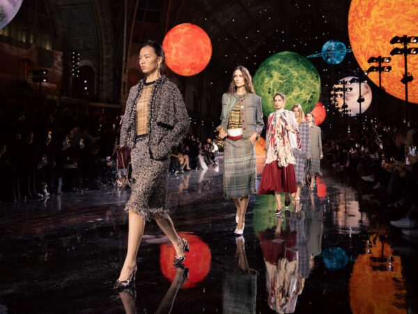
It’s been 3 years since Hedi Slimane departed Saint Laurent and was replaced by creative director Anthony Vaccarello. Often when a new creative director takes office at a big design house the waves are felt within a couple of seasons—take Slimane’s designs for Celine, or Clare Waight Keller’s work at Givenchy. However, in the 3 years since Slimane’s exit from Saint Laurent the direction of its bags didn’t stray far from the vision that Slimane left behind. The Sac de Jour remained a large part of Saint Laurent’s line up, and Slimane’s wildly popular Monogramme bags carried on the logo love. Slowly Vaccarello began to introduce bags that strayed a bit from the mark Slimane left at Saint Laurent, and for Spring 2019 it seems that Vaccarello has continued to come into his own.
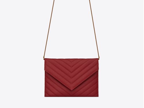
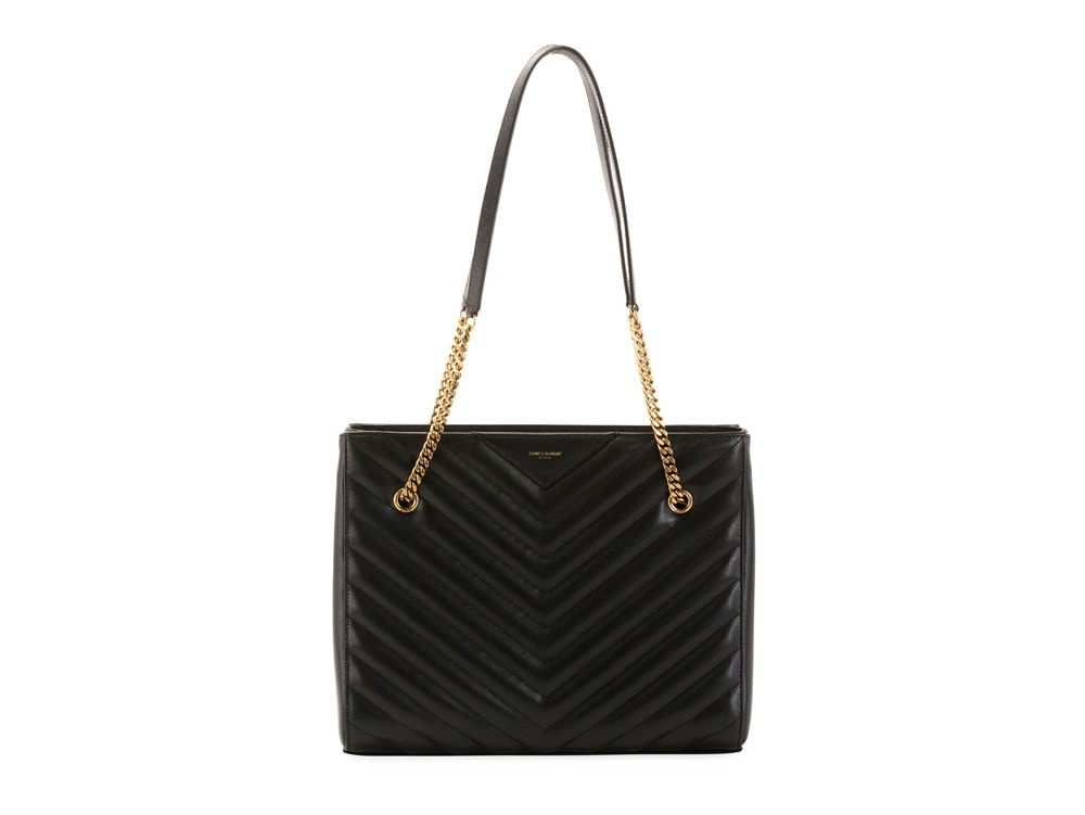
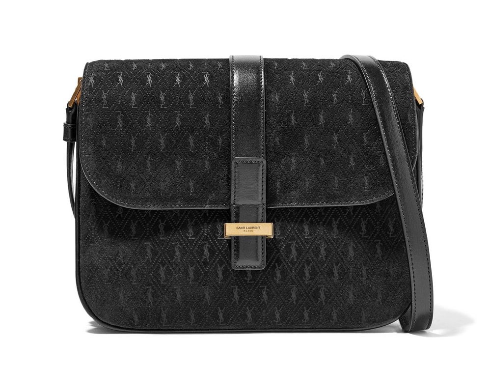
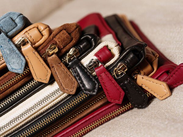
First there was the structured, and seemingly unbranded Bellechasse bag and then there was the recently introduced Manhattan Satchel. Both of these bags finally moved away from Saint Laurent’s (sometimes excessive) use of logo hardware. At a time when the logo love is at its peak, Vacarello might be on to something as consumers are getting sick of overly branded, in your face, designs. For Spring 2019, Saint Laurent’s newest bags continue to move away from Slimane’s constant obsession with exaggerated logo hardware. Of course, the YSL logo is present in some of Vaccarello’s new bags, but in a much less obvious way. The new Le 61 Bag features an embossed leather monochromatic logo, and the Monogramme Suede Shoulder Bag features an all-over tiny logo print that’s so barely there it took me a moment to understand why it was called ‘Monogramme’. View these new designs below and let us know what you think.
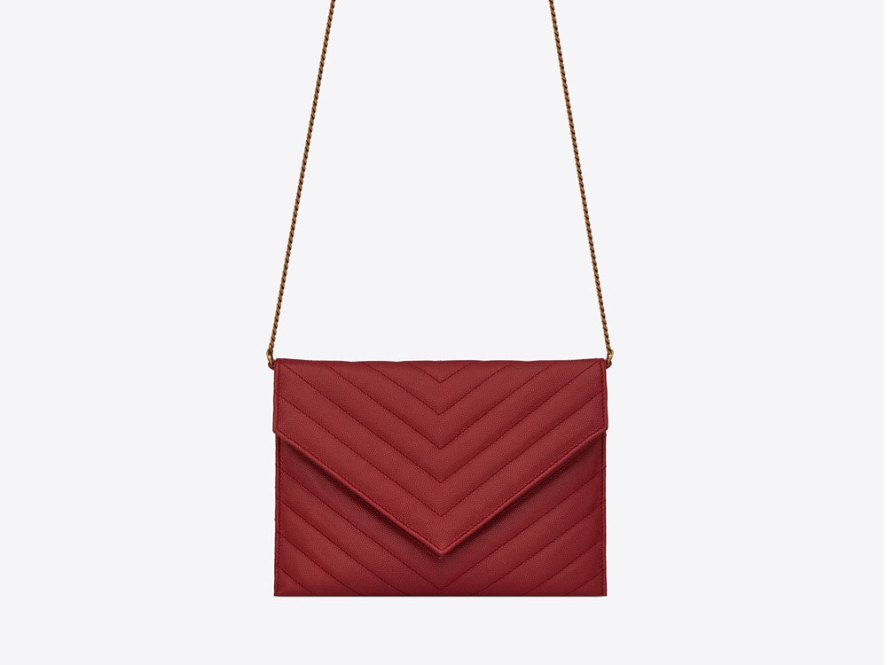

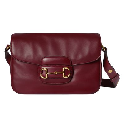
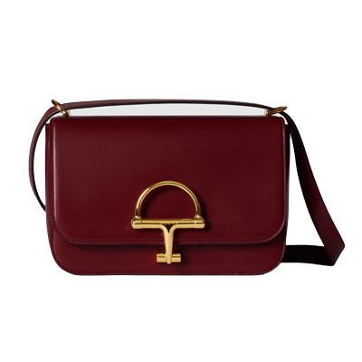


I think most of the bags look fine, but the red chevron flap with no hardware just looks strange without any sort of hardware/logo. It just ends up looking a bit dull and inexpensive.
you have absolutely no sense of style if you value items based on how expensive they look
This seems unnecessarily harsh and rude. I also think you misunderstood me. I don’t think that something actually being expensive means it’s fashionable. But I want my accessories (whether designer or not) to look like they’re well proportioned, well made, of high quality material, and well designed, in general. I don’t think that red bag does, and instead, looks like any knockoff you could pick up in any number of stores (so why would I spend 4 figures on it.)
Agreed, very well said!
The logo is on the backside! It’s a nice and discreet logo, I wish it was placed on the front of the bag, this way it just looks like a YSL dupe, and there are millions of them out there.
I think the classic YSL-logo is beautiful, I just wish it was a tenth of the size. It’s a bit more feminine and unique than the “Saint Laurent”-logo, that frankly looks like any other logo. The style of the old one feels a bit “vintage-y”, which is nice, even though it tends to looks quite vulgar and excessive in the size they use it in.
This makes it looks like a Rebecca Minkoff knock off YSL bag. I think it still needs some type of identifier.
OMG I was thinking the same exact thing!!
Agreed!!!
Agreed! The YSL hardware didn’t bother me since it was like jewelry i.e. gold or palladium hardware against black pebbled leather. I thought it was pretty.
I completely agree. This just doesn’t say YSL to me.
Literally doesn’t say YSL
They look exactly the same as they have… I see no difference. The SDJ had a small label. The Duffel had a small label. The bucket bag had a small label. They’ve always had this along with the YSL monogram. Nothings changed really.
But apparently, judging from the comments above, it’s all about the logo! This is clearly demonstrating that some people only see that value of the bag because it has a giant logo on it. So sad!
I don’t think it’s the logo specifically that people miss, I think it’s just that the red bag looks dull and like it’s missing something, the look that someone who likes the classic YSL aesthetic would be going for just isn’t there. It looks, like someone above said, unfinished. A little something would probably do it, some sort of decoration equivalent to the “jewellery like” metal that the YSL logo in fact was (being a name/logo or not), or if no logo, a completely new design that can stand on it’s own without the need for any added decoration. I don’t think that bag can do it.
Compare it to the Chanel classic flap and the 2.55, without the metal piece in the front (be it a CC or a square lock) a huge part of the overall aesthetic would go missing, some might like the look of it, but many would miss the glamorous feel that it gave the design.
I should add that I personally have brand name bags without any visible logos, as well as a monogram covered bag, so I am truly not biased in any way.
And I also do agree with those saying that the YSL logo is a uniquely beautiful logo, it’s a beautiful, feminine design, and not just a brand name straight up and down. The bags with “regular” logos can ofc be beautiful as well, and cool in some cases, but without the YSL logo on the market something quite special would go missing. And I am really not a YSL girl, I should add, I don’t have a single bag from them, but I have always admired the beauty of their logo, although I agree that it is often way too big, I think that’s the reason why I never was drawn to YSL bags, I don’t care for gianormours hardware, but design wise, it’s beautiful. Not saying nothing can replace it, but I am yet to see what that would be.
Do you think the bag looks finished without any hardware or logo? I’m interested in your opinion.
I don’t find it stunning, but I also don’t find it less stunning than with the YSL logo on it (if that makes any sense). If I wanted a bag like this, with or without the logo, I would go for Chanel rather than St. Laurent.
I hope so because that big YSL logo is sooooooo overplayed.
And an ugly 70’s logo at that. What can’t they make up their mind on what to call the brand? St Laurent or YSL?!!
I love the YSL logo! Some brands go over the top. I personally hate the way Balenciaga is just printing their names on bags in giant font. There is not any design to it. It just looks lazy.
Love it. It looks much more chic to me!
The YSL logo is very much part of their identity in my view, it’s an old school brand, goes with the logo:))))
The red one in the article looks unfinished.
I like YSL logo from all brands. But these are beautiful!
Why would I want to spend that much money on a bag that looks like a Rebecca Mink(rip)off knock off!
Sorry but that’s a no from me.
The red bag looks like a 20 € fake leather bag from a cheap clothing store. I think just having a smaller YSL logo would be best – just look at Chanel WOCs. The logo is well proportioned to the bag and not as in-yo-face like the YSL logos.
Bag feels like an ear with no earring.