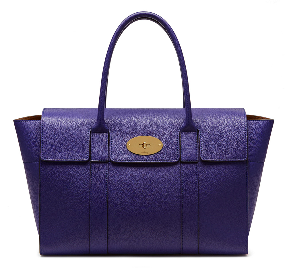
Last week, Mulberry released to shoppers Johnny Coca’s first handbag designs as creative director of the British label, and this week, the brand has debuted something that may prove even more interesting to longtime fans: the brand new Mulberry Bayswater, which is Coca’s take on Mulberry’s most popular style. Don’t worry, he didn’t change it too much.
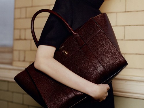
Updating a longtime fan favorite to increase its longevity is a precarious pursuit, but when done correctly, it breathes brand new life into a bag. Case in point: Givenchy’s pitch-perfect reimagining of the Nightingale bag last fall. With the new Bayswater, Coca and his team have taken a similar approach as Givenchy: simplifying the bag’s finishing while retaining its overall shape. The new version of the bag is also a bit more structured, with flared gussets and sharper corners. It feels like a good, if very restrained, evolution to the original.
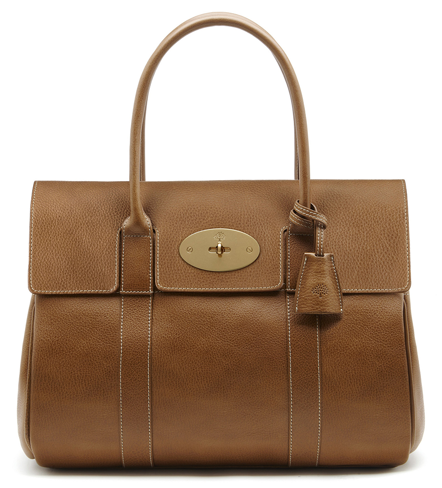
If you prefer the old-style Bayswater, the good news is that it looks as though it will be sticking around for the immediate future. Mulberry lists both as available for Pre-Fall 2016, with the full-size new version retailing for $1,550, while the original will set you back $1,395. The redesigned Bayswater also comes in a more petite option, which costs $1,250. You can shop the full collection of Bayswaters via Mulberry.





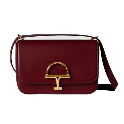


Bayswater has been an iconic bag for Mulberry for many years and instead of changing it they should have introduced a new name instead of doing it this way, it’s quite a big change actually. It’s like a LOUIS VUITTON Speedy gets some outside pockets and still call it Speedy
I agree with Charlie. Wrong move in altering your iconic bag, Mulberry. 🙁
Or make an open, zipless version of the Speedy and still call it by the same name.
It’s not interesting, it’s tragic mostly. It looks like they’ve just wanted to make it look more Céline (frankly, the only style Coca can do), and cut back on the manufacturing costs. It’s a lot cheaper to just sew a few straight seams instead of making those much-loved adjustment straps. And the Bays has kept its place as THE Mulberry bag – or at least, it would have had they not ruined everything with their ridiculous and unfounded price increases.
Watch the Mulberry preloved markets soar like Chanel and LV. And probably their repairs service will be swamped in the future when people choose to re-re-repair their bags instead of buying the crappy-looking, overpriced “improved” versions!
Agree. The design is so transparently a Celine copy. If somebody wants a copycat bag, they should save their money and simply buy something from Michael Kors. I wasn’t a huge fan of the old Bayswater but it has a distinctive, inconic look that clearly represents (or represented) the brand. Also, the new lock is blecch.
I do like the color. And that’s all I like about it.
Indeed. The Celine luggage tote look
Totally agree. The Bayswater didn’t need “improving”. When you compare the two designs, there’s no comparison!
http://www.olderfatterhappier.com
I love it. It looks very modern and up-to-date. Looks like Mulberry will be making a comeback and getting more popular with younger consumers.
Modern is not classic.
Never said it was
And losing all the old ones in the process. The old, faithful costumers have kept Mully going for a long time.
I hope they can strike a balance. The old customers, like you said, have kept them going. I just think it’s a win-win when a brand can appeal to varying demographics. I think Louis Vuitton has done a fair job of that, and their staying power is probably a result of that.
Killing off Alexa, killing the Bays design with “improvements” and producing hideous Céline knock-off designs isn’t exactly something us old classic Mully lovers look at kindly. IMO, Mully has lost itself and forgotten their legacy. They don’t love the Mulberry woman anymore. She’s gone, pushed aside, lost and it’s really sad.
I’ll stick to the old Bays. Hate the new lock to bits, and the workmanship is not what I’m used to from Mulberry. And to price the new one higher than the old one is almost as gross an impudence as naming the new one Bayswater. Name it Batman or something. The only improvement IMO is the pocket on the front, which really is incompatible with the old design. All in all, not a fan.
HAHAHA Batman made me laugh
It doesn’t look like Mulberry. It looks halfway stylish and like it could be carried by someone under the age of fifty.
I think I like both versions, particularly the blue above. But they are different bags, so logic says they should have that reflected in their names. I need to see it IRL before I make a final decision though.
I use my oxblood bays regularly, everyday at the moment, and love it.
Why would you want to make “your iconic classic” bag into another Celine luggage wannabe?
Absolutely agree. I’m so over these Trapeze style bags.
Have been a Mulberry lover for years, but it seems I have to move forward.
Indeed, it looks like they too have followed the trend of the luggage. With the “ears” on both sides.
as Mike explained I am alarmed that some people can earn $6581 in 1 month on the internet . look at this website https://www.facebook.com/Canada-US-UK-Australia-and-New-Zealand-online-jobs-1603538373295103/app/190322544333196/
It looks more modern and structured, but where is the tree? Mulberry’s oval opening with the tree stands out, and the new one doesn’t have it. What is going on with Mulberry? Desperate to find a spot in the already cluttered luxury handbag market? Why ruin your iconic bag?
I like the new one. The original looks too old lady-ish to me (and I’m an “old” lady!!). New one is cleaner, fresher looking. On their website they are selling both.
What I love about Mulberry is their understated “tree” logo on its hardware. The new one replaced it with the “Mulberry” name. I like the “tree” better.
I love the new bayswater and bayswater tote. I’m more of a trapezoidal bag than square bag person and I could see myself buying one of each to be honest.