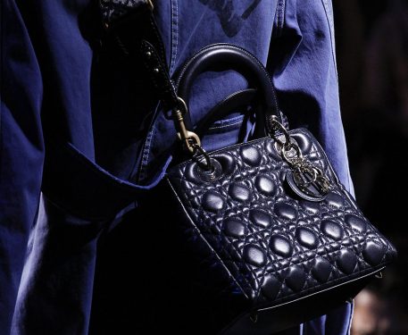
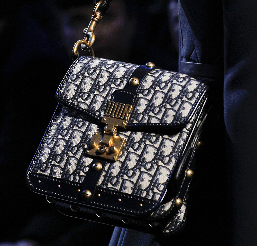
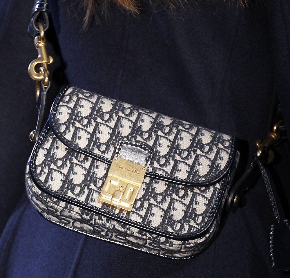
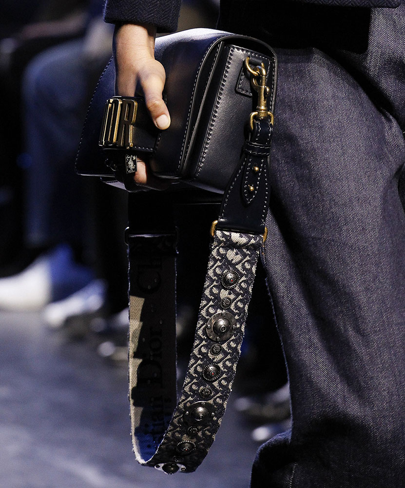
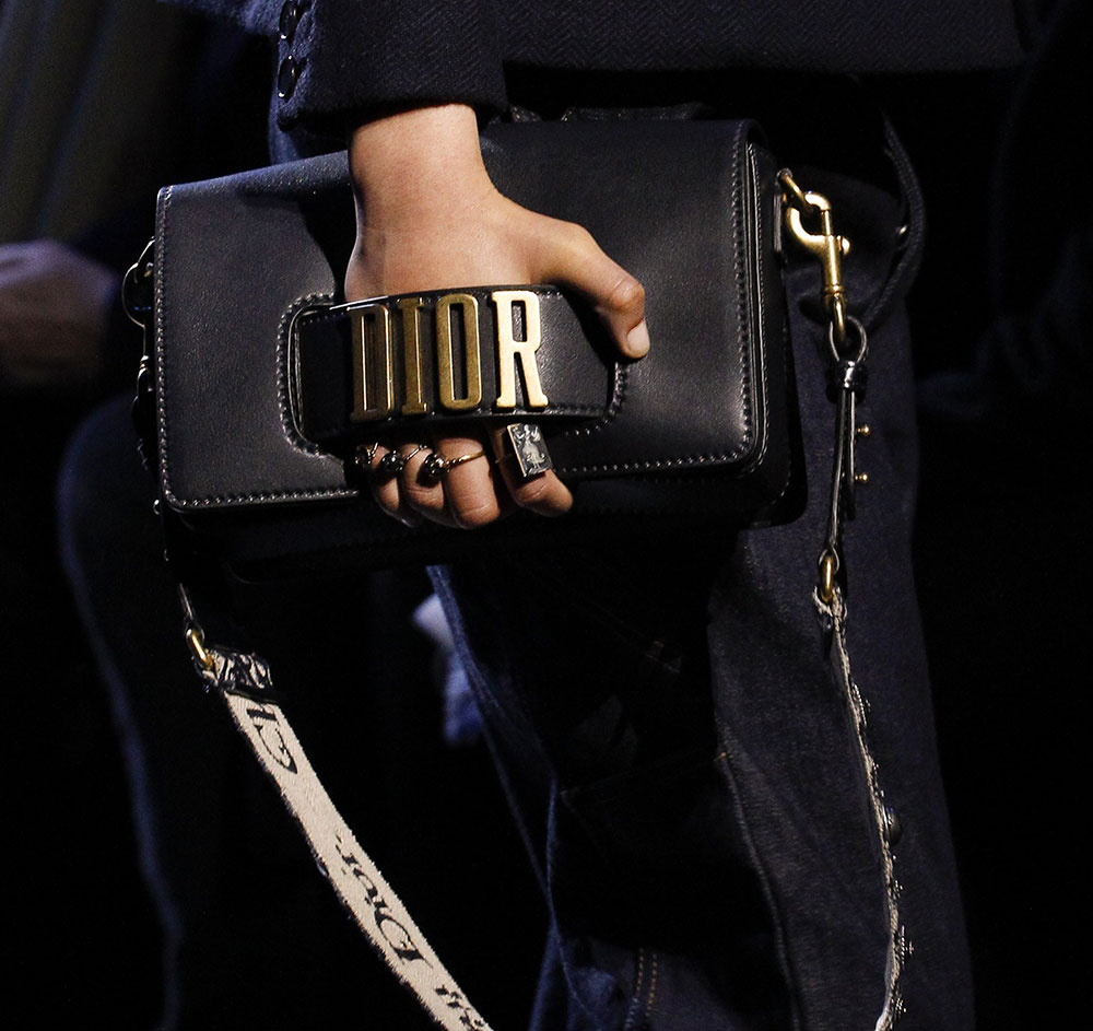
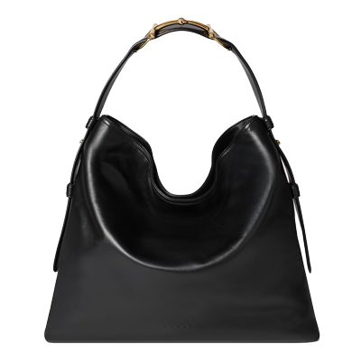
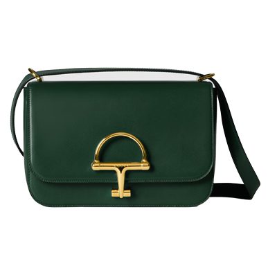
By virtue of its history in strict waists and signature tailoring, Dior has always been a brand with a more formal aesthetic. Under previous creative director Raf Simons, that formality took on a forward-looking innovation, but new designer Maria Grazia Chiuri is quickly making her mark by turning the dial in both a more retro and more casual direction. On the brand’s Fall 2017 runway, those changes were well-reflected in the bags, which were all rendered in dark neutrals.
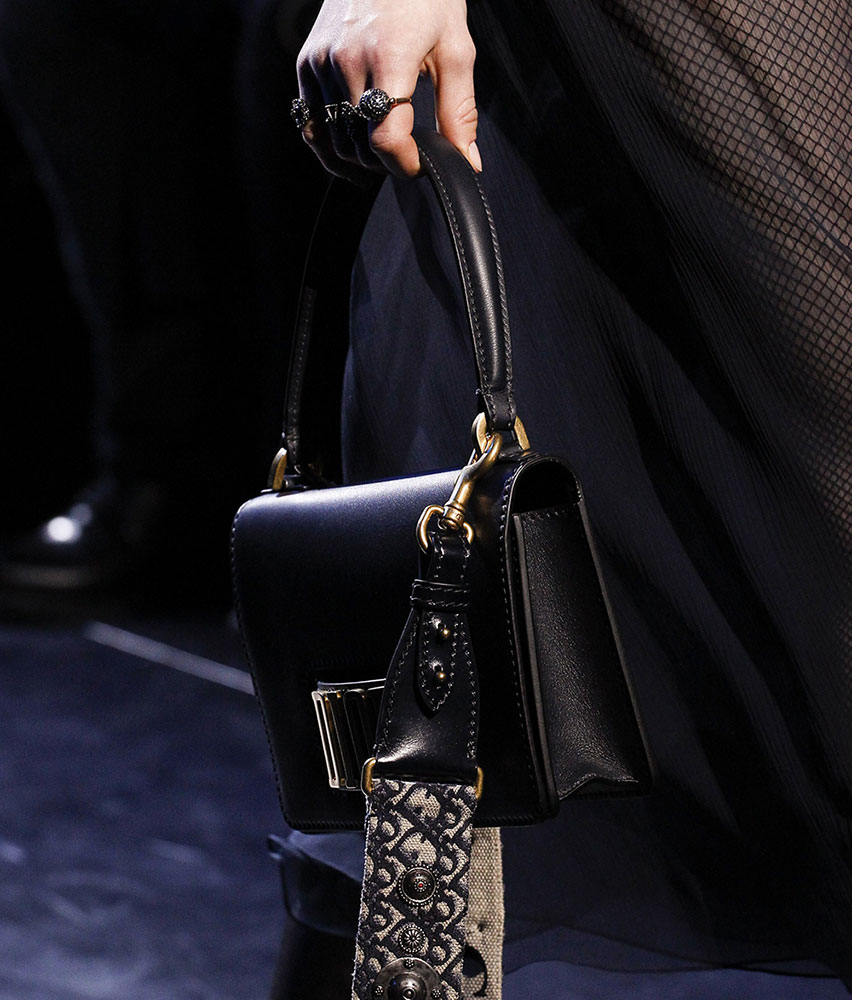
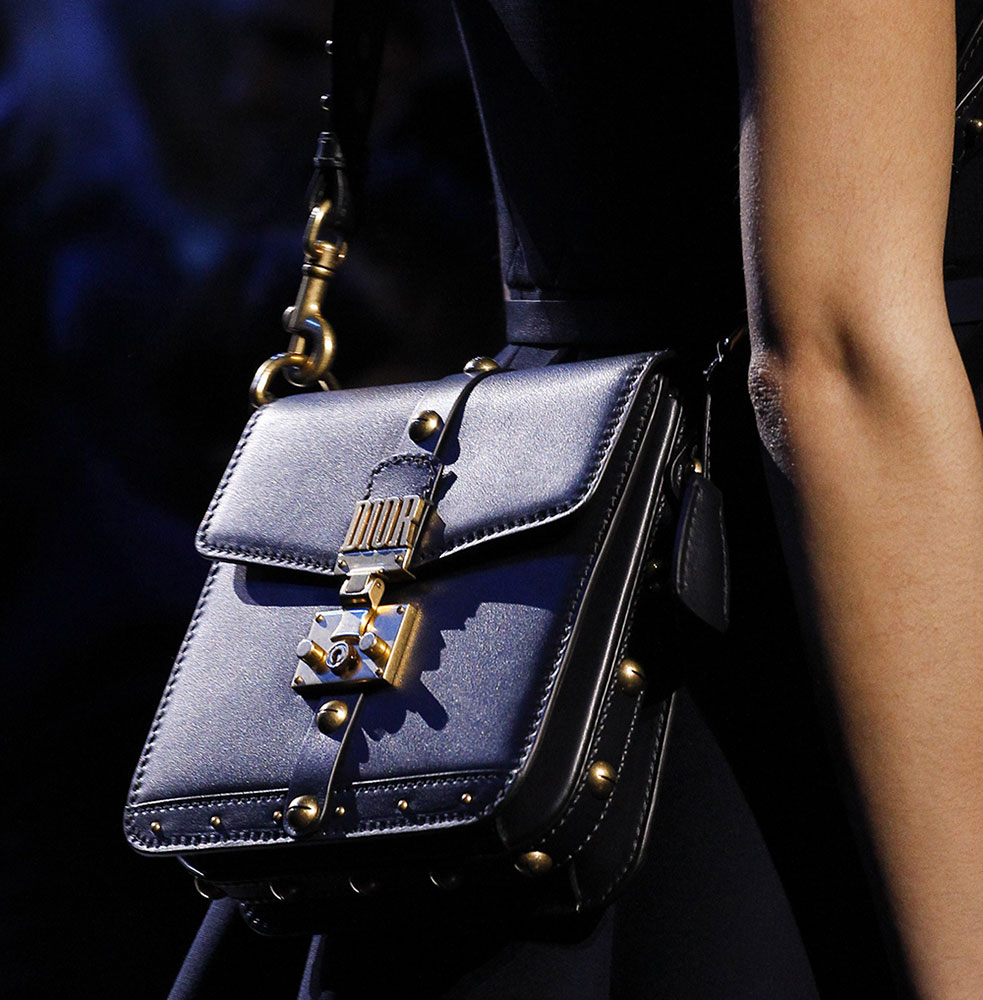
Most of the models wore the bags slung around their bodies on thick, embellished straps, which is unusual on runways and seemed designed to emphasize the take-anywhere casual nature of the designs, which included both longtime favorites like the Lady Dior, as well as brand new shoulder bags. Many of them sported the new block-print logo that Grazia Chiuri debuted in her very first collection with Dior, which the brand seems fully committed to. Check out all the bags below.
[Photos via Vogue Runway]
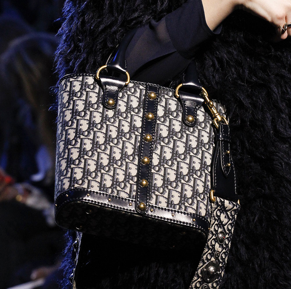


I like the inclusion of the old Dior monogram. I’ve been stalking them on eBay. Not a big fan of the Dior nameplate. It’s like they’re trying to capitalize on what Gucci is doing. Works for Gucci because they’re bringing back a vintage logo. For Dior, it’s not working.
Dior has always been ladylike with an edge, but I’m not getting that here. I understand that they want to try new things, but all I’m seeing is an amalgamation of other design houses.
Completely agree. None of this is ladylike. She seems to have abandoned that. The nameplate even smacks of Moschino. Just blech! I don’t feel she knows the Dior customer.
DO NOT like the monogram. Bags too chunky for my taste. They don’t look “Dior” to me.
As Valentino seems to get better and better, things seems to got worse at Dior. Those bags are not even fun…
I’m glad I got my vintage trotter when I did! I wonder how much one of those separate pattern straps would cost…I only paid $100 for my vintage Dior though, and I bet a new strap would be that many times over.
The nameplate is a tacky travesty. It’s unfortunate to see Dior go in this direction.
I am in the minority here but I love them. LOVE. It took me awhile to go over to the dark side of the new Dior, but I am here and loving it. The quality of the new items is off the charts, and they are all thoughtfully designed, edgy, eclectic, a little grunge 90’s. Definitely a few of these are on my list!!!
She is negating all the progress that Ras Simons made with the brand.
THIS!!!!!
Just yuk. These designs are all over the place and NONE of them say Dior. The worst is bringing back the canvas mono. No wait, it’s the clunky gold Dior on the bags. No maybe it’s the awkward shapes and proportions.
Oh…no….it’s all awful.
I would consider a dark blue Lady Dior bag. For the rest, no. Do not like the DIOR logo in those ugly, blocky, all-caps letters.
Am I the only one who thinks that slides 7 and 8 look like Coach bags from the early 2000’s?
No, you are not…