I hope you’re done with burgundy, because according to Pantone, we’re all going to be moving away from Marsala, 2015’s big color trend, and on to something a little bit softer: Rose Quartz and Serenity. The soft shades of pink and blue are Pantone’s 2016 Colors of the Year.
If you’re not familiar with Pantone, the company is the steward of a color-matching system used primarily in the printing industry, which helps standardize shades across media and create consistent printed results, cataloging thousands of shades along the way. Every year, Pantone predicts which shade will be the trendiest over the next 12 months, and 2016’s the first time the company has chosen two.
According to Pantone, the company picked the shades (and specifically, a blur of the shades, which does not have its own name) as a nod to changing conceptions of gender in fashion and beyond, but whatever the reason, you’re most likely to run into these Easter-perfect shades in handbag form in the first few months of 2016, as spring collections hit shelves.
Of the two shades, Serenity was definitely the harder to match in existing bags. It has a purple undertone that makes the color lean more toward periwinkle than true blue, and most of the bags on the market had cooler undertones that kept them more toward traditional baby blue. Below, we’ve selected a dozen bags that are as close to each of the two shades as possible from designers’ current collections, as well as the Rebecca Minkoff bag above that manages to use them both.
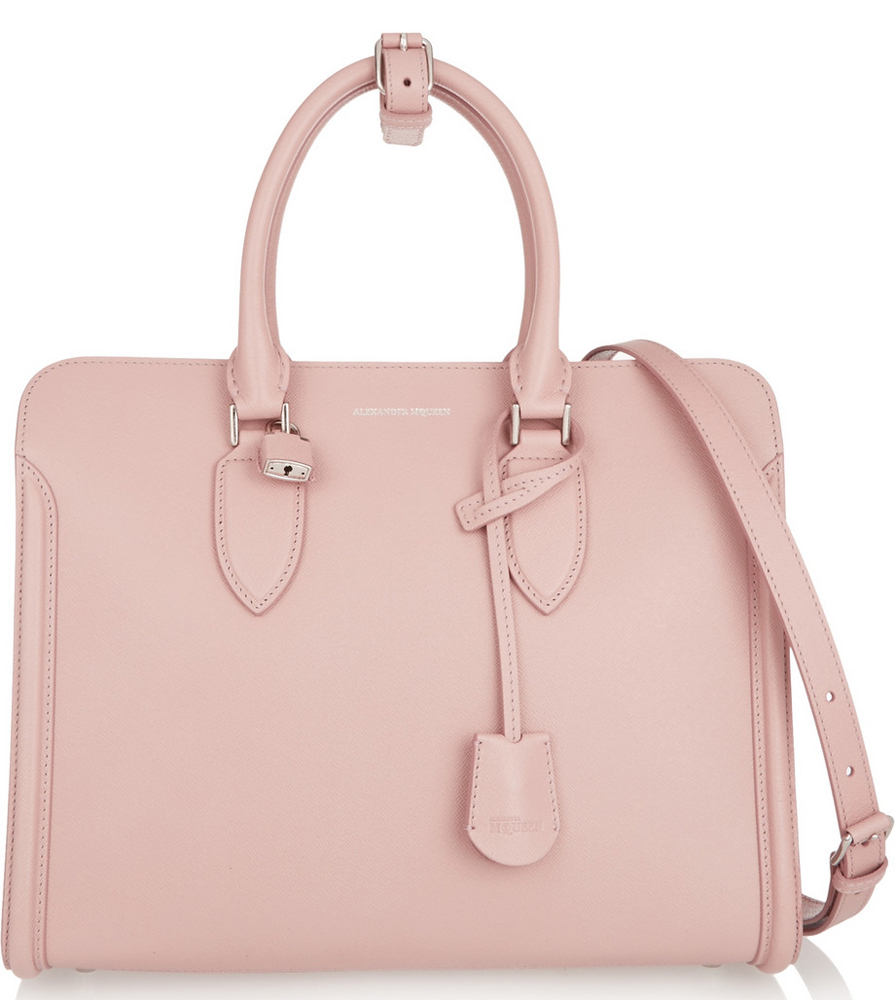
Alexander McQueen Padlock Tote
$2,245 via Net-a-Porter
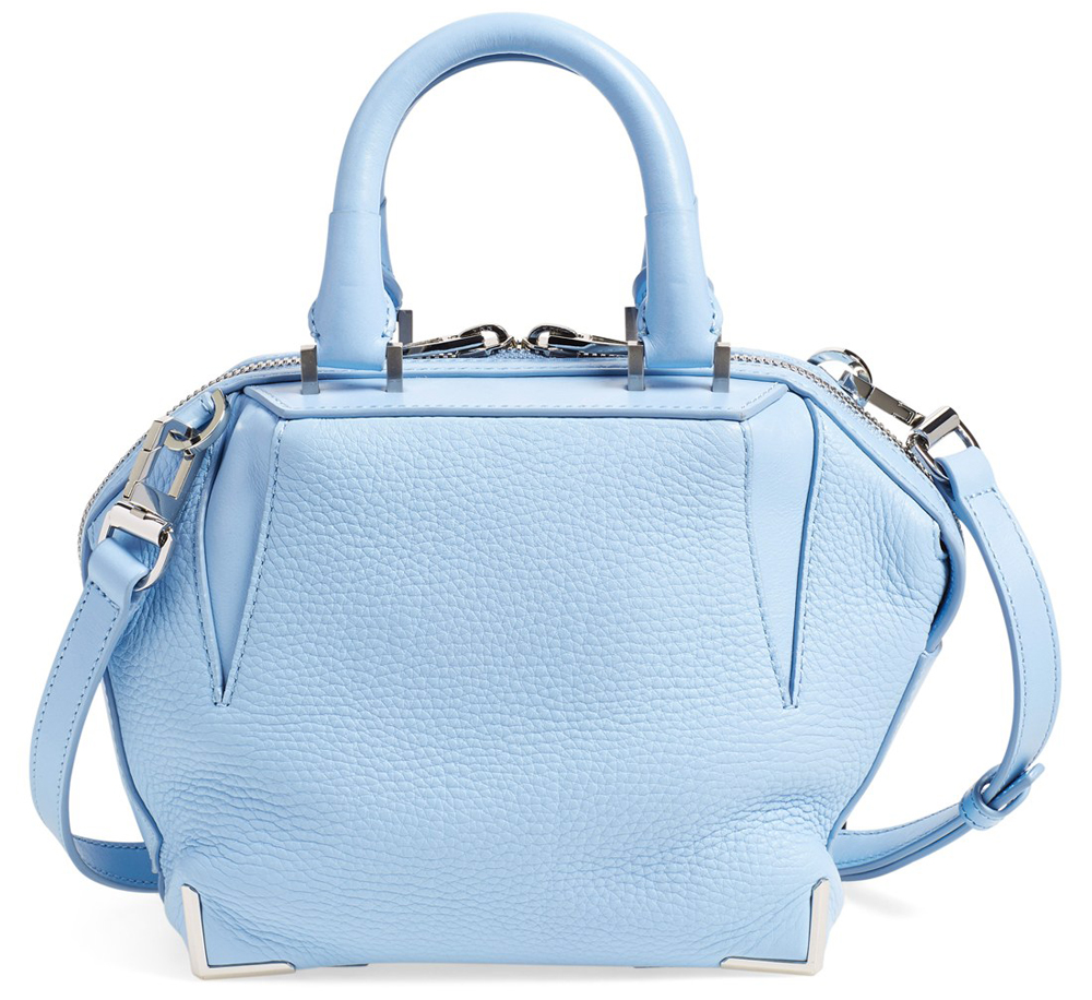
Alexander Wang Mini Emile Bag
$795 via Nordstrom
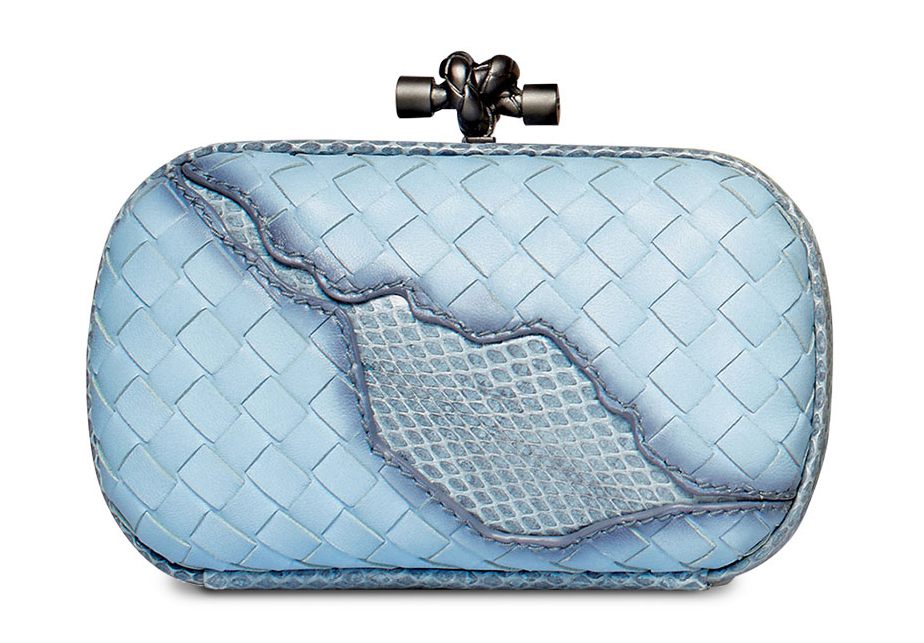
Bottega Veneta Knot Clutch
$2,250 via Neiman Marcus
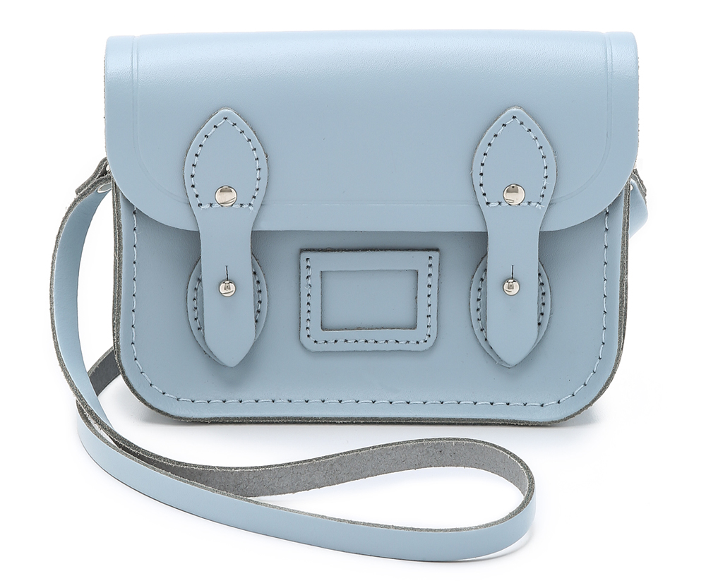
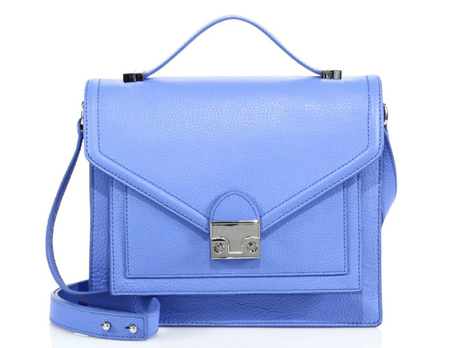
Cambridge Tiny Satchel
$85 via Shopbop
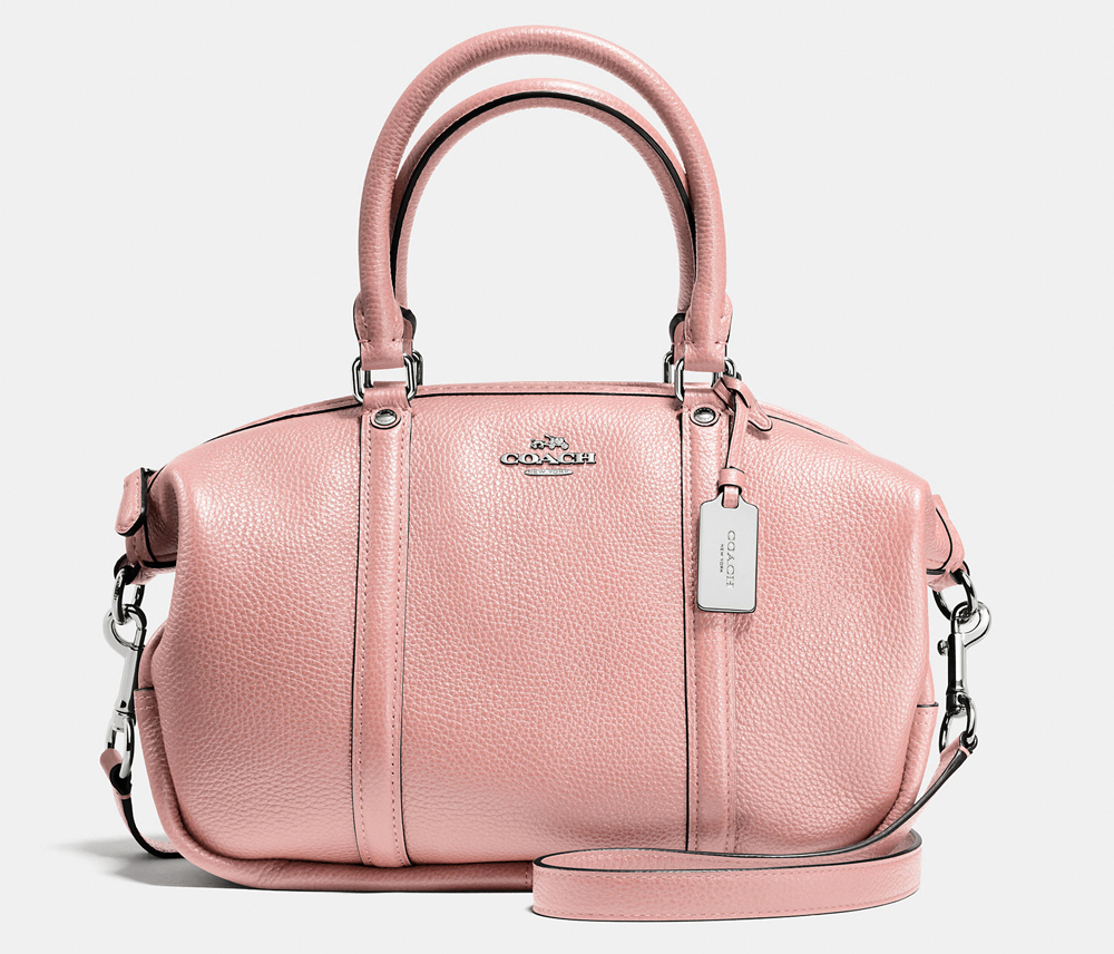
Coach Central Satchel
$177 via Coach
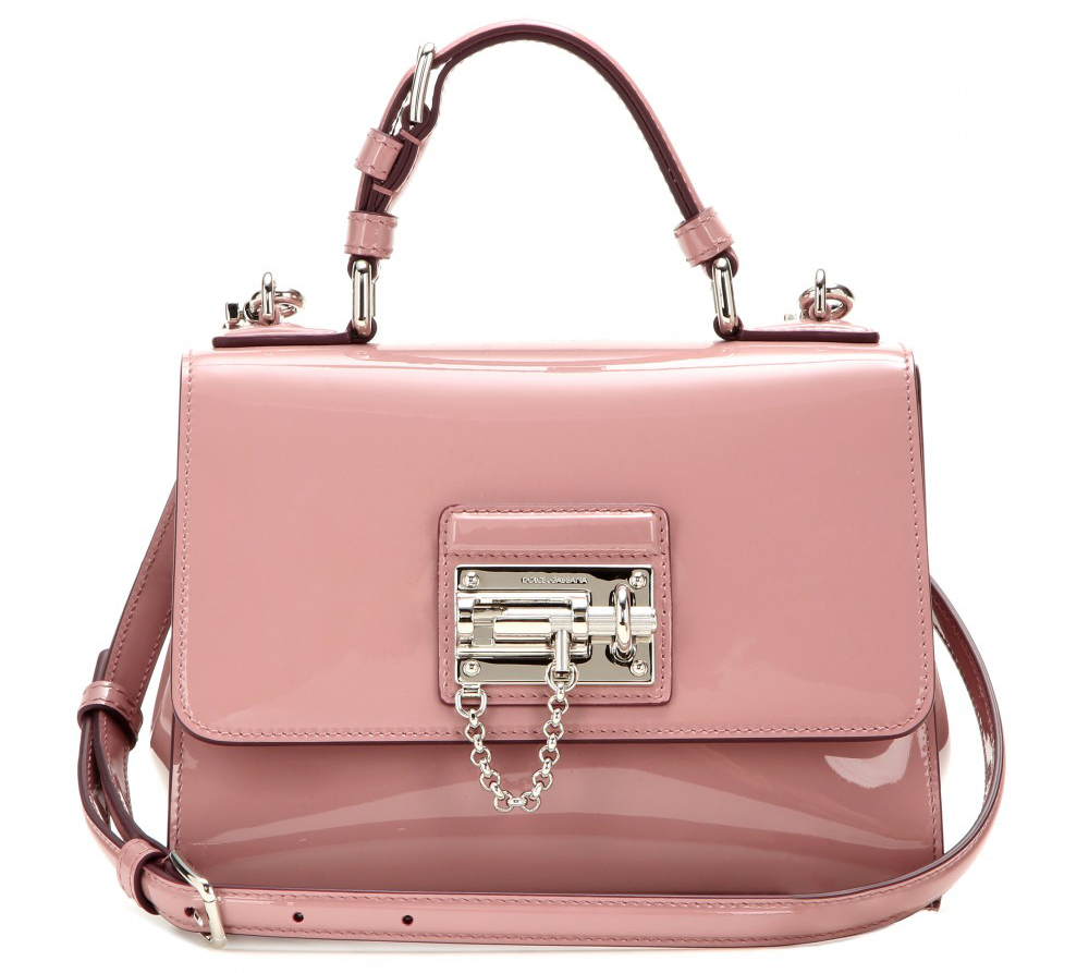
Dolce & Gabbana Monica Satchel
$2,495 via mytheresa.com
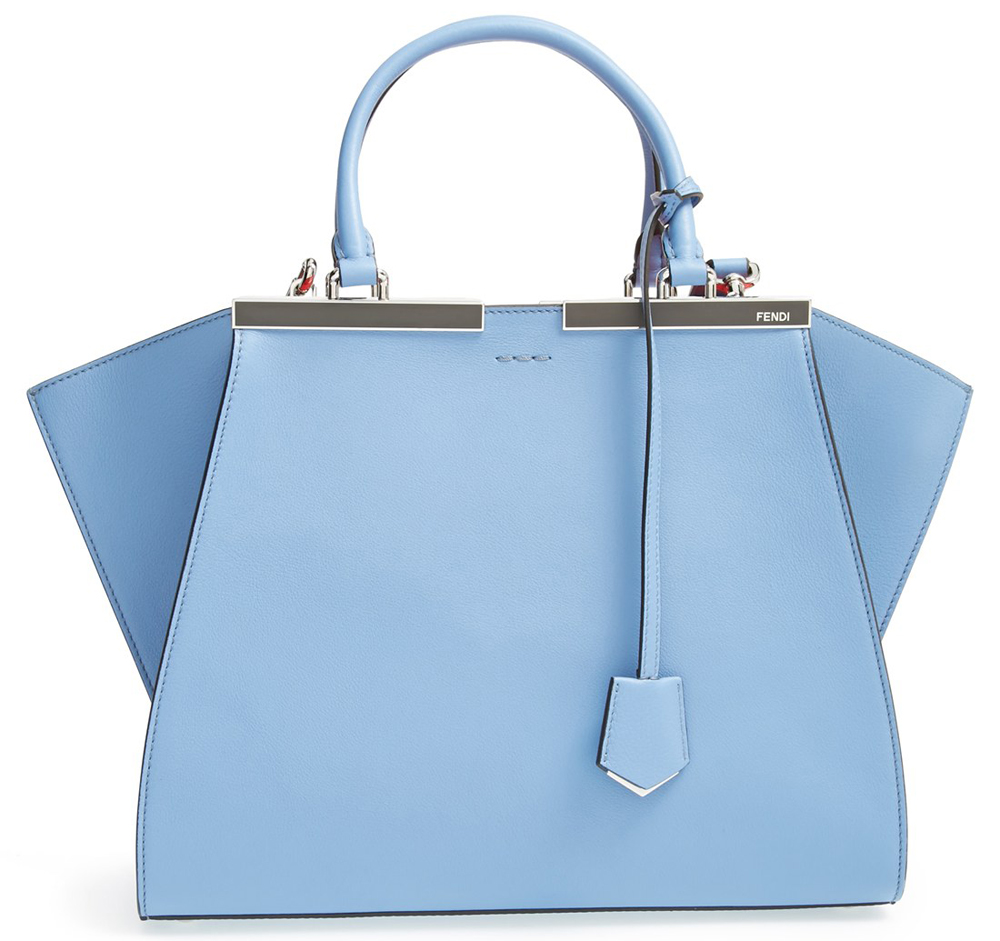
Fendi 3Jours Bag
$2,650 via Nordstrom
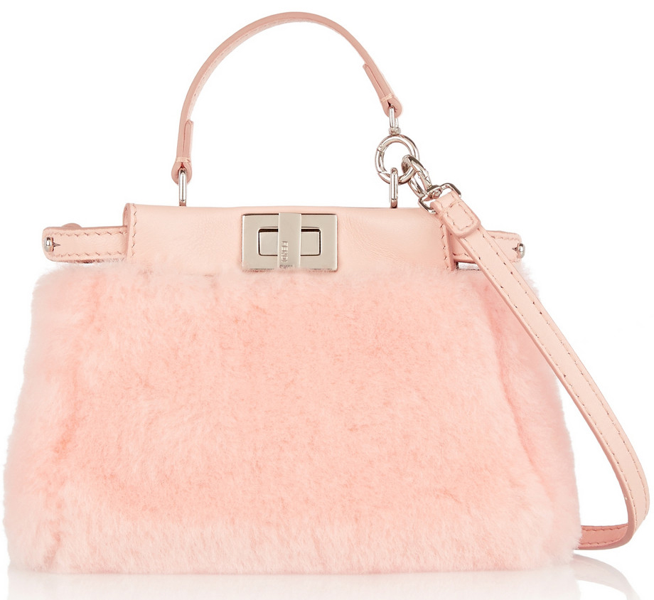
Fendi Micro Peekaboo Bag
$1,950 via Net-a-Porter
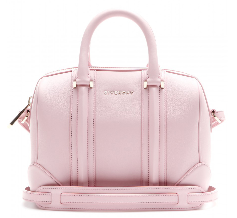
Givenchy Mini Lucrezia Bag
$2,250 via mytheresa.com
Gucci Icon Leather GG Chain Wallet
$895 via Gucci
![]()
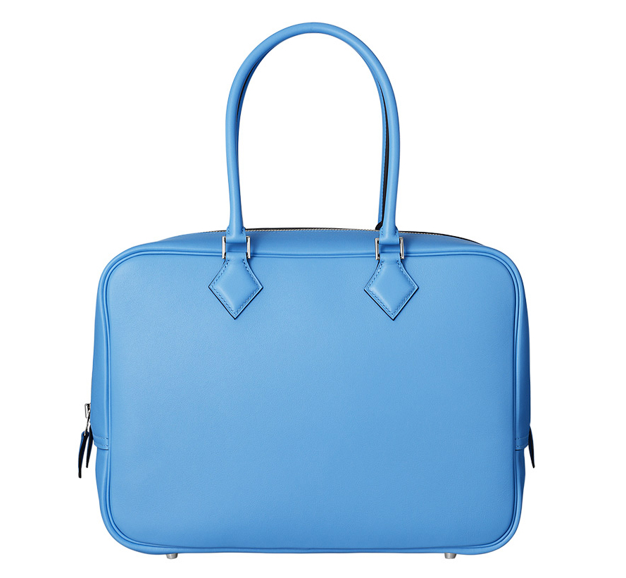
Hermès Plume Bag
$8,700 via Hermès
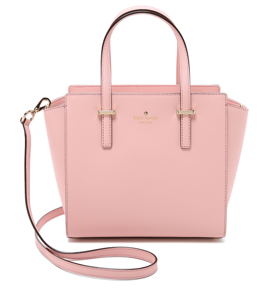
Kate Spade Small Hayden Satchel
$298 via Shopbop
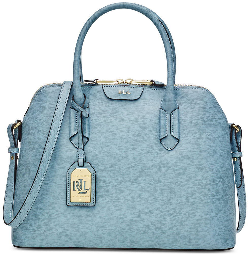
Lauren Ralph Lauren Tate Dome Satchel
$228 via Macy’s
Loeffler Randall Rider Bag
$475 via Saks
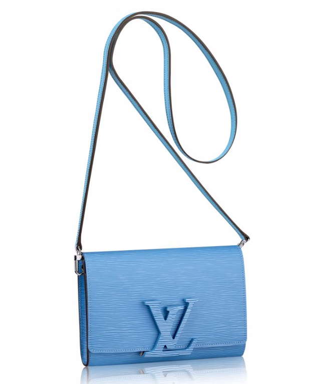
Louis Vuitton Epi Louise PM Bag
$1,900 via Louis Vuitton
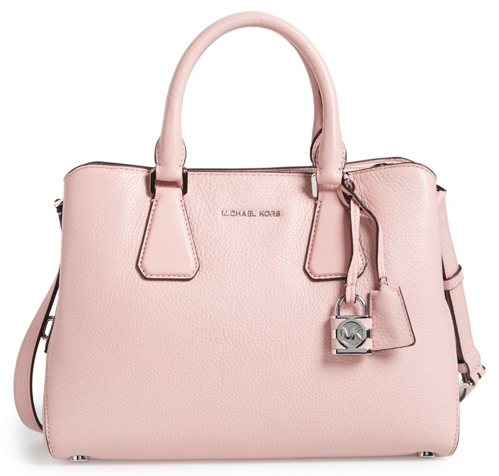
MICHAEL Michael Kors Camille Satchel
$358 via Nordstrom
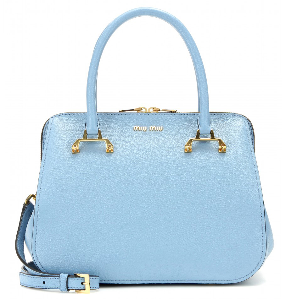
Miu Miu Leather Satchel
$1,970 via mytheresa.com
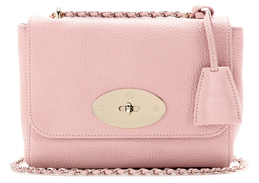
Mulberry Lily Shoulder Bag
$1,110 via mytheresa.com
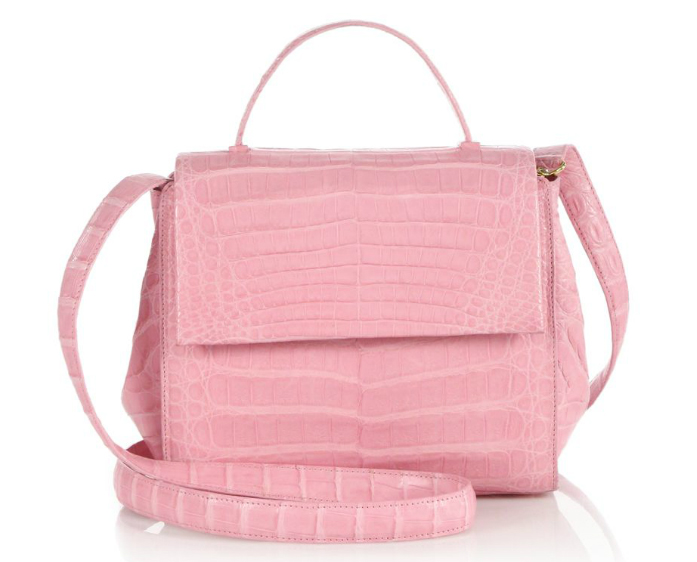
Nancy Gonzalez Top Handle Crocodile Bag
$2,950 via Saks
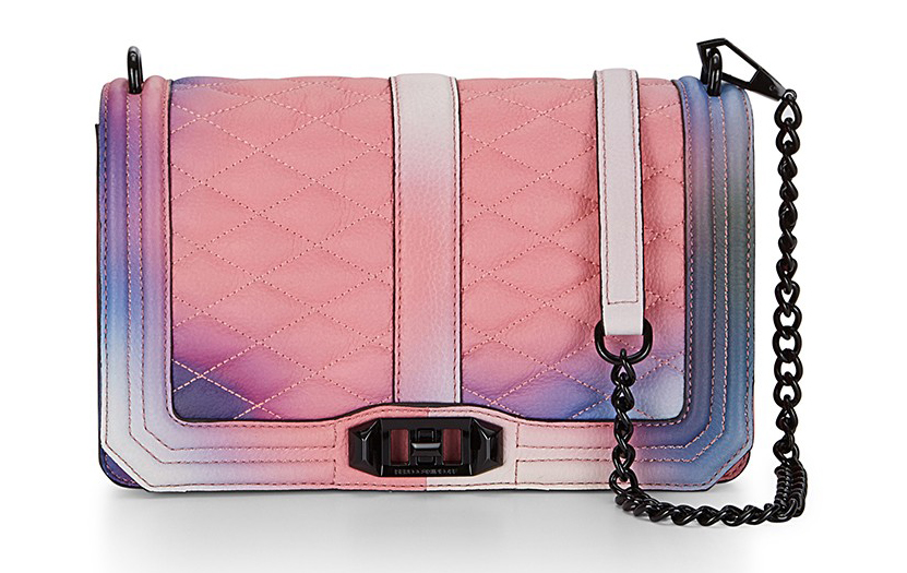
Rebecca Minkoff Love Crossbody Bag
$395 via Rebecca Minkoff
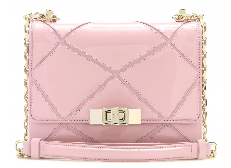
Roger Vivier Prismick Micro Patent Bag
$2,395 via mytheresa.com
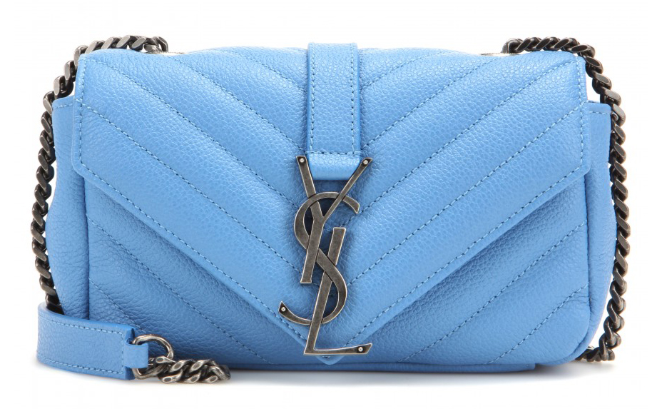
Saint Laurent Monogramme Baby Bag
$1,550 via mytheresa.com
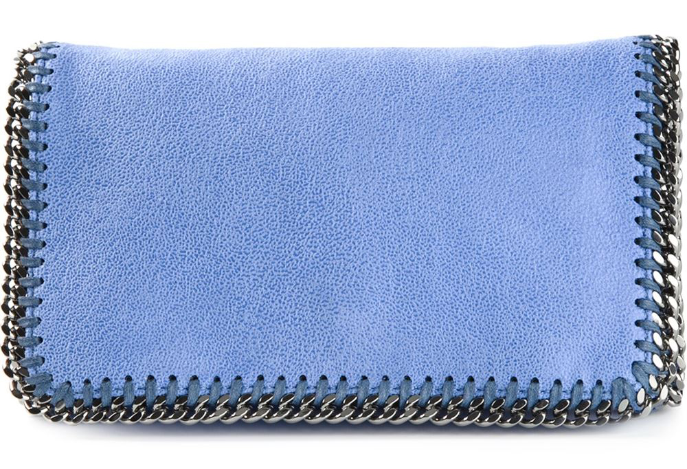
Stella McCartney Falabella Flap Clutch
$895 via farfetch.com
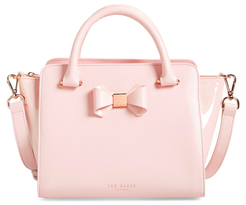
Ted Baker Bow Tote
$319 via Nordstrom
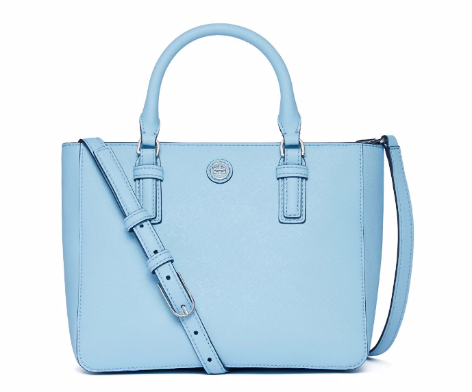
Tory Burch Robinson Mini Square Tote
$450 via Tory Burch