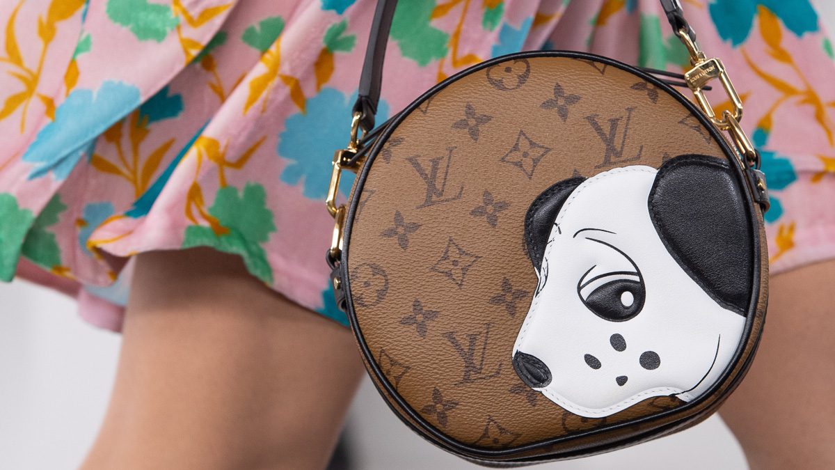
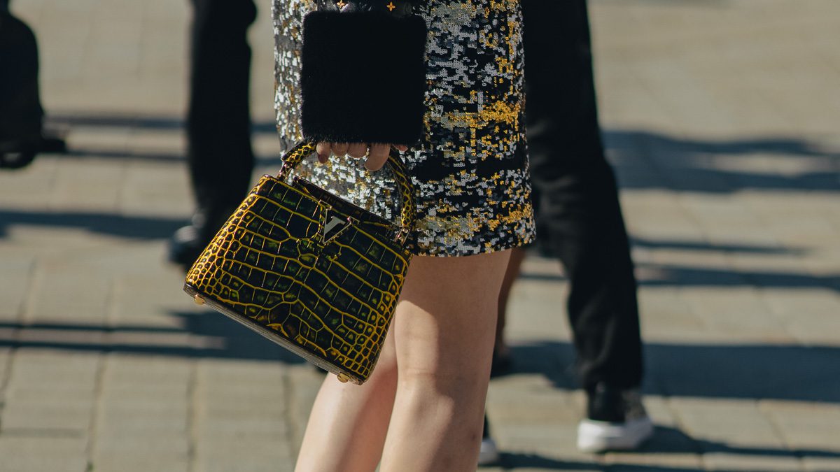
Image via Louis Vuitton
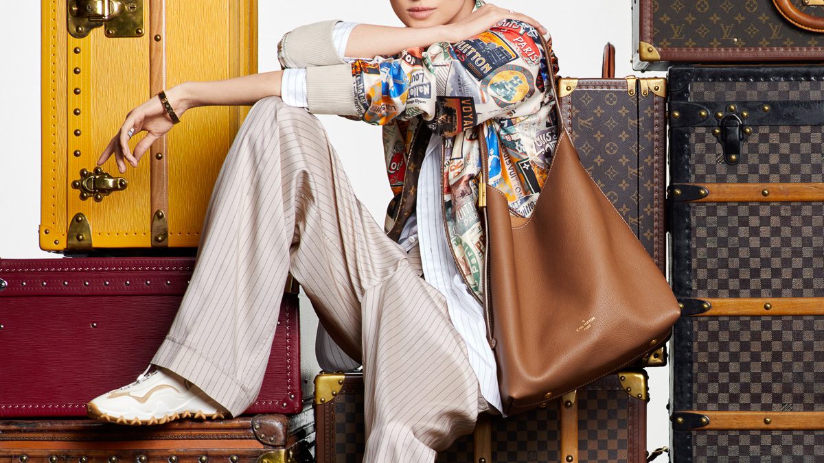
When you’re a brand with as giant a product line as Louis Vuitton‘s, designing a website can understandably be a bit difficult. Showing dozens upon dozens of bags, most of which come in multiple materials and sizes, without showing too much to potential counterfeiters is tricky at best, not to mention incorporating all the other multimedia content that it now takes to paint a cogent picture of a modern luxury brand. I wouldn’t want to be the person tasked with figuring out a usable way to do all of that.
Vuitton found someone who was up to the task, though, and the results of the LouisVuitton.com redesign are mostly solid. At the very least, if you were hoping for easier organization of product pages and larger images, the new site gives you exactly that. It isn’t without its problems, though, and I’d love to hear your thoughts in the comments.
First and foremost, I hope your computer is hardy and current. I’m using a year-and-a-half-old MacBook Pro with Apple’s newest operating system and an up-to-date version of Google Chrome, and the website eventually crashed both my browser’s Flash player and my browser itself. Things have been a little unstable since I upgraded to OSX Lion last month, so I won’t blame it entirely on Vuitton’s site, but the enormous graphics and video backdrops will likely stress any but the most finely tuned systems. Perhaps in a nod to this problem, Vuitton seems to have reduced the resolution of some of those huge background videos, which leads to a blurrier backdrop than I would have expected from a brand with a reputation for details.
On the positive side of the multimedia coin, the new site is much more rich in content than the previous design. It’s relatively easy to view videos from brand ambassadors like Angelina Jolie, take a look at the just-shown Spring 2012 collection and explore Louis Vuitton’s collaborations with various contemporary artists, if you’re the kind of consumer who wants to do those things. If you’re interested in fashion as an industry, there’s plenty to see.
It will likely be the online shoppers who are most pleased with the new design, though. Navigating through Vuitton’s litany of materials is much easier with this version, and although you still don’t get a chance to view a much-needed grid of thumbnails when searching for a product, toggling between material and size is much easier. The side-to-side flow of products make me feel a little motion sick, but fashion sites seem to adore the setup so much that I doubt it’ll go anywhere anytime soon. Overall, the site seems to be an upgrade in both senses of the word, as long as your computer can handle it.